I'll be on WBAI tonight discussing the Rubin Museum's Wheel of Life comics project

Illustration, Publicity, Work

Tonight, starring at about 9:40 pm, I will be on WBAI 99.5 FM here in NYC discussing the Rubin Museum’s Karma-Con series. Along with fellow cartoonists Katie Skelly and Rubin Museum curator Beth Citron, we’ll be guests on WBAI’s Asia Pacific Forum. We’ll talk about the cartoonists’ Wheel of Life project and the ongoing exhibition “Hero, Villain, Yeti: Tibet in Comics.”

On April 18, myself and a group of other local cartoonists/illustrators will unveil our reinterpretations of segments of the Tibetan Wheel of Life (also known as the Wheel of Becoming, a representation of Buddhist beliefs about life, death, and rebirth). I was given my section last week (at the very enjoyable “Studio Salon“), and I’m in the middle of completing it. My section is the world of Humans, and I’m having fun trying to depict the various suffering we go through in our attempt to reach enlightenment. Here’s a sneak peak of how it’s looking so far…

Wheel of Life: Humans

Nick Flynn's BEING FLYNN… the back story

Comics, Illustration, Plug

I first met Nick Flynn back in the fall of 1999, in Provincetown, Massachusetts. I had accompanied Sari there for her Fine Arts Work Center fellowship, a residency which would keep us in P-town through the winter and into the following spring. Nick was a second-year fellow, and Sari and I were immediately drawn to his charm, intelligence, and good humor.

Nick was a natural storyteller, and had some amazing stories to tell, about a life filled with drama, heartbreak, debauchery—all that good stuff. By trade, he was a poet—a good one—and over the years he and I did some collaborations, basically me adapting his poems into comics. One of the pieces, “Father Outside,” had to do with the time Nick was working in a homeless shelter and his long-estranged father arrived as a new client. Another piece, “Bag of Mice,” dealt with Nick’s mother’s suicide. In all, we did three collaborations, all of which were published in literary journals (and later published my me in The Vagabonds #2). The original art from our first piece, “Cartoon Physics, Part One,” even traveled as part of a multi-city comics art exhibition.

In 2004, Nick published a memoir, memorably titled Another Bullshit Night in Suck City. (That was a favorite phrase of his father’s.) Nick hoped to collaborate again with me on the cover of the book (which was being published by W.W. Norton, much later to be my publisher for The Influencing Machine.) So we worked together on some sketches. Long story short, Norton declined to use my art for the cover (though it was eventually published as a frontspiece in the British Faber & Faber edition). And I have to admit that the art they used instead, by Hon-Sum Cheng, is far superior.

So, fast forward eight years, and Nick’s book has been made into a feature film. Now called Being Flynn (you can see why they didn’t use the other title), it stars Paul Dano as Nick and the legendary Robert DeNiro as Nick’s father. Julianne Moore makes an appearance as Nick’s mom—not a bad cast! The film opened last week, so to commemorate it, I’m sharing the book’s rejected cover art.

Another Bullshit Night in Suck City

STATE OF EMERGENCY: Evolution of a Cover

A.D., Illustration

I’ve written previously about State of Emergency, Sari’s adaptation of both my A.D.: New Orleans After the Deluge and Dave Eggers’ Zeitoun. Part of Scholastic’s On the Record series, the book is aimed at high-school “reluctant readers” (thus the appeal of the graphic novel format). I think Sari did a really great job of adapting and abridging the two books.

For me, it’s a thrill to be paired with Eggers. I really admire Zeitoun, and of course I’m grateful to Dave for his blurbing of A.D. And what makes this project even sweeter for the whole Josh & Sari family is that Scholastic asked me to draw the cover for State of Emergency. I was happy to oblige, and thought you might enjoy seeing how the illustration developed.

We quickly determined that they were looking for images of post-flooding New Orleans and "people helping people." So the first thing I did was come up with a few sketches:

State of Emergency sketches

I swiped Caravaggio!

A.D., Tribute

While at my opening the other day, cartoonist pal Joe Infurnari asked me about one image in particular, a panel from A.D. chapter 13, where the character Denise and her family witness the death of Miss Williams, a fellow refugee at the New Orleans convention center.

Joe said the image strongly reminded him of a painting by the Italian Baroque painter Caravaggio, and asked if my panel was an homage to it. I had no idea what he was talking about. I was an art history major in college, and I have always loved Caravaggio’s work, but I didn’t purposefully do any such thing when I was drawing A.D.

Later, however, Joe sent me a jpeg of the Caravaggio painting in question. Check it out (it’s called The Entombment of Christ, from 1602–03):

Caravaggio's "Entombment of Christ"

And here’s the panel in question from A.D.:

Hmmm. Looks like my subconscious was hard at work when I drew that image. I just hope Caravaggio’s heirs aren’t in a litigious frame of mind…

WarHolk

Illustration

This past weekend, the Austin American-Statesman ran a special summer movie preview in their entertainment supplement, and they asked me to draw the cover. In honor of the Incredible Hulk film premiering in June, the art director had me do an Andy Warhol-style portrait of ol’ greenskins. As a guy who doesn’t make a living drawing superheroes, it’s fun to go back to my roots once in a while. For this one, though, all I had to do was make an angry face in the mirror, remove my glasses, change my hairstyle, “Warhol” it up, and voila!

As a bonus, here’s a link to the a.d.’s story about his search for the “Credible Hulk”…

Old Unpublished Crap!

Comics

Digging through some stuff yesterday, I found this vintage piece in an old sketchbook.

I had just returned from my worldwide backpacking adventure and had settled in Chicago. I happened to live near Chris Ware (at that time an obscure cartoonist toiling away for the Chicago alternative weekly New City), and we had a mutual friend in common (Rob Walker, actually), so I met Chris and even hung out with him a little. He showed me his “sketchbooks,” which were actually meticulously drawn studies, ideas for Jimmy Corrigan, humorous one-page narratives, and the like. I was completely intimidated, of course, but one thing that particularly intrigued me about his sketchbook comics was that he did many of them totally impromptu, with no preconceived idea of where the story was going, just ad-libbing one panel after the other. This was very different from how I worked at the time (and certainly not the way Chris did comics for publication), but I was inspired to try it.

Thus, this goofy “intro” to my sketchbook. As simple as it is, it was the first time I tried doing an ad-lib story, and I remember being actually scared as I was doing it. Of course, it was liberating to not have to worry about sharing it with the public — not that I had much a public, having barely been published at that point! Anyway, it was fun, and the piece has a refreshing looseness, but it’s not really my “style.”  I returned to my traditional method of writing full scripts for subsequent comics — except for a 24-hour-comic I attempted back in 2002.

I’m afraid this intro is much more interesting than the actual piece, but courtesy of the JoshComix Way Way Back Machine—before A.D., before The Vagabonds, before American Splendor, before Keyhole, even before Keyhole Mini-Comics — here it is:

Christian Rock illo process

Illustration

I just did a new illustration (for the San Antonio Current) and thought it would be fun to show the process. The illo was for a story about how dull the “Christian Contemporary Music” scene is. The art director had a concept in mind when he called, so this was one of those gigs deadredfred first told me about, where your job as an illustrator is basically to “do something nice that can hang over the couch.” But that’s cool; I didn’t have the energy for a great new concept.

Anyway, the a.d’s idea was to show Jesus in a band T-shirt, rocking out to music in a crowd of polite, conservatively dressed Christian concert-goers. The a.d. had worked with me before, so he didn’t need to see sketches or even pencils; he said I could go straight to final.

Even so, for my own piece of mind, I worked up a tiny thumbnail, just to get the basic layout for the dimensions of the piece:

SPX program cover

Illustration, Work

Image hosted by Photobucket.comThrough a series of coincidences, I got invited to draw the cover for this year’s SPX program. Seeing that Harvey Pekar will be a special guest at this year’s show, SPX Executive Director Steve Conley thought a Pekar theme would be appropriate.

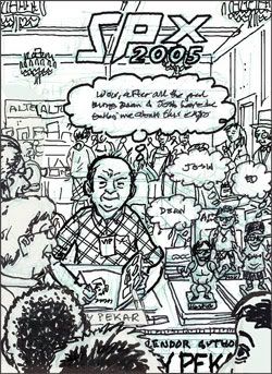
I talked it over with Harvey, and he suggested showing himself at the show, with me, man_size, and Ed Piskor, all artists of his who will also be in attendance. Harv is saying, “Wow, after all the great things Dean and Josh have been tellin’ me about this expo, and now I’m here finally — as a guest with his own booth no less.” Pekar also suggested having me, man_size, and Piskor coming up with our own lines of dialogue.

Given Harvey’s line, I felt my obligation as the artist was to:

a.) promote Harvey being at the show
b.) Promote SPX itself

Thus, my sketch showed a line of eager fans in front of Harvey at his booth as he signs copies of his books, DVDs, etc. Behind him we see other exhibitors, fans, cartoonists, etc, in the Versailles Room. Showing the American Splendor artists (me, man_size, & Piskor) didn’t seem as important, and took away from the other two important elements above.

So I decided to render us artists as bobble-head dolls! man_size is perched on a pile of The Quitter, the new book he’s got coming out this fall, Piskor is on a pile of Macedonias, the book he’s working on, and my bobblehead doll is situated in front of the Best of American Splendor book, which features a number of pieces with my art. I think it’s a funny conceit, and a sly allusion to the Harvey Pekar bobblehead dolls which were part of the promotion of the American Splendor movie. (I own one myself.)

I left space for each of us bobbleheads to have a line of thought- balloon dialogue, but personally I thought that took away from the concept. Having the dolls talking was just a little too symbolic and surreal. After talking it over with Steve and man_size we decided to keep the bobbleheads mum, so I was happy to scrap that. Neither man_size nor Ed had come up with lines of dialogue anyway!

So there you have it. I finished drawing the actual cover yesterday and am coloring it today. There are a lot of people in the background scenes — see if you recognize any familiar faces.

The painting is in the mail

Illustration

I got an illo assignment Monday morning for a piece due yesterday evening. The article was about a painter (in Washington, DC) who pays his rent with his art. He makes pop-art pictures of George Washington. So immediately I made the connection between G-Wash and the one dollar bill. I did a couple of different concept sketches but this one made the most sense:

With George popping out of the dollar bill to sign a rent check, I thought it captured most of the elements of the story. The art director liked it, but suggested adding a frame to the outline of the dollar bill, to drive home the point that the bill itself is art and not an actual dollar bill. I also liked his idea because it takes the illo further away from the possibility of it being a commentary on, say, the national debt.

So here are the pencils for the piece:

I scanned in an actual dollar bill and squeezed and stretched it to fit the layout of the piece. Then I lightboxed it to get the details of the bill and lettering, and integrate it with the image of George leaning out of the bill. (I was especially proud of how I sneaked my signature in there.)

Then I went to final with inks and toning:

And, voila! – a finished piece. All by 6 pm last night.