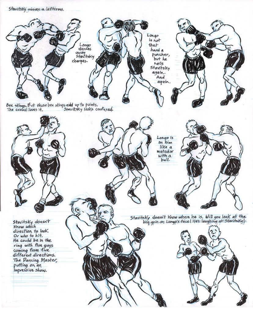
Back in 2013 I posted a comics page that I had copied from R. Crumb. It was an exercise assigned by the great Phoebe Gloeckner, who was teaching a comics class I was auditing at the University of Michigan. (This was during my Knight-Wallace Fellowship in Journalism at Michigan.)
I really enjoyed the exercise, and ever since I have incorporated it into my own teaching, especially when I’m working with comics students who lack confidence in their drawing. The rules of the assignment are no tracing or light-boxing; just to copy the page as best you can. As I always tell my students, there’s nothing like “getting into another artist’s hand”—following their process, step for step, and appreciating they way they solve pictorial problems…
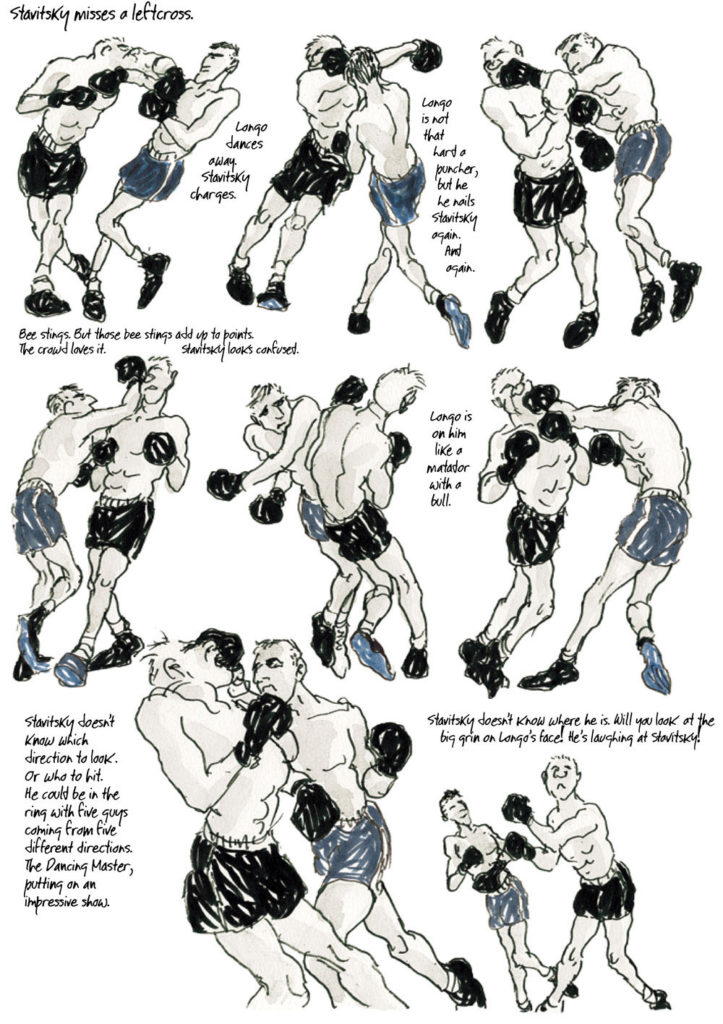
Recently, I had the occasion to assign the copying drill for a comics class I was teaching, and I took the opportunity to again do the exercise myself. The page I chose to copy was from Jules Feiffer‘s 2014 graphic novel Kill My Mother.
I’ve always admired Feiffer “from afar”—his style is so different from mine! —the devil-may-care look of his figures, and his comfort with white space and borderless panels. So copying a page of his was a real exercise for me in getting out of my normal head space as an artist.
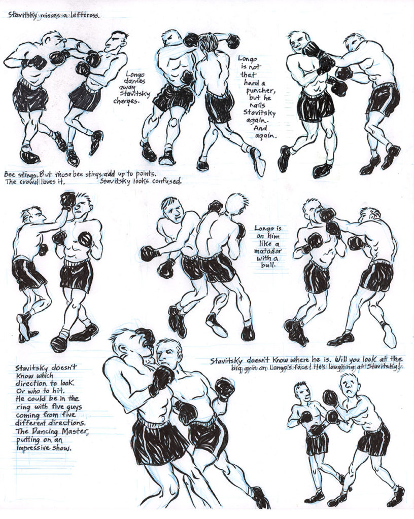
As with the previous Crumb copy, I tried to do as little penciling as possible and work directly in ink. The original page was two colors and utilized a faint ink wash, but I chose to do my copy in simple black—although I left in the faint blue pencil marks I made as I was sketching in the figures and lettering. It also appears that Feiffer did his art using a nib (and a brush for the wash?), while I chose to retain my trusty Kuretake Sumi Fountain Brush Pen.
One challenge I faced was that the paper I used to make my copy had a slightly different size ratio than Feiffer’s—mine was a bit “fatter.” So in the end I had a bit more horizontal space to work with than he did.
I really enjoyed this exercise! For the first time I saw what a solid understanding Feiffer has of the human figure—that despite the looseness of the art, how grounded it is in real human anatomy. It was also fun for me to draw “heroic” figures again, a practice I basically abandoned 25 years ago when I stopped drawing superhero comics. I tried my best—not always successfully—to capture the fluidity of his forms, to not let my figures get stiff. I especially enjoyed copying Feiffer’s lettering—the distinctive way he forms his T’s, K’s, Y’s, and G’s is so different than mine.
And as with the Crumb assignment, this process really helped me appreciate what a masterful cartoonist Feiffer was and is—especially when you consider that he produced this book when he was 85 years old!
It’s fun to compare the two pages and see where they differ (mostly in unintentional ways). So without further ado, here are the results: first Feiffer’s page and then my copy…


Bonus question: can you spot the typo in the Feiffer page? I fixed it in the copy.
