I illustrated the cover of Alissa Quart’s new book, Republic of Outsiders: The Power of Amateurs, Dreamers and Rebels (The New Press), and I thought I’d take you through the whole process.
The book is about how a diverse group of outsiders who seek to redefine a wide variety of fields—from film and mental health to diplomacy and music, from how we see gender to what we eat—are succeeding in various ways in changing the status quo. So from the get-go the initial concept was to show a large crowd of people on the cover, something to convey the idea of “here comes everybody.” The book’s particular subjects—including an Occupy Wall Street “alternative banker,” a transgender activist, an autistic artist, and indie musician Amanda Palmer—would be prominently featured at the front of the crowd. I wanted the art to “bleed,” to extend past the edge of the cover, to help convey the “infinite” size of the crowd of amateurs, dreamers, and outcasts (at that point the book was subtitled “The Power of Rebels, Amateurs, and Outcasts”).
My initial sketch looked like this:
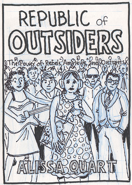
The client was pretty happy with the sketch, with their only major comment regarding the Amanda Palmer figure. Because of some recent negative press, they asked me to downplay her somehow—suggesting I “anonymize her, so she could be a more generic glam genderbending figure.” I pointed out that with my cartoony style I doubted many people who would recognize the character as Amanda Palmer, but I was happy to do as they asked.
We also agreed that I would hand-letter the title and other cover lettering. Given that, the client felt the subtitle needed a little more air. At that point, I came up with the idea of the crowd holding signs making up the words of the subtitle. I thought it further sold the concept of this group being paet of a movement effecting change on society.
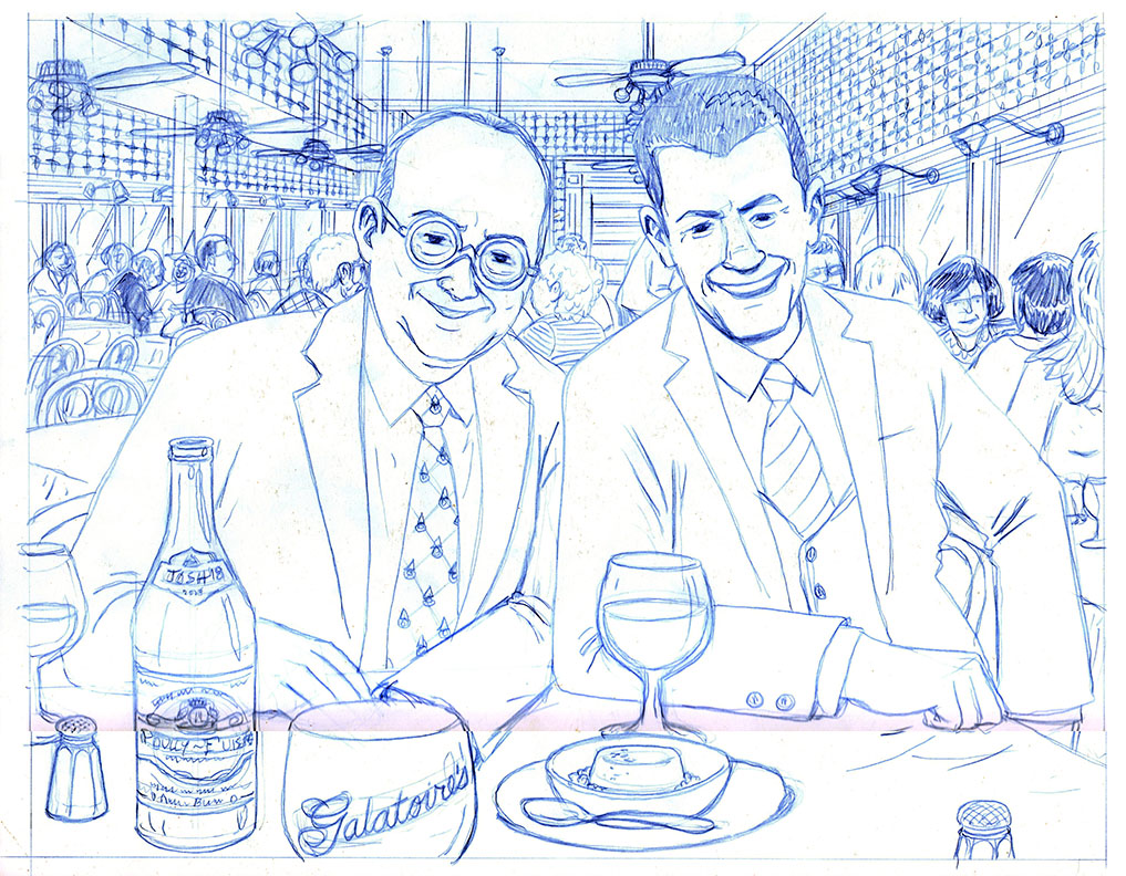
This was my first attempt at the pencils (the blue outline shows the bleed and the crop marks of the actual book dimensions):
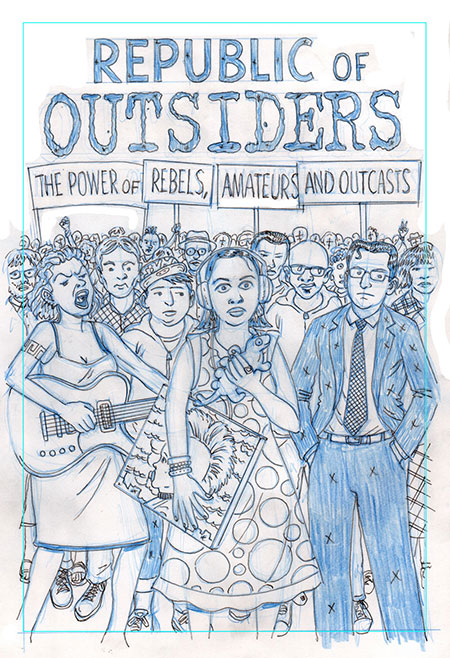
Although generally happy with the pencils, the client asked for some changes. There was some concern that the central figure (based on a real-life autistic artist was “too prominent and particular.” One way they suggested to do that was to eliminate the plastic iguana she was holding and make her expression less vacant; the second adjustment took care of another unresolved issue, which was how to display the author’s name. They came up with the idea of setting in a foreground sign which also would partly cover the autistic character. In addition, feeling that the “Amanda Palmer” avatar was too aggressive, they asked me to tone down her expression a bit as well.
At this point, I was a bit concerned about the changes being requested because frankly I thought they weakened the impact of the image. My understanding of the project was that the people on the cover were outsiders dancing to the beat of their own drums—and succeeding by doing that. And my feeling was the client’s suggestions were making the cover blander and less memorable. But… in the end, they were the client (who is always right ;->). I expressed my reservations and made the changes they asked for. (I also found out later that there were some legal concerns regarding the autistic artist character, who is only referred to by her first name, Katie, in the book…)
Finally, they asked me to replace the chunky “Outsider” title lettering with a simpler “font.”
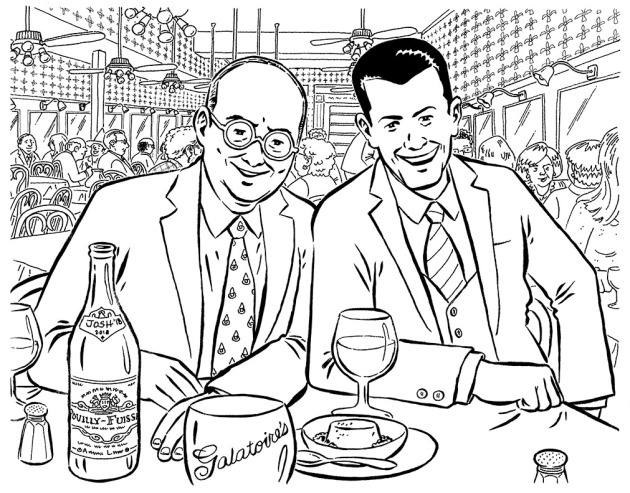
This is what the second round of pencils looked like:
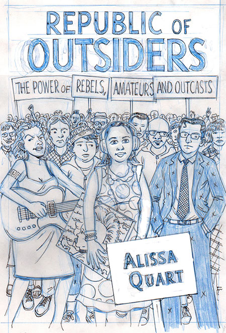
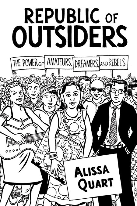
By this point, the client and I were pretty much on the same page, and they gave me the go-ahead to proceed to inks. Wait! There was one more last-minute change: the subtitle of the book was changed from “The Power of Rebels, Amateurs, and Outcasts” to “The Power of Amateurs, Dreamers and Rebels”. So, here are the inks:
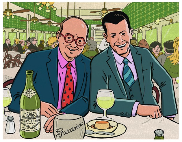
After a little more back-and-forth (thankfully, nothing too onerous), they gave me permission to color the piece, which I did in PhotoShop. As is my wont, I went with a reduced color palette, focusing mostly on greens and yellows, with a optimistic blue sky and red lettering to really pop. Here’s how it looked:
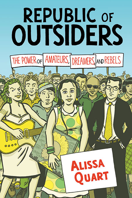
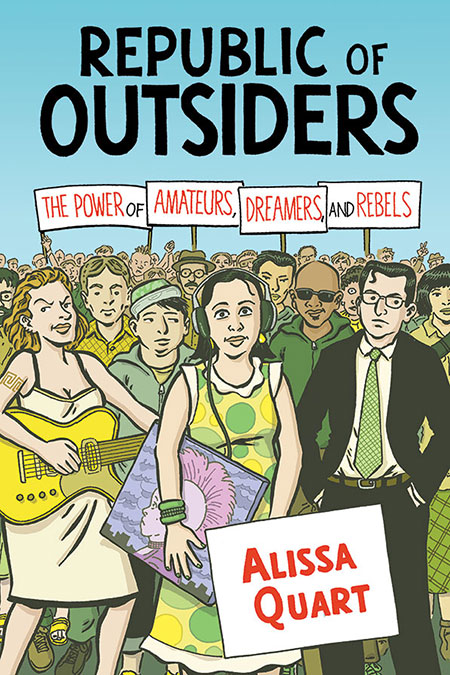
The first color treatment made it all the way up the line to publisher, but she felt the palette was “too retro.” The client’s direction was to “maybe lighten the skin tones and add a bit more cyan to the clothes, so they’re not so contrasty with the sky.” Given how “unrealistic” the original color treatment was, I was prepared for some pushback, and thought their comments made sense. So I warmed up the skin tones and made a few other adjustments (including making the “Katie ” painting a bit more distinctive from the rest of the scene). I thought the changes relieved the “monotony” of the original color treatment while staying true to my original concept:
Success! Everyone liked the new color treatment. So I was done, right?
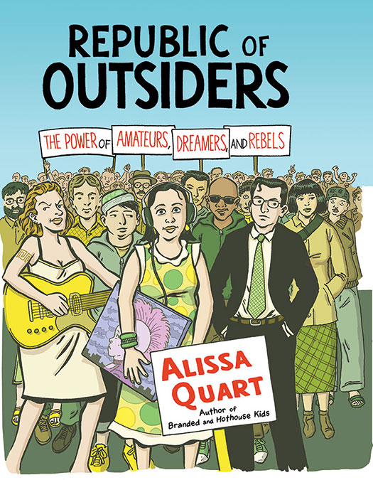
Wrong! When it came to mocking up the book, the artwork on the right-hand side didn’t extend far enough to cover the bleed on to the dust cover flap. Left as-is it would show the art “fading away”—which I thought undermined the “infinite” feeling of the crowd. They also wanted the line “author of Branded and Hothouse Kids” added underneath the author’s name. So… I went back to the drawing board (literally) and extended the artwork to the right (as well as adding the “author of” line in PhotoShop, using a font of my lettering). And, voila:
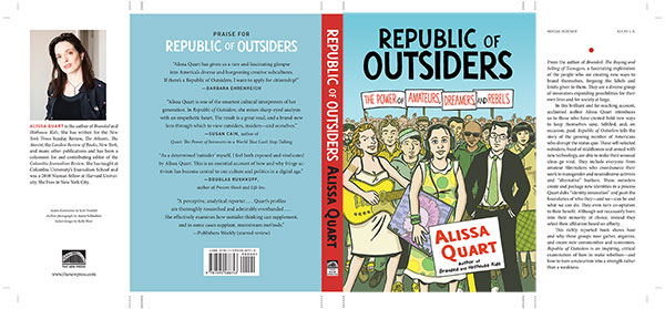
We were finally done! This is how the “mechanical” (front, back, flaps, and crop marks) looked on publication:
The book came out last month, and it’s been cool seeing my work on the cover—a first for a book I did not myself draw.
After all the back and forth, I obviously felt very connected to the process, and to all the individual decisions that led to the distinctive final product. So I was a bit chagrined when this image was brought to my attention: the cover of Eric Alterman’s 2008 book, Why We’re Liberals: A Political Handbook for Post-Bush America (Viking), illustrated by the very brilliant Tom Tomorrow…
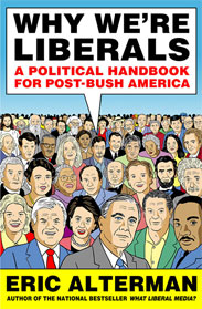
Oops! I don’t remember ever seeing that book cover before, I swear!


 Writer

 Matthew Baker
 The folks at the venerable Franco-Belgian comics magazine
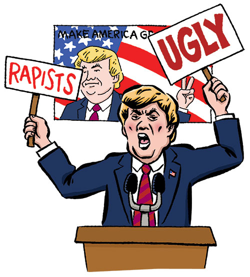
  It was funny: when I was pitching the stories to editor Perez, the one he had the most trouble believing was the details of Trump’s vitriol-fueled campaign. As he said, “In the media we often see him as a ‘larger than life man,’ but not dangerous.” To which I responded that


 I illustrated the cover of