I’m not sure what to say about Ed Piskor except that it is all so sad. I knew Ed — albeit peripherally — and it’s a big deal when someone in your circle dies — especially at their own hand.
But what I really inferred from Ed’s letter was that his entire ego and identity were unhealthily tied to his life as a cartoonist. Last week, when it appeared that his livelihood was being taken from him, it must have felt like EVERYTHING had been taken from him. And that’s what led him to take his own life.
It’s hard for me to reconcile this with the Ed that I knew, because I was only really acquainted with him at the very beginning of his career. Ed reached out to me and Dean Haspiel back when HE was the young cartoonist, only 21 years of age. He was just starting to work with Harvey Pekar and he wanted to connect with us to know what our experiences were with the famed curmudgeonly writer.
We could see why Harvey was attracted to Ed’s talent — his artwork was so clearly influenced by underground luminaries like Crumb and Shelton. (Piskor’s work always reminded me a bit of Derf’s: they both took their weaknesses — drawing relatable people — and made it their strengths.) Even at that tender age, Ed struck me as someone who was all-in on the cartoonist life — for better or worse.
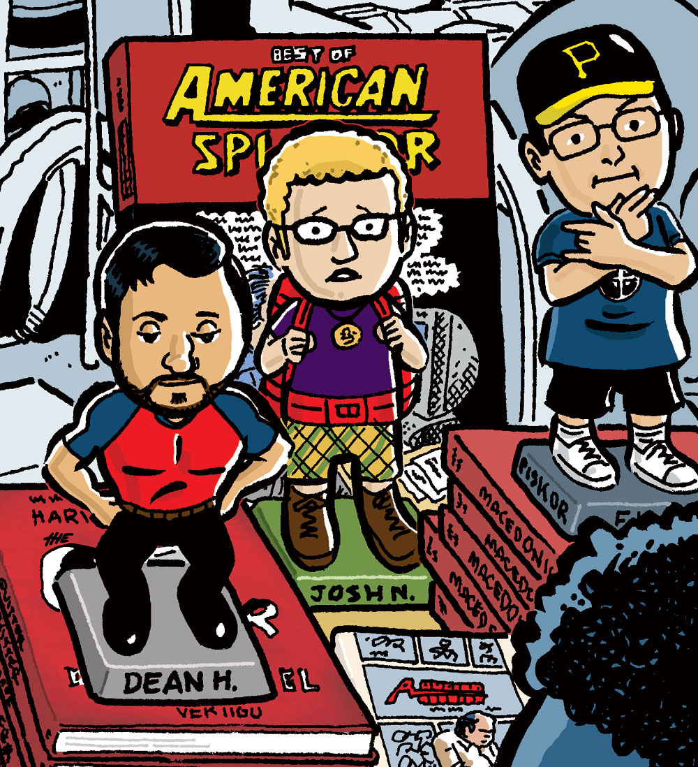
Ed, Dean, Harvey, and I all ended up together a few years later at SPX 2005. We did a panel together, and I drew the SPX program cover that year, featuring Harvey signing books for fans – and Ed, Dean, and myself as bobbleheads. (There had been a Harvey Pekar bobblehead sold in conjunction with the American Splendor movie, which I guess is where I got the idea!)
That was when I first met Ed in person, which was a bit of a surprise. His hip-hop getup of a ball cap, Public Enemy T-shirt, and dark glasses struck me as a pose. Was it ironic or serious? In reality, he seemed shy and insecure (in other words, like every other cartoonist). I came to see Ed’s outfit as his “convention uniform” — maybe his way of protecting himself from feeling too vulnerable when he emerged from behind the drawing table?
I kind of lost touch with Ed after he did Macedonia with Harvey. I really dug his Hip Hop Family Tree stuff, but I haven’t followed his work since then, other than to remark how prolific he was and how much he grew as an artist. (Dean and I interviewed Ed for our American Splendor podcast back in 2019, but that was the first time I had interacted with Ed in probably ten years.) And I never saw how he was around women and female fans.
The portrait of Ed that emerges from his letter is of a guy who only felt at home when he was making comics, or talking about comics on his YouTube show. Correct me if I’m wrong, but it doesn’t appear he had many, if any, strong human connections — romantic relationships, family — to keep him on track both during and after COVID. The isolation of COVID was real! I thank my lucky stars every day that I had Sari and Phoebe during those years.
Yes, Ed made some unquestionably bad choices… but nothing actually criminal, right? He was troubled. We all are. And I don’t imagine that his accusers feel that what he did was worthy of him dying! Yet that is where we sit today.
I was saddened to read the other day that Rachel Pollack had passed away. Rachel was a fiction writer, an expert on the tarot, and a beloved teacher, but I basically knew her as the writer of Doom Patrol and as a client.
Back in the early-to-mid 1990s, just when I was beginning to curtail my consumption of most genre comics (i,.e., I wasn’t going to the comic shop every week), I still made a point of reading Pollack’s Doom Patrol (with notable art by the brilliant Richard Case and then later the equally brilliant Ted McKeever). Taking over the title from Grant Morrison, Pollack’s Doom Patrol dove headfirst into stories on the LGBTQ+ experience and religion — while remaining delightfully WEIRD in that special Doom Patrol way. During Rachel’s run, she created mainstream comics’ first transgender superhero, Coagula.
Some years later, through a mutual acquaintance, Rachel became a client of my “boutique” web design business. (One of the ways I made money as a freelancer in the period 1996–2003 was by designing simple websites for various small businesses, entrepreneurs, and artists.) At that point my own comics career was still very much a passion rather than a “going concern,” and it was exciting to be working with an actual comics professional (even if Rachel was no longer working in comics).
I designed Rachel’s first website, “The Shining Tribe,” which is where I discovered that she had all these other specialties. (Thanks to the Wayback Machine, we can go visit her old site — it all looks so quaint now!) She and her later-to-be wife Zoe Matoff were so pleasant to work with, and Rachel, I think, was charmed that she and I had a comics connection; she always made sure to ask me about my own work and offer encouragement. (At one point she even floated the idea of me illustrating a tarot deck of hers, but I didn’t think my particular style would have been a good fit for that type of job, so I turned it down.)
I stopped updating Rachel’s site around 2003, which is around when my freelance life picked up with work closer to my heart: comics and editorial illustration. I hadn’t thought much about Rachel Pollack in the years since, so when I came across her obituary in the New York Times, a lot of memories came flooding back. One of them was about the manner in which Rachel took over as writer for Doom Patrol. As she had already been already hired as the writer, but was basically unknown in the comics industry, Rachel and the editor came up with a clever ruse to announce her takeover of the title. In the guise of a fangirl, she started writing letters to the editor that were published every month in the letter column, “Doom Sayers.” She started off by announcing her intention to become the title’s writer one day — “Someone once told me that most comics writers started out writing letters…” Her letters were truly wacky and hilarious — at one point she suggested that Barbara Bush should join the Doom Patrol, and in another, she announced that she “used to have a secret identity. Well, actually I gave up the public identity and kept the secret one, which was a lot more fun.” Apparently, a number of people — myself included — thought she had been hired based on her letters!
The Times‘ obituary (written by George Gene Gustines) also taught me one fundamental thing about Rachel that I’m embarrassed to say I NEVER knew: that she was trans. I mean, given the content of her writing on Doom Patrol, I should’ve guessed, but I’m obviously pretty clueless. And, as she was quoted as saying, comparing when she transitioned (in 1976) to now, “The big thing that’s changed, an astonishing change, is that transgender people are now visible,” she said. “Society recognizes that this is something people can be. Obviously, there is a strong reactionary element fighting change, as always, but the difference is remarkable.” And the truth is that Rachel had a VERY public identity, one which touched a lot of different people in a myriad of ways.
My deep condolences to her family, friends, fans, and of course to her widow Zoe.
Thinking about Victor S. Navasky (July 5, 1932–January 23, 2023), the longtime editor and even longer-time public face of The Nation magazine, who passed away last week. He was a towering figure in journalism, and his life and career have been documented by people much more qualified than me. But I have some personal memories to share.
It was 1990. I was a year out of college, searching for direction, and I wrote a desperate plea to The Nation, a sort of moral compass for me back then. I begged for a job — any job — and even though the magazine didn’t have any openings, Victor agreed to meet with me. Despite his vital obligations in putting out a weekly magazine, he was so kind and patient during the interview, crinkling his eyes in a sympathetic smile as I expressed my existential crisis.
And somehow he created a job for me! At first, I was the magazine’s jack-of-all-trades — my duties included everything from helping with the magazine’s classified ads section and selling back issues and T-shirts to putting fresh toilet paper in the bathroom — but I couldn’t believe my good fortune to be in the door and apparently steering my life in the “right” direction.
Victor was never a director mentor to me, but he embodied the spirit of the place. I learned so many things from him just by observing his manner and the way he dealt with his people. I thrived at The Nation, where I made a bunch of great friends and contacts, and eventually became director of reprints and syndication. I also learned how journalism and fact-checking work, and I credit that formative experience with setting me on the path to my eventual (current) role as a journalist.
And no doubt the best thing that happened at The Nation was that I met Sari Wilson, who began her own post-college career as an intern there. The rest, as they say, is history!
I left The Nation in 1992, setting out with Sari on our round-the-world backpacking adventure (which led to us living in Prague, then Chicago, then San Francisco, then Provincetown, and finally, nearly a decade later, back to New York City). At the farewell party for me, Victor gently ribbed me about how far I had come in my two years there, and even jokingly took credit for connecting me with Sari. But it wasn’t a joke: if he hadn’t taken “pity” on me and given me a job that didn’t exist, Sari and I would never have met.
I ran into Victor here and there in later years — when Sari and I were back in NYC for a visit, and a couple of times upstate in the Berkshires. And he was always the same: avuncular, sharp-eyed, and happy to see how my life was progressing. I’m happy he had a good long life, and I’m grateful our lives intersected at such a key juncture in mine. He will be missed.
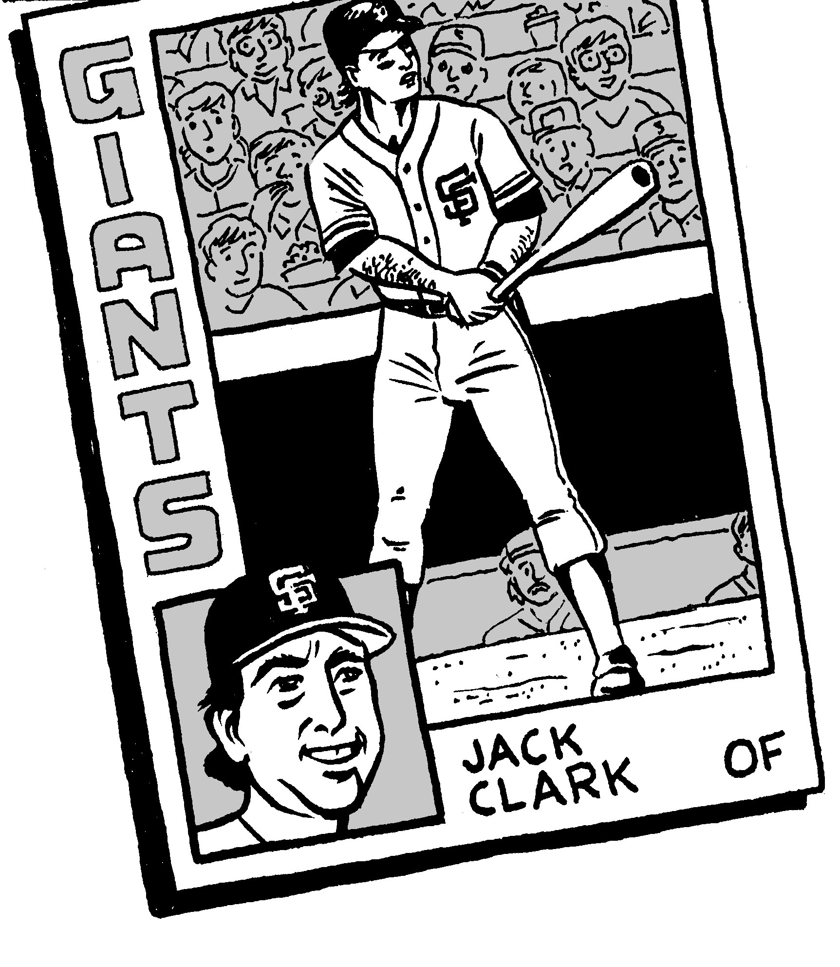
My version of Jack Clark’s 1984 Topps baseball card, drawn some years back.
On July 30, my beloved San Francisco Giants will retire the number 22 jersey of Will Clark. It’s a well-deserved honor for an iconic Giant of the 1980s and early 1990s. But my question is why can’t the team also retire the number 22 jersey of Jack Clark, an iconic Giants of the 1970s and early 1980s? The two Clarks are not related, but their stats as Giants are comparable…
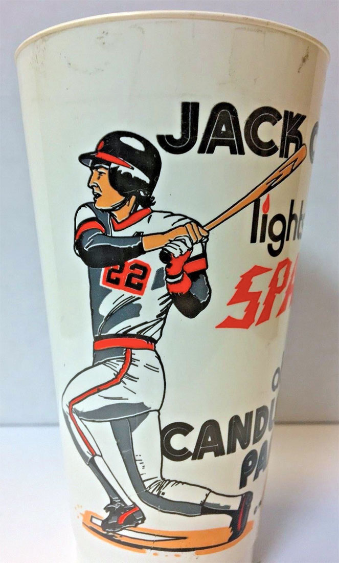
I owned this giveaway plastic cup for many years.
As a Giant from 1975 to 1984, Jack “The Ripper” Clark played in 1,044 games, slashing at a rate of .277/.359/.477 for an OPS of .836, with 163 homers and 595 RBI. During that time he added 60 stolen bases and 497 walks. He made two All-Star teams (1978 and 1979) and came in fifth in the 1978 NL MVP race. During a notoriously down period for offense in baseball, he was in the top ten in home runs in the National League three times as a Giant. He was a solid right fielder with a strong arm, showing up in the top five in outfield assists three times. The guy who “Lit the Spark of Candlestick Park,” he generally hit third for the team. (Regarding his uniform number, Jack actually wore #15 in his first two years, 1975–1976, when he was splitting time between the minors and the majors — when he was only 19/20 years old.)
A scant two seasons after Jack Clark was traded away, the team promoted another player named Clark and gave him the same number 22 jersey. (He was 22 years old when he joined the Giants.) As a Giant from 1986 to 1992, Will “The Thrill” Clark played in 1,160 games (104 more than Jack), slashing at a rate of .299/.373/.499 for an OPS of .872, with 176 home runs and 709 RBI. During that time he added 52 stolen bases and 506 walks. He made five All Star teams (1989–1992) and finished in the top five in the NL MVP race four times (1987–1989, 1991). A good first baseman, he won the NL Gold Glove in 1991. Will generally batted third, and is famous for homering off of Nolan Ryan in his first Major League at-bat, and destroying the Cubs in the 1989 National League playoffs.
So, yeah, although Will’s stats as a Giant are undeniably better than Jack’s, both were highly productive number 22s. And both Clarks’ final career statistics are remarkably similar, with each finishing with the same career OPS+ of 137. (Will had a higher career batting average, but Jack hit more home runs.) The main difference is that Jack’s most productive years came in the five seasons after he left the Giants, while Will’s best years were with the Giants.
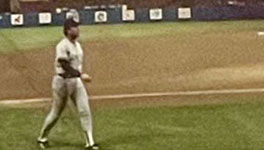
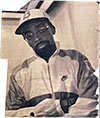
My 1988 photo of YankeeJack Clark.
Don’t get me wrong — I have great affection for Will Clark. But for me, Jack Clark was the man. I became a San Francisco Giants fan in late 1978, and he — along with a declining Willie McCovey — was the heart of the Giants’ offense in those early years of my Giants fandom. For the most part, the team was pretty mediocre during those years, but Jack could be counted on to produce. (Game-winning RBI used to be considered a reliable metric of “clutch hitters,” and Jack was always a league leader in that category.) Because of him, number 22 became my favorite baseball number (yes, that’s a thing.) I was practically heartbroken when the Giants traded him away, and I followed the rest of his career with great interest. (I still have pretty much all his baseball cards from every stop along the way.) After many years, I got to see him in person again when I was in college in Ohio when, as a member of the New York Yankees, he came to play the then-Indians. (Clark only played one year for the Yanks — because he pissed off the manager.)
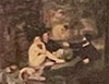
Here are the stats of both Clarks — as Giants — added together: 2,204 games with a slash line of .289/.366/.488, 2,312 hits, 339 homers, 1,304 RBI, and an OPS of .854. That’s a pretty good career!
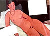
To sum up, I think it’s great that the Giants are retiring the number 22 in honor of Will Clark. But how cool would it be if they invited Jack Clark to come to the ceremony and gave him some due as the first Clark to wear the number with distinction?
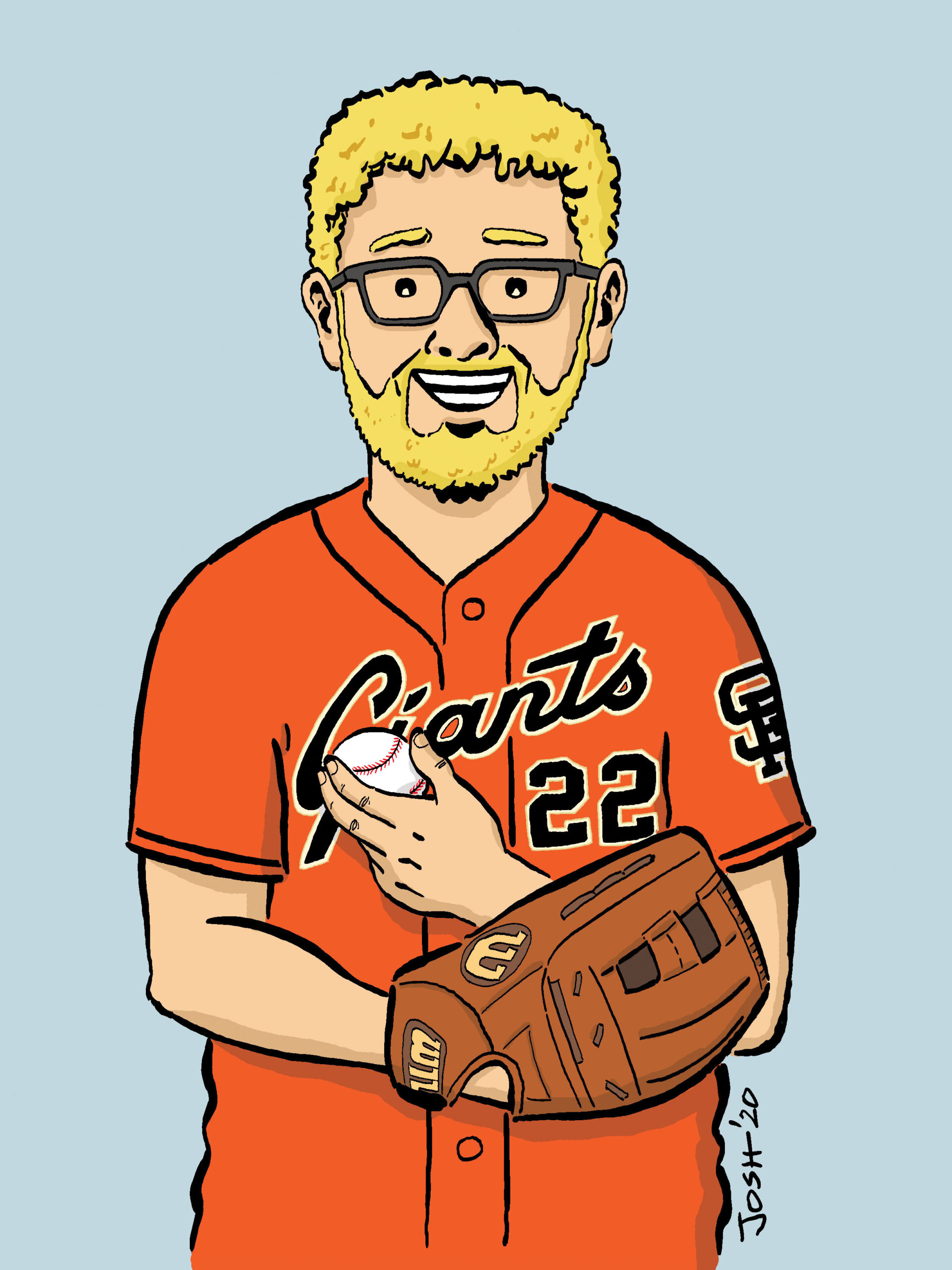
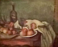
My 2020 cutout wearing the no. 22 Clark jersey.
P.S. Full-disclosure side note: before either Clark came along, two other Giants’ players had worn no. 22 for lengthy periods — Don Mueller (1948–1957, ten seasons, technically two more seasons than Jack wore it) and Hal Lanier (1964–1971, eight seasons, the same number as Will and Jack). Mueller, an outfielder, was a .296 lifetime hitter but had virtually no power, with a career OPS of .712. Lanier was a light-hitting infielder. So there is that.
The great baseball writer Roger Angell passed away today. He had lived an impressive 101 years. You can read his obituary in the New York Times. This is a slightly edited letter I wrote to him in 2002 (back before my beloved San Francisco Giants won three World Series in five years). I think it still makes a nice testimonial to his work and what it meant to me during my life…
Dear Mr. Angell,
Your books have given me so much joy over the years. They seem to be about so much more than just baseball. For years now I’ve been meaning to send you a “thank you” letter, but I always feel as if I have so much to say that I’ve intimidated myself! So I figure the best thing to do is just start, and see where it takes me. First off, I’m a 34-year-old cartoonist living in Brooklyn. When I first came across your work, I was a 12-year-old pipsqueak living with my mom in San Francisco. So that’s over twenty years ago!
My parents were divorced, and my dad lived in New York, and in the summer of 1977, he introduced me to baseball, by playing catch with me every day after work, taking me to a couple of Yankee games (and teaching me to keep score!), and watching the Yanks with me on TV. By the time I returned home to San Francisco and my mom, I had fallen hard for the game. I started out as a Yankee supporter, but I evolved into a huge Giants fan. Sure, the Yanks were great, with their two recent world championships and all, but they were 3,000 miles away. And who could resist the Giants’ magnificent trio of Willie McCovey, Vida Blue, and Jack Clark? I remain a Giants fan to this day. I still root for the Yankees, too (since the two teams are in different leagues), but when push comes to shove, I favor the Giants by a broad margin.
It was tough being a Giants fan in the early 1980s, when I moved with my mother back to my birthplace of New York. For one thing, in those pre-Internet, pre-sports radio days, it was nearly impossible to get the West Coast scores until late the next day. So frustrating! Secondly, all my friends were Mets fans, and despite both teams being pretty awful, my “pals” found nothing more enjoyable than razzing me about every Giants loss—especially when it came at the hands of their beloved Mets. But, what can I say? I’ve always been an underdog sort of guy, and given the Giants’ perennial also-ran status, that makes them pretty irresistible.
Baseball seemed to answer so many questions for me during that period of my life. Back in San Francisco, I spent more time than was healthy parked in front of the radio (we didn’t own a television), listening to Hank Greenwald and Lindsey Nelson give the play-by-play, as I kept pace, keeping score on my own custom-made scorecards. I got endless satisfaction from the stats, the computing of averages, and the comparisons of players from one era to another. There was comforting reliability to baseball statistics: the whole world fit into these little boxes, everything had a scoring symbol or a slot to fit into, and in my itinerant youth (my mom, a college professor and artist, took me with her to jobs in San Diego, San Francisco, Halifax, Vancouver, and finally, in the summer of 1980, back to New York), this dependability meant a lot.
I always loved playing baseball, too, although I never got very good at it. In San Francisco, the neighborhood kids and I were crazy about our version of stickball (with a wooden bat and an old tennis ball). And even my two or three years of Little League ball were fun, although I wasn’t much of a hitter (and not much better as a pitcher).
Until I came across The Summer Game,my exposure to baseball writing had been confined to juvenile fiction and simplified biographies of stars such as Hank Aaron, Jackie Robinson, and Joe DiMaggio. You know the kinds of books I mean: bland histories where every chapter offers a life lesson. Or the fictional stories, which always seemed to be about that terrible Little League team that over the course of a long summer comes together, bonds, and goes on to win the championship against incredible odds.
Well, stumbling across The Summer Game (sometime in 1978, I believe) was like opening my eyes to a whole new world. You brought the lyricism of the game to my attention. Even though I was far too young to really appreciate the beauty of your prose, your easy, colloquial style, your love of the quiet moments between the actions, your appreciation of the weather, the stadium, the fans around you: all of this was captivating to me. I’ve re-read your books many times over the years, from my adolescence in New York, to my college years in Ohio, and during even a stint in Prague, the Czech Republic! Since then, I’ve lived in Chicago, back in San Francisco, and now am back “home” in Brooklyn, always with your books in tow.
When I first read your books, I was absorbed by the inside-baseball; the quotes from the stars, the feeling I was vicariously getting to know these superstars (and benchwarmers too). Even at age 12, I was an avid reader of the sports pages, and it seemed to me that the players quoted in there didn’t have the ability to form complete sentences, rarely anything other than the typical clichés about giving “one hundred and ten percent,” taking it one day at a time, etc., etc. But when you spoke to those guys, they seemed real: thoughtful, opinionated, humorous, human.
And of course I loved the way you brought the big games to life, your annual recap of the pennant races, the playoffs and the World Series. It didn’t matter if I had followed every game myself. Somehow you brought those moments back, capturing the drama, the tension, the whole atmosphere. I realize now that it wasn’t the suspense of the unknown that I craved, but the sense that during those moments, this game was the content of my entire world.
Over the years, as I’ve re-read The Summer Game, Five Seasons, Late Innings, and Season Ticket, I’ve come to appreciate your abiding humanism, the way you continually embrace the changing playing field of major league baseball. In the face of greedy players & owners, astronomical salaries, stadium scandals, contraction, and the nearly endless postseason, your love of the game and its participants has never waned. Somehow you’re able to express your concerns, to plainly state why you think the most recent “innovation” does the game a disservice, and yet maintain the generosity of spirit and perennial optimism to know that baseball—the game itself—will persevere. Nay, triumph!
I feel like I’m just going on and on, so I’ll cut this short. I hope this letter brings you some satisfaction—It’s the least I can do to repay you for all the wonderful hours of enjoyment and education you’ve provided me all these years.
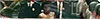
Thank you again; as always I look forward to your next baseball piece in The New Yorker.
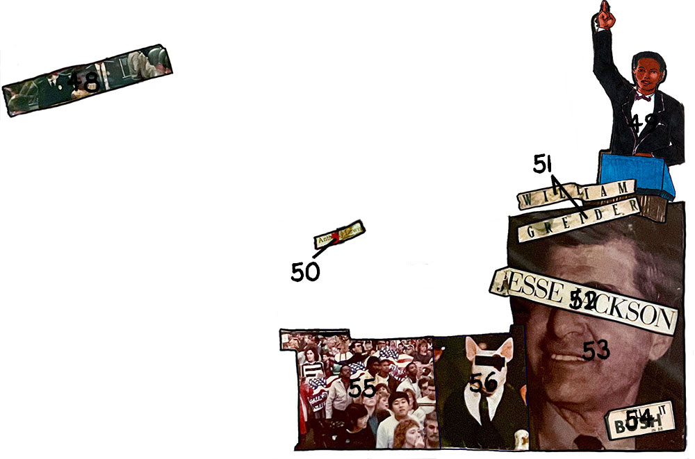
Jeez, what a month of losses this has been. Personally, I’ve lost two family members and, now, two major influences in my art career: first Neal Adams back on April 28, and now George Pérez, who died of pancreatic cancer on May 6. Pérez was only 67 years old.
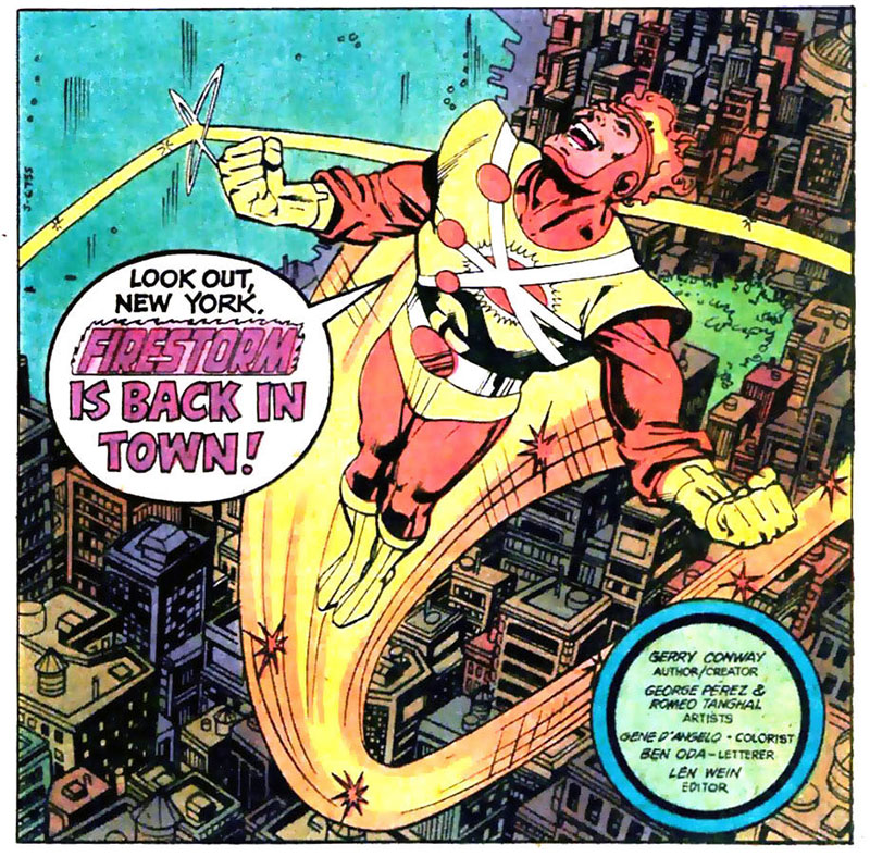
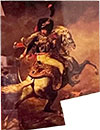
Pérez art on a Firestorm story from 1980.
I was 13 years old when I first discovered Pérez’s work—on DC Comics’ dynamic (Marvel-style) superhero team comic The New Teen Titans (probably the title that Pérez is still most associated with). I was immediately taken by the energy of his dense, detailed artwork.
Talk about chops—this was a guy who drew the heck out of each page on which he worked. (And he drew thousands and thousands of pages!) When I think of his work, I picture one of those crazy, crowded city skylines, often shot directly above. Or his group fight scenes, with every character doing a specific action. Or the particular way he would draw a face in chiaroscuro, with that little spot of light under the eye on the shadowed side. He could draw crowd scenes and detail better than anyone.
Looking at his work now, I recognize that the casual observer might not necessarily appreciate Pérez’s art; it can be stereotypical “comic-y” in its reliance on overly muscled, sometimes stiff, characters, and exaggerated “camera” angles and poses. But what set Pérez above all the hacks who emulate that same style was the passion he put into every page, his attention to detail, his devotion to craft, and his love for the form of comics.
As instantly “blocky” and recognizable as his work was, it was also refined in surprising ways. He really cared about differentiating his characters. With so many other comics artists, the basic features of the main characters were the same—without the costume or the hairstyle you might not be able to tell Robin from Kid Flash from Changeling; or Wonder Girl from Starfire from Raven. Not so with Pérez, who clearly thought about the shape of each character’s face and the proportions of their features.
And of course, he loved to draw strong women. His female superheroes looked as powerful as the men—you could believe that Wonder Woman could lift a tank or Starfire could blast through a wall with her powers.
From that moment I first saw Pérez’ art on Teen Titans, I was hooked on his style, and for many years made it my mission to track down his work, including his earlier run on The Avengers—even those backup Firestorm stories in The Flash!
And he was so damn prolific. Whereas other artists struggled to keep up with a monthly book, Pérez thrived under the heavy workload. In one stretch in 1981, he was drawing both the Teen Titans AND the Justice League—both team books with tons of characters! Not to mention that he was frequently commissioned to illustrate covers for other books (which led to me buying comics in which I had no interest just to savor his amazing cover art).
There were also the odd side projects which showed up from time to time: who remembers his awesome self-inked short stories in Pacific’s Alien Worlds #7 and Vanguard Illustrated #6? (As much as I appreciated Romeo Tanghal’s inks on Pérez in Teen Titans, I loved it when Pérez inked his own pencils—so much more detail!)
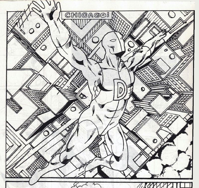
Pérez-inspired art of mine from my high school days.
Pérez—along with John Byrne and Frank Miller—was a huge influence on my own comics work at the time. I studied Pérez’ artwork, read his interviews when I could find them, and savored the fact that he was a New York City kid like me. In high school, I drew my own superhero comics, and you can clearly see Pérez’ influences in my work of the time. (In fact, I aspired to one day draw The Teen Titans when Pérez retired!) Without his example, I would never have drawn this crazy one-point perspective cityscape in my high school comic, Blade. There are so many other examples from my comics and sketchbooks of the time of me emulating Pérez’ style—someday I’ll dig them up and display them here…
As the years went by and I went to college, still dreaming of becoming a superhero artist, I continued to follow Pérez obsessively—highlights of his work from that period include the groundbreaking limited series Crisis on Infinite Earths, his landmark work as writer/artist on Wonder Woman, and his memorable stint on The Infinity Gauntlet miniseries. (Recent movies and TV shows like Avengers: Infinity War, Wonder Woman, and Supergirl all featured adaptations of stories on which Pérez worked.)
By the mid-1990s, I was transitioning from drawing superhero comics to what I do now—making comics about real people and real life. I pretty much stopped buying superhero comics, and lost touch with Pérez’ career. I draw a different kind of comics now, but those early influences never really go away, and even nowadays I find myself thinking of his work when I draw a detailed city scene or try to find the most dynamic angle from which to frame a shot.
I never got the chance to properly meet George Pérez, or to let him know how much I loved and had learned from his work. The one time I saw him in person was at a comics convention where we crossed paths. I was already getting published in the “indy comics” world by that time, and felt self-conscious about going up and introducing myself to someone who was now in a “different camp.” Plus, he was already surrounded by admirers. I remember just standing there at the con, watching him interact with his fans and taking in the fact that we were both there at the same time.
I usually make it a policy to send “fan letters” to those who have served as “mentors from afar”—I did so with writers like Roger Zelazny, Roger Angell, and Roger Ebert (all Rogers!), and even baseball announcer Jon Miller. But I’m sad to say I never did with Pérez. The closest I came was a fan letter I wrote to—and had published in!–“Titans Tower” (the Teen Titans letter column) in 1984; I like to think that George read it…
Even though I hadn’t followed Perez’ work in recent years, I was saddened last December to hear of his cancer diagnosis. And I was amazingly touched by the letter he wrote to his colleagues and fans, where he announced that he would not be seeking treatment, and instead would be spending his last few months with his family. It turned out that this superstar artist was a brave, inspiring human being as well.
I’ll end this piece with a message for other aspiring artists: his New York Times obit mentions that when Pérez first started getting published professionally, he really struggled with rendering perspective and anatomy. It’s a testament to how hard he worked that those features later became strengths of his; a lesson that every young artist should take to heart.
Thank you, George, from me and on behalf of all those readers whose lives you enriched through your example and your work.
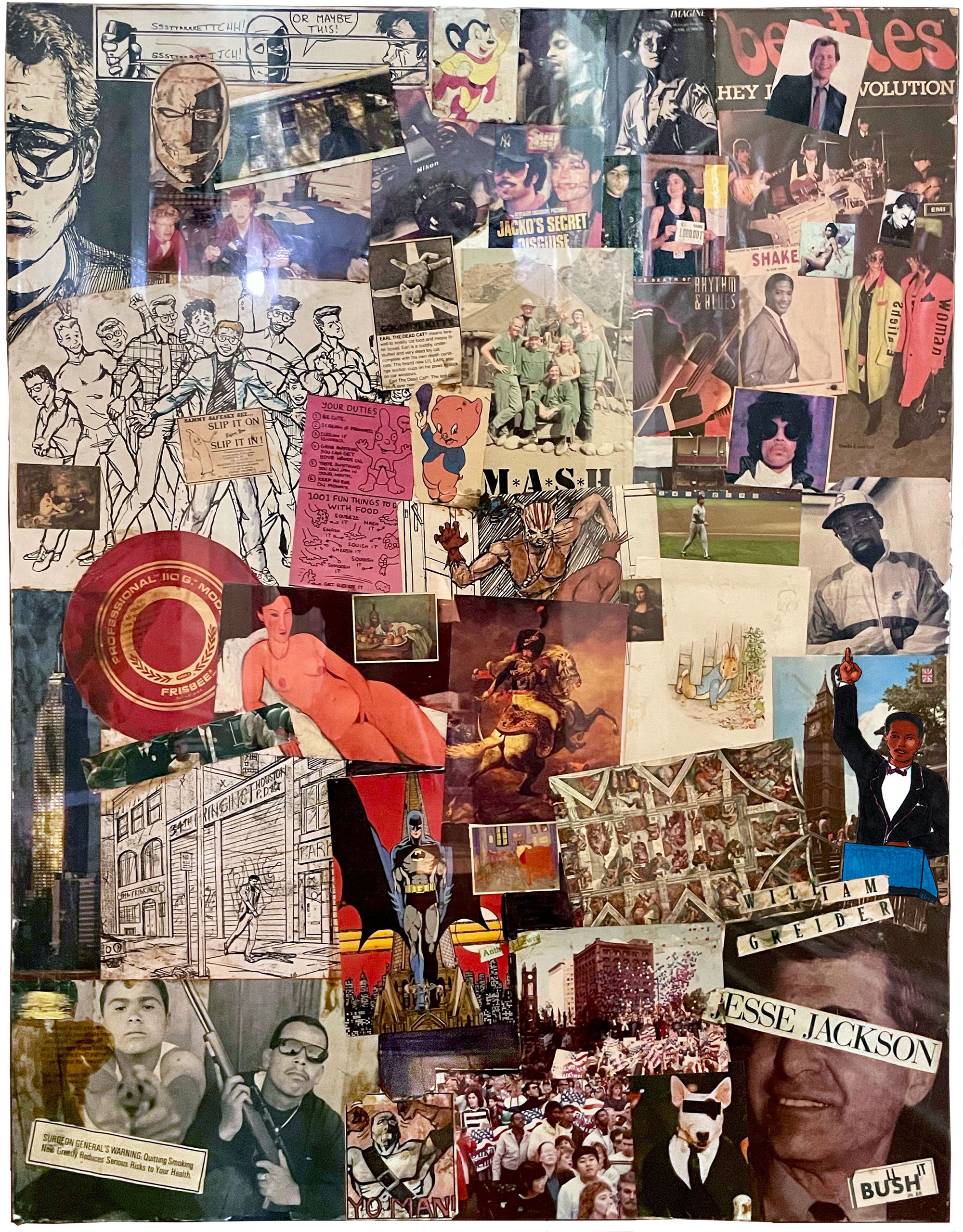
I recently unearthed an old art project of mine from 30+ years in storage, and it’s a fascinating time capsule, both of the late 1980s and of myself from that period.
The object in question is a large 36″ x 48″ collage I painstakingly crafted out of images cut from magazines, postcards, and my own art and photographs. Made during my senior year of college at Oberlin — on the cusp of charting my own path as a so-called adult — I see now that the collage reflects my desires, and fears, about the future.
Why did I make this thing? I believe I got the idea from a birthday present I had received a few years before: a wall calendar that encouraged the owner to decorate the page above each month of the year. For some of the months, I drew something, and for some of them, I made little collages.
It must also be acknowledged that my mother, the artist Martha Rosler, had created a series of feminist collages when I was a child for which she became quite well known. (One of those series, Body Beautiful, or Beauty Knows No Pain, featured images of nude women paired with kitchen appliances!) I actually got to study my own mother’s work in college — I was an art history major with a focus on contemporary art — and while I was there she was invited to visit the school in an official capacity. So, I’m sure my mom’s work was hovering in the back of my mind as well.
Either way, I got in my head to make my own giant-size “Josh Collage.”
At first glance, the collage appears to be a straightforward catalog of my interests/obsessions from that period. My tastes back then were pretty mainstream — they still are — but what I was into, I was REALLY into. (And it’s funny: only in going through this collage in such detail do I truly appreciate how many of my interests and tastes — in music, in art, in politics — were informed by my mother. Thanks, mom — for bringing me into the world and shaping who I am in it.)
So WHY did I make this collage? I believe it was a form of “art therapy” for my insecure 21-year-old self, a way of proclaiming, “Hey, I exist!” And if so, it was a fun coping mechanism, like solving a puzzle, fitting all the images together in various pleasing (and occasionally clever) ways.
That said, it’s interesting to see what I chose to reveal about myself. Surprisingly there are virtually no images from popular movies or TV — no stills from Vietnam films (my obsession at that time), or Taxi Driver or The Godfather, or Woody Allen movies (probably for the best, that last one). No Star Wars. By the same token, there’s virtually nothing from the world of comics — other than my own artwork of the time. Clearly, I was trying to project an idea of myself, and even though I was still an avid reader of mainstream superhero comics at that point, I must have felt self-conscious about advertising it to whoever walked into my room. (This was all before I “discovered” the world of alternative comics — Harvey Pekar, Joe Sacco, et al.)
And, in poring over the collage again, I see that there was actually a larger concept behind it. The collage is roughly divided into sections — about me and my friends, about pop culture, about sports, about art, about city life, and about politics (with a fair amount of overlap). Looking at it now, though, from the vantage point of 30+ years, it seems to actually be a reflection of my anxieties and desires about the next stage of life in the “real world”: the big city, career, relationships… family?
So, here’s the full collage and my thoughts on its various elements. Prepare yourself for a trip back to 1988 — and the contents of my unformed brain…
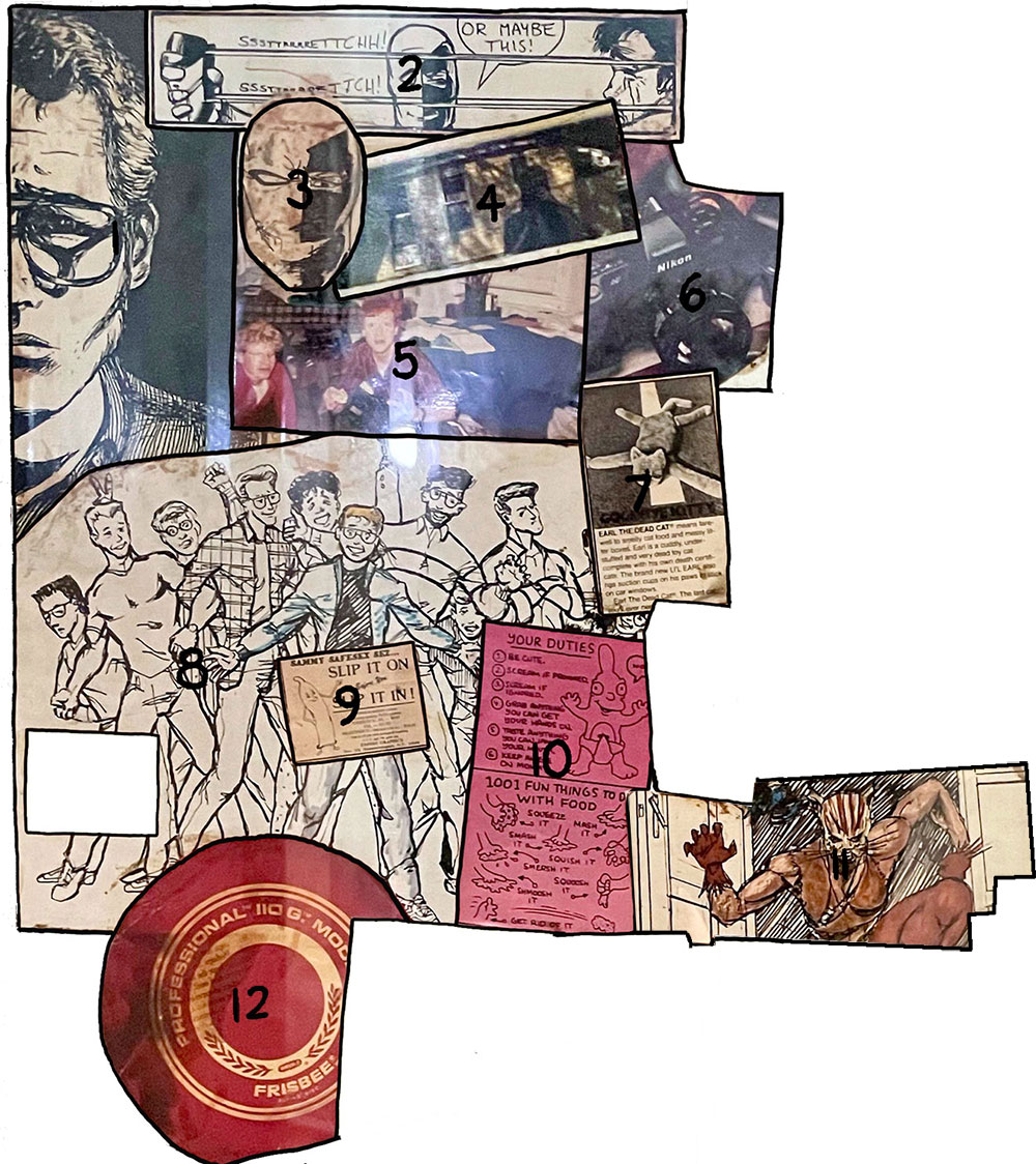
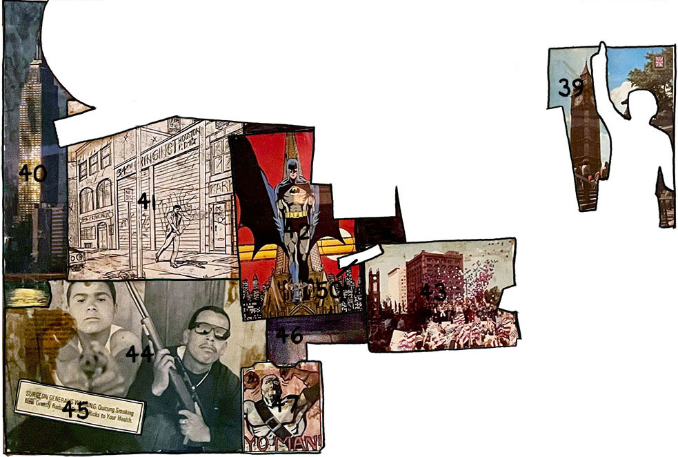
Just in case you don’t instantly recognize these icons of the late 1980s (and in the spirit of the cover of Superman vs. Muhammad Ali), I’ve created a legend that identifies the various images that make up the collage. Let’s go through it, section by section, shall we?
Collage legend with highlighted sections
This first section focuses on 21-year-old me: self-portraits, my own art, my friends, and my sense of humor. In retrospect, it also reveals some preliminary anxiety I might have had about one day becoming a father…
Self-portrait in pen-and-ink — It’s only appropriate that this self-portrait collage should start with a literal self-portrait. Like most teenagers, I spent countless hours staring (unhappily) at my face in a mirror. I drew this “soulful” chiaroscuro self-portrait in 1985, at the start of my freshman year at Oberlin. Is there any significance to the fact that I cut off the left (dark) side of my face from the original portrait? You tell me!
2. Slash vs. Blade — a panel from “Battle,” a jam comic I did with Dean Haspiel also during my freshman year, in the period 1985–1986. (Back then, pre-Internet, we would draw a page of the strip, fold it up and mail it via the post office to the other guy so he could continue the story. I was in Ohio; Dino was back in NYC.) Dean and I have known each other since freshman year of high school; this may have been our first true collaboration, predating our two-man anthology Keyhole, the jam comic Lionel’s Lament, and of course our podcast Scene by Scene with Josh and Dean. Slash was Dean’s character (inspired by Star Wars‘ Boba Fett) and Blade was mine (inspired by the Teen Titans villain Deathstroke the Terminator). In this panel, my character Blade is torturing Dino’s character Slash by stretching his mask to its fullest extent so it will snap back on his face in an extremely painful manner. (Later on in “Battle,” the two characters wind up naked and then have sex with each other.)
3. Blade as drawn by Dean Haspiel — I always loved/envied this drawing of Blade, which I felt looked cooler than any image of my own character that I had ever drawn. (Did I imagine that Dean was a better version of myself? No, that can’t be…)
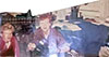
4. Self-portrait reflected in a car window — my mom (also a renowned photographer) had given me a Minolta X-7A 35 millimeter camera, and I loved it. And it presented new opportunities to make “interesting” and “dramatic” self-portraits. Deep!
5. Josh & Jake — a candid shot of me and my college BFF Jake Elsas up to our usual hijinks. I’m not sure where this photo was taken, but I don’t think it was at Oberlin. Possibly one of our family homes on a spring break visit? A few years later, after Jake spent a year in the Soviet Union, he and I were roommates in a couple of too-small NYC apartments. Then, my girlfriend (and future wife) Sari moved in and Jake moved to Portland, Oregon.
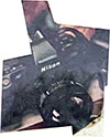
6. Nikon 35mm camera — As mentioned before, I was really in love with my Minolta camera (remember, this was before everyone had a high-quality camera in their pocket). I guess I couldn’t find an image of my exact camera, but this Nikon looked pretty similar.
7. Earl the Dead Cat — “Earl the Dead Cat(TM) means farewell to smelly cat food and messy litter boxes. Earl is a cuddly, under-stuffed and very dead toy cat complete with his own death certificate. The brand new L’IL EARL also has suction cups on his paws to stick on car windows. Earl the Dead Cat(TM). The last cat you’ll ever need.” Apparently, this toy was introduced in 1985, and was featured on The Tonight Show and Weekly World News. A typical example of the “ironic” humor from that period. True, I was never much of a cat fancier, but this seems to clearly reveal anxieties I may have had about taking care of a real living thing…
8. Residents of Dascomb second-floor men’s wing — my first two years at Oberlin, I had the weird fortune of living in the same dorm room (with a different roommate each year) on the second floor of Dascomb Hall. Freshman year I drew a series of pen-and-ink portraits of roommates on that hall; sophomore year I saved time by just drawing a whole group of guys at once. (It was a fun bunch — we all had a lot of good times together despite them being so much younger than me LOL.) This is that illustration, which was probably originally drawn in 1987.
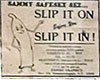
9. Sammy Safesex sez… “Slip It On Before You Slip It In!” Another example of what I found HILARIOUS back then. Anyway, note how Sammy Safesex is strategically placed over my self-portrait’s crotch from no. 8. Safe!
10. Life in Hell cartoon by Matt Groening — two panels from “Childhood is Hell: Chapter 2: How to be a Wily 1-Year-Old,” probably from 1988. I loved the Life in Hell strip, which ran weekly in alternative papers (and at that point was the closest thing I got to so-called “alternative comics”). Matt Groening, right around this time, was creating The Simpsons, an animated show that changed American humor forever. But I can’t help but find it significant that I chose and placed this strip, focused on childhood, in the vicinity of the above condom cartoon…
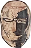
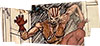
11. The Ocelot — When I was still in high school, I hooked up with an APA (amateur press association) called The Chain that was set up to help wannabes like myself get work in the comics industry. I met writer Gene Phillips through The Chain. He and I collaborated on a number of stories in the late 1980s — none of which ever saw print. This image, drawn in the late summer 1988, was of our superhero The Ocelot, whose powers derived from her allegiance to the Aztec god Itztlacoliuhqui. Following every sexist superhero comics trope of the time, I designed her as a scary/sexy cat-woman. Tsk. Hiss!
12. Frisbee — my dad is the one who first taught me to throw a frisbee, and I’ve loved tossing one around ever since. (There’s nothing more “Oberlin” than a frisbee.) While I was still at Oberlin, a pal from another school commissioned me to draw a T-shirt for his Ultimate team, Dasein.
This next section — the biggest part of the collage — focuses on what were my pop culture interests: music, TV, and sports. (I still find it odd that I left movies out of the collage. Maybe there was just too much for me to condense down to a few images?) Again, many of my musical interests back then reveal what was foremost on my mind (hint: it’s spelled S-E-X)…
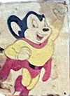
13. Mighty Mouse — As a scrawny youngster, I had really identified with this little cartoon mouse with big super-powers. “Here I come to save the day!”
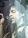
14. Prince — I was a HUGE Prince fan during this period (I still am), buying every single, every 12-inch, every bootleg, and of course every album he released. (To this day, my favorite Prince song is the album version of “Purple Rain.“) I also tracked down every article I could find about Prince in every magazine. Prince’s whole image and much of his music were centered around sexuality and its taboos. This photo looks like it’s from the Controversy period (circa 1981).
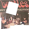
16. The Beatles — my first musical obsession, dating back to when my mom introduced me to their music when I was about ten years old. I still have my vinyl LPs of all their American albums and a few imports. According to Discogs, this image is from the Swedish edition of the “Hey Jude” single, released in 1968 with “Revolution” on the B side. (Since you didn’t ask, I would say my favorite Beatles songs are “A Day In the Life,” “I Am the Walrus,” “I Want You [She’s So Heavy],” and “Ticket to Ride.”)
17. David Letterman — from the get-go I loved Late Night with David Lettermanand Dave’s send-up of the traditional stodgy talk-show format. Late Night‘s combination of absurdist humor, wacky segments, and awkward celebrity interviews — sprinkled with huge heaps of irony — really spoke to me and my ilk. Back then, it seemed like a big deal that a late-night host wore sneakers with his suit!
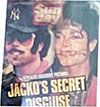
18. Michael Jackson — It wasn’t exactly cool to like Michael Jackson during this period (which is probably why I chose this image), but I really did love his music, beginning with Thriller and continuing on with Bad. (I retroactively came to love Off the Wall as well.) But one couldn’t help but be fascinated with how odd Michael was — little knowing how much more bizarre he would become (tragically). This was from a British tabloid image of him walking the streets in “disguise,” coming off a bit like a skinny Reggie Jackson — no relation — from the 1970s. It looks like Michael put in fake teeth too? Oh, Jacko!
19. Terence Trent D’Arby? — It’s small and blurry, but I’m 85% sure that this photo is of Terence Trent D’Arby, because the cap and leather jacket are extremely similar to what the singer wore in the video to “Sign Your Name Across My Heart.” I’ve also seen a live rendition of “Wishing Well” where he wore a coat even more like the one in this photo. See no. 16 for more on the singer now known as Sananda Maitreya.)
20. Madonna — Is it a shock that I was really into Madonna (oh, and her music too)? This photo was taken in New York City on September 11 (!), 1988, when Madonna ran the 5k event Sport Aid 88: The Race Against Time, which was held simultaneously in cities all over the world. Madonna is shown here holding up her running bib number 1,000,001 (fellow pop stars like Sting, Steve Winwood, and Eurythmics took part in Sport Aid 88 as well). Sponsored by CARE, the race was part of a slew of charity events all inspired by Bob Geldof and Live Aid.
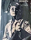
21. Prince — yep, him again, looking quite fetching. This iconic androgynous photo is from the cover of Lovesexy (1988).
22. Terence Trent D’Arby — As soon as I heard the music from his 1987 debut album, Introducing the Hardline According to Terence Trent D’Arby (this image is from the cover), I was in love. And how could I not have been, given how evocative of Prince he was in both his music, his stage presence, and his general vibe? Though D’Arby’s follow-up albums had some good stuff, I wasn’t as into Neither Fish Nor Flesh (1989) or Symphony or Damn (1993), and I lost touch with him after that. I wasn’t even aware that he had changed his name to Sananda Maitreya until I looked him up again recently.
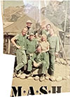
23. The cast of M*A*S*H— My favorite TV show for many, many years, a show that artfully combined humor and pathos (“dramedy”). I identified with the character of Hawkeye Pierce to an extreme degree, and I think my personality was greatly formed by that admiration. (I became equally obsessed with Alan Alda for similar reasons.) A shared love of M*A*S*H in high school and college lead me to a number of lasting friendships. Even though the show had gone off the air some years earlier, while at college I watched daily reruns on a tiny black-and-white TV in my dorm room. This postcard shows the latter group of cast members, including B.J. Hunnicutt, Colonel Potter, and Charles Winchester; but no Radar, Trapper John, Frank Burns, or Colonel Blake.
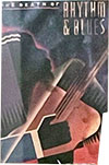
24. The Death of Rhythm & Blues — I never read this book by Nelson George, but I loved the cover art, which to me evoked cubism and art deco. I periodically read George’s column, “Native Son,” which ran in the Village Voice around this time, and I remember his work as being passionate and challenging. I’ve read that in this book, George partially blames Michael Jackson and Prince for bringing R&B to the white mainstream, which helped “kill” it as an art form. And now they’re both dead too — RIP.
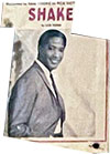
25. Sam Cooke(“Shake”) — After she got me into The Beatles, my mom introduced me to the music of Sam Cooke, and I still get a thrill when I hear his distinctive, heartfelt voice, especially on songs like “A Change is Gonna Come” and “Frankie and Johnny“. My mom has good taste in music! This album, Shake, was released in 1965, one year after Cooke’s untimely death (murder?).
26. Sheila E. and Cat — Two of Prince’s sexy protegés from the Lovesexy era. Sheila E. is an awesome percussionist who was associated with Prince for much of the second half of the 1980s — as well as heading her own band — and Cat Glover (“Woman”) is a dancer, singer, and choreographer who performed with Prince in the late ’80s.
27. Prince — Mr. Rogers Nelson looking cool as can be; this image is from the cover of the “When Doves Cry” single (1984). When I first heard the song, I hated it — I think it scared me. After I saw the Purple Rain film, and came to appreciate Prince for the genius he was, I came to accept “When Doves Cry”… and now I rank it as one of my favorite Prince songs.
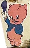
28. Porky Pig — he’s a funny little cartoon pig with a stutter. (He also looks like a baby, which is probably why I glued this pic down next to nos. 8, 9, and 10 of the previous section.) It’s crazy to think that many people today are unfamiliar with Porky, Bugs Bunny, Daffy Duck, and their Looney Tunes friends.
29. Jack Clark — My dad taught me to play baseball when I was about 11 or 12, and I soon became obsessed with the game. Right around that time, I moved to San Francisco, becoming a Giants fan, a team I have stayed loyal to ever since. Jack Clark was the team’s indisputable star, and I was obsessed with him — even after he left the Giants I followed his career with great interest. (I still have pretty much all his baseball cards from every stop along the way.) I took this photo when I went to see him play in person in mid-September 1988, when the Yankees visited Cleveland Municipal Stadium to play the then-Indians. (Clark only played one year for the Yanks.)
As I’ve mentioned, I was an art history major at Oberlin, and this section features reproductions of European fine art, mostly of paintings I had seen in person when I spent a month traveling around France, Italy, Germany, and the Netherlands on a Eurail Pass in the winter of 1987–1988. That trip followed a fall semester I had spent at University College, London. Oberlin’s study abroad program was extremely expensive, so to get to London, I temporarily transferred to Beaver College, which ran a much more affordable study abroad program in the U.K. (I never actually set foot in Beaver College, which was located in Glenside, Pennsylvania.) And, yes, before you make any dumb jokes, Beaver College changed its name in 2001 to Arcadia University (in large part because its name was being filtered out of Internet searches due to the “other” meaning of “beaver” LOL).
31. Le Déjeuner sur l’herbeby Édouard Manet (1862–1863) — I was an art history major at Oberlin, and really came to love French 19th Century painting; this originally infamous image of a luncheon on the grass is one of my favorite works from the period. (I’m sure the fact that it features a nude woman sitting with two fully dressed men has nothing to do with that.) It hangs in the Musée d’Orsay in Paris.
32. Nude with Coral Necklace by Amedeo Modigliani (1917) — My dad had a pair of Modigliani reproductions — of a clothed man and a nude woman (there’s that theme again) — hanging in our apartment for many years, and I studied them intently. This particular Modigliani painting hangs in Oberlin’s very own Allen Memorial Art Museum, which is where I got the postcard for my collage.
33. Still Life with Red Onions by Paul Cézanne (1896–1898) — Cézanne was an artist I had to be taught to appreciate; when I first saw his work I was put off by the angularity of his work. When I later studied him in art history class (thank you, Pat Mathews!), I came to love Cézanne: the vibratory tension, the geometry of forms, his beautiful understanding of color — and that brushstroke! This painting also hangs in the Musée d’Orsay.
34. The Charging Chasseur by Théodore Géricault (1812) — Géricault is another favorite artist of mine. When I first visited England and France, as a high school teenager, my mother was dragging me through the Louvre Museum when I caught sight of Géricault’s epic history paintingThe Raft of the Medusa (1818–1819). According to my mom, I audibly gasped, and stood there for ten minutes just taking it all in. That may have been the moment that led to me eventually majoring in art history. The Charging Chasseur also hangs in the Louvre, which is where I got the postcard.
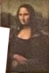
35. The Mona Lisa by Leonardo da Vinci (1503–1506) — as beautiful and mysterious as everyone says. Also hangs in the Louvre.
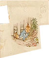
36. Peter Slips Under the Fence by Beatrix Potter (c. 1902) — my mom was a huge fan of Beatrix Potter and Peter Rabbit, and she read me the stories when I was kid, pointing out how beautiful Potter’s illustrations were. I grew to love them as well; I picked up this postcard when I was studying in England.
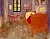
37. Bedroom in Arles (3rd version) by Vincent Van Gogh (1889) — What’s there to say about Van Gogh‘s work that hasn’t already been said by people way more articulate than me? This painting also hangs in the Musée d’Orsay.
38. Sistine Chapel ceiling by Michelangelo (1508–1512) — I got to visit the Vatican during my 1987-1988 Eurail adventure, an experience I will never forget. Being in the actual Sistine Chapel, staring up at the ceiling Michelangelo painted was as close to a religious experience as I’ve ever had. I bought this postcard in the Vatican gift shop.
This section focuses on city life — featuring monuments, crowds, deserted streets, and images of implied violence. Living through the 1980s in New York felt like an achievement, and though I wore that experience like a badge of honor, I was clearly a bit apprehensive about my imminent return to the Big Apple! But I think that after spending the better part of four years in the quiet corn fields of Ohio, I felt the need to reclaim my urban origins.
39. Big Ben in London — The “city section” is bookended by two towers; this famous clock being one of them. My semester in London was foundational for me. I made some good friends, I had a lot of adventures, and I learned a lot — about history, art, and myself. I also spent a lot of time involved in an ill-advised long-distance love triangle, which entailed various periods of panicked phone calls and letters back to the U.S. Oy!
40. Empire State Building — I’ve long had an appreciation for the Empire State Building, which to me always represented the essence of New York City. Looking back, it’s probably a good thing I didn’t have the same affinity for the Twin Towers. *Sigh*
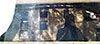
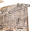
41. Penciled Panel from The Ocelot — this panel from The Ocelot #2 ostensibly takes place in Houston, Texas, but I didn’t have much photo reference for Houston, so I drew my version of a neglected NYC street instead. This page was penciled in August 1988; I finally finished the 8-page story in February of 1989 (probably working on the bulk of it during Oberlin’s Winter Term).
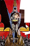
42. Batmanby George Pérez — this is the only example of professional comics in this whole collage, and I couldn’t resist adding an image by one of my original artistic heroes, George Pérez. (Batman stands here atop a Gotham building; Gotham was a comics analog for New York City.) My early attempts at superhero comics were greatly influenced by Pérez and John Byrne. Pérez recently announced that he has inoperable cancer; his last wish is to share his final months with his family, friends, and fans. What a brave and generous spirit.
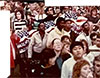
43. Cleveland, Ohio (Michael Dukakisrally) — In September of 1988, I went with a busload of Oberlin students to nearby Cleveland for a Dukakis presidential rally, which is where I took this photo. See nos. 52–55.
44. V13 Gang Members — Despite being a typical Oberlin peacenik, I was (not so) secretly obsessed with images of guns and portrayals of gun violence. The photo, by Merrick Morton, of a baby-faced Venice 13 gang member pointing his gun right at the camera, was irresistible. It accompanied Mike Sager‘s Rolling Stone article, “Death in Venice: The Effect of Crack on Gangs in Venice, California,” (September 22, 1988), which helped open my eyes to the “hardness” of life in American cities other than New York.
45. Surgeon General’s Warning: “Quitting smoking now greatly reduces serious risks to your health” — I was really anti-smoking! I didn’t even like my friends to smoke around me (which is probably why I didn’t have any friends who were poets or intellectuals). Smoking is certainly not confined to urbanites, but back then the image of cigarettes and tough city streets really went together.
46. Sidewalk? — Hard to tell, but this looks like one of my own photographs, maybe a bird’s eye view of city sidewalks, shot out of a window from the second or third floor.
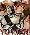
47. Blade from Slash vs. Blade — “Yo, man!” Blade is very upset with Slash because in the previous episode of “Battle,” Slash cut him in half. From what I recall, this scene took place in the city where Slash and Blade were having their battle. (It also probably just fit really well in that particular spot of the collage.)
The final section of the collage features politics and the world around me in 1988. A big focus is the 1988 election for U.S. President (already alluded to in no. 43), which pitted Democrat Michael Dukakis against George H. W. Bush. Spoiler: Bush won. By a lot. It was a depressing time.
48. Unknown Civil Rights Pioneer — The best I can tell, this is a photo from the Civil Rights era, of a lone Black woman escorted by FBI agents and flanked by National Guard soldiers — possibly bravely desegregating a Southern school? Like many college students during this time, I felt very engaged with the anti-Apartheid movement during this period, so the connections between what was then going on in South Africa and the American South during the 1950s were very clear. My guess is that this photo was from a Rolling Stone article about the Civil Rights era. If anyone can identify the woman in the image, I would be most grateful.
49. Sean Tucker — Sean was on my hall in Dascomb during my freshman year, and this image is from the drawings I did of various sets of roommates. He had this inherent gravitas, and this great deep voice, and it always seemed to us that he was destined to become a politician, which is why I drew him speechifying at a podium! Sean was from Cleveland and I went to visit his family once. I also once flew with him and another Oberlin couple in a tiny 4-seater prop plane; they flew the plane to an island on Lake Erie, we ate dinner at a restaurant and then flew back to a local airfield outside of Oberlin. Sean and I went back to our respective cities after college, and we fell out of touch. I don’t know if he ended up pursuing public service.
50. Anthony Lewis — My mom got me a subscription to the New York Timeswhile I was at college, and I actually read it — well, at least the sports pages and the op-ed page. Lewis was one of my favorite columnists — his At Home Abroad column always helped me see the alternative point of view during that period of conservative Reaganism.
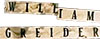
51. William Greider — I was an avid reader of Rolling Stonemagazine during this period, and I loved Greider‘s columns. He wrote powerfully about finance and income inequality in ways I could actually understand. (I had never taken an economics class.)
52. Jesse Jackson — Jackson’s name artfully placed over the eyes of the eventual Democratic presidential nominee Michael Dukakis (see 53). It’s hard to overstate now how exciting was Jackson’s run for the Democratic nomination in the spring of 1988. A civil rights leader who had worked with Martin Luther King Jr., Jesse Jackson was leader of the National Rainbow Coalition, and an inspiring public speaker. At that time, 20 years before Obama’s election, it was so thrilling to imagine the possibility of a Black president. By the time Obama won in 2008, it felt like most people had forgotten how far Jackson got in ’88 — winning 13 state primaries and caucuses, and accumulating over 1,000 delegates to the convention. I voted for him in the primaries and always thought he would’ve been a far better candidate than was Dukakis. After college, I applied for a job with the Rainbow Coalition, though I never heard back from them 🙁
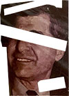
53. Michael Dukakis — I always think of that video of him riding around in a tank. Meant to make him look tough and “presidential,” it instead made him look like a silly little kid.
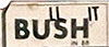
54. BU ll SH itin 88— get it? Summarized my thoughts on the guy who beat Dukakis — in large part due to Lee Atwater’s infamous “Willie Horton” strategy.
55. Oberlin students at the Dukakis rally, Cleveland, Ohio — I clambered up a lamppost or a stanchion to take this shot of a bunch of Obies in the crowd.
56. Spuds MacKenzie — the cute bull terrier from those Bud Light commercials. Spuds was attacked by politicians because he (actually she) supposedly made beer seem attractive to kids. Big industries like beer and tobacco would never stoop so low as to target underage consumers, right, Joe Camel?
Phew! So there you have it: thanks for taking that trip back in time with me.
The collage itself, once I finished it, was obviously very important to me, because I ended up framing it for wall display. I think I actually did hang it on the wall of my first New York City apartment, but by the time I moved in with Sari, barely a year and a half after graduation, it had been put away, never to be displayed again. Like I said, a time capsule.
And you know — I shouldn’t have been so anxious about the future… Life since college has been pretty good: I’ve discovered my calling as a nonfiction cartoonist, had the opportunity to travel widely (pre-pandemic), and have gotten to share my knowledge with later generations. And best of all, I’ve been able to spend 30+ years married to my best friend, and together we have a wonderful daughter.
Makes me wonder what a contemporary version of this collage would look like. Well, that’s a project for another day. (And then I can revisit that collage when I’m in my 80s and analyze it to death as well!)
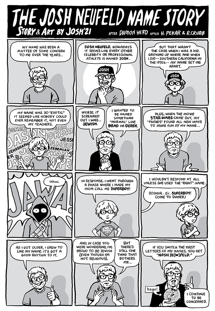
There’s a funny story in today’s New York Times about a battle for supremacy that took place on Saturday in Lincoln, Nebraska, with a bunch of guys named Josh. It couldn’t be more apropos because I just drew this humorous one-pager on the story of my name. Touching upon my being Jewish, growing up different, Star Wars, Superboy, and so much more, the comic has fun with our current obsession with identity and self-discovery. (By the way, I have only ever run into one guy with my exact name—the Canadian Josh Neufeld is a professor of microbial ecology and a very nice fellow).
For those in the know, “The Josh Neufeld Name Story” is also an homage to a story by Harvey Pekar, illustrated by R. Crumb, which first appeared in American Splendor #2 (1977). (As I’m sure you know, I was an artist for Pekar on American Splendor for 15 years.) (The best online link to the original story I could find was this mashup of the comic and Dan Castellaneta’s monologue of it from the American Splendor play produced in 1990. [starts at 1:13].)
Furthermore, my piece is not the first comics reference to “The Harvey Pekar Name Story”—Damon Herd did an homage to the Pekar/Crumb piece back in 2013. And of course the story was dramatized in the American Splendor movie… But I like to think my piece puts a different spin on it.
Anyway, I often use the Pekar comic and a set of prompts I created as part of a workshop where I have students draw their own “name story.” Whether they’re high school art students or people who may have never drawn a comic in their lives before, the results are always fascinating. They help the students get into the “comics space” and enable me to learn a little about each participant.
But it always bothered me that—until now—I had never done my own name story. It’s one of the first autobio comics I’ve drawn in a while, and I enjoyed the experience—hearkening back to those halcyon Keyhole days! (Talking about Keyhole, and my long-time collaborator Dean Haspiel, he and I talk about “The Harvey Pekar Name Story” quite a bit in episode 28 of our podcast Scene by Scene with Josh & Dean…)
On a separate note, because I’m fascinated by the emergence of the NFT (or non-fungible token), I am announcing that I am auctioning off the hi-rez NFT of this comic! It seems appropriate that a piece like this—which I created entirely digitally—would become an NFT, which after all helps artists in this age of endless digital copies to benefit from their work. Plus, the comic is a double-layered reference to a previous original story, which somehow also seems appropriate.
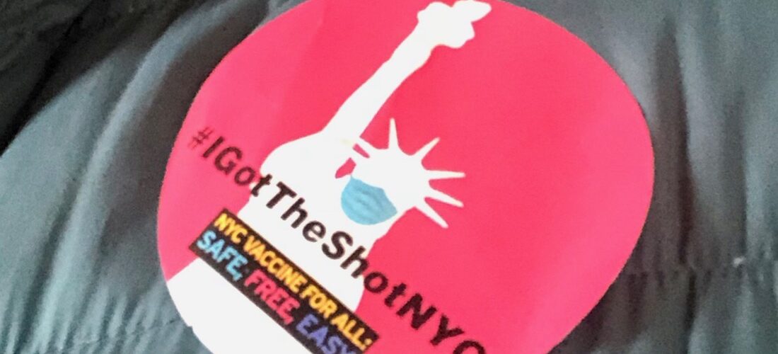
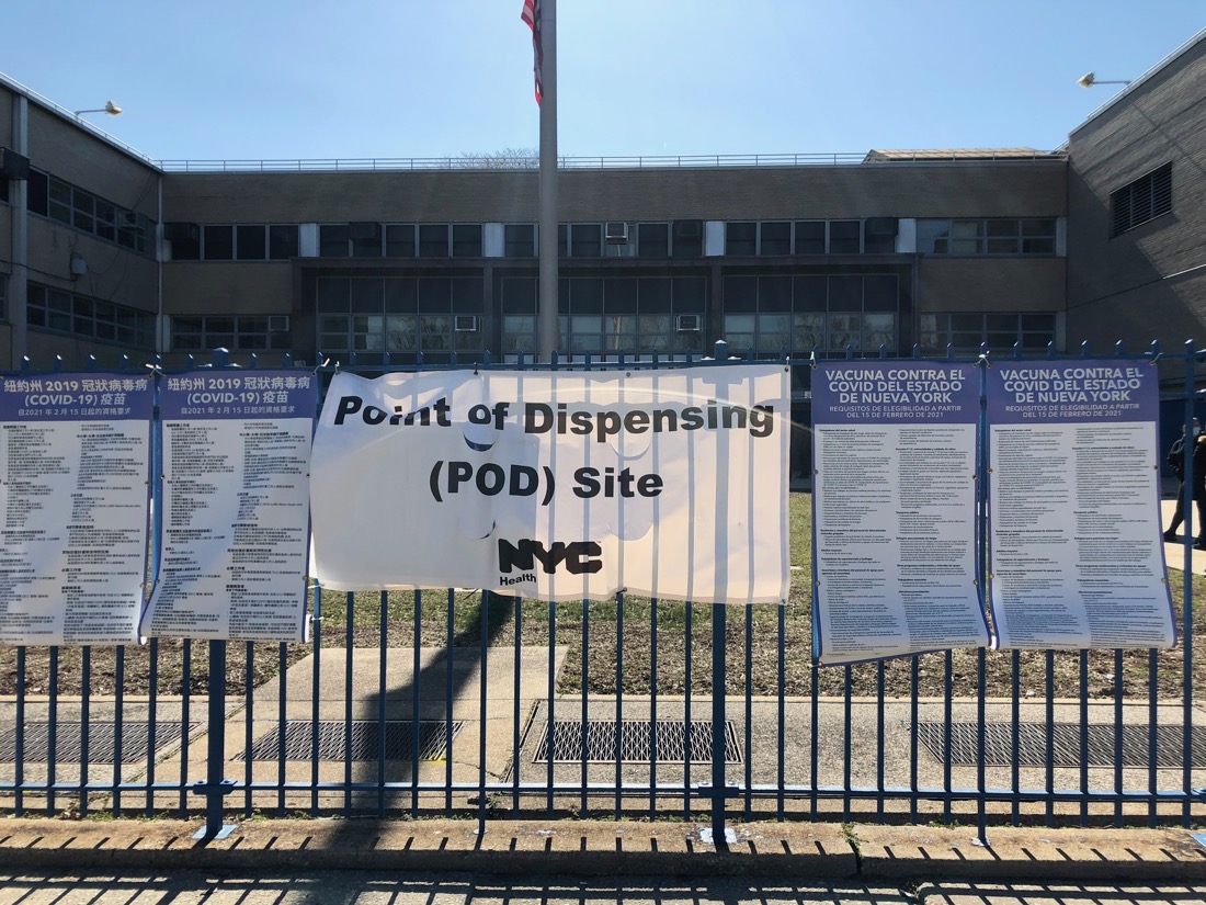
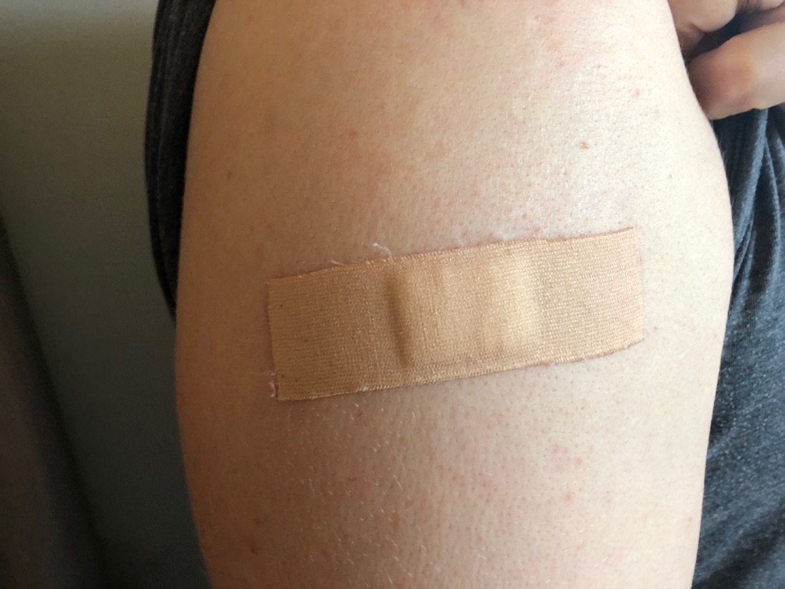
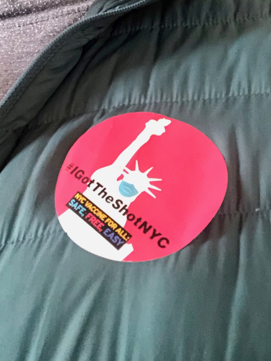
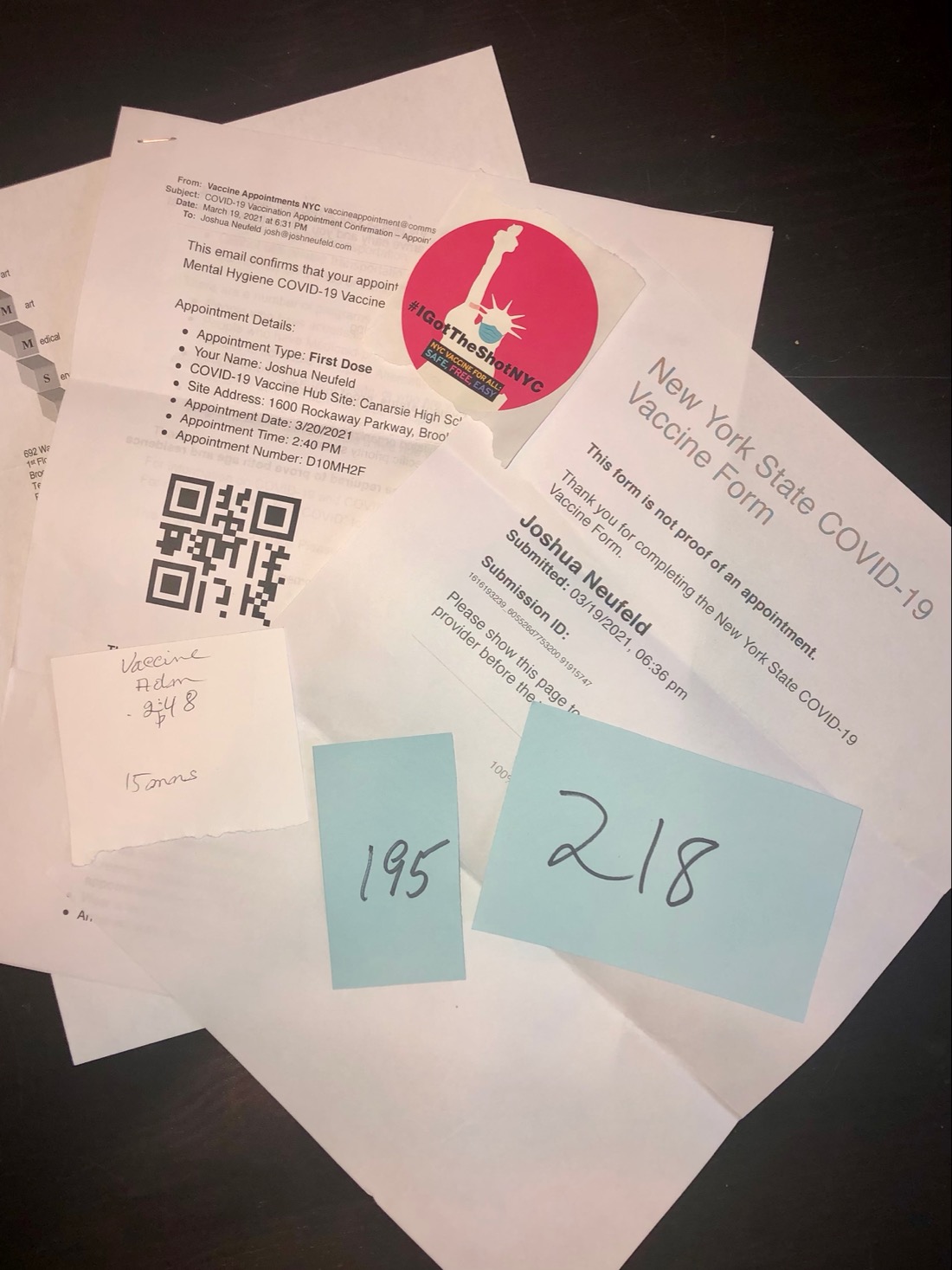
I got my second COVID-19 vaccine shot this weekend, and I am feeling so grateful: to our scientists to and to all the volunteers and workers at the Carnegie High School vaccine site.
I got my (Moderna) vaccine through the New York City Dept. of Health and Mental Hygiene, which is why I had to schlep out to Canarsie on two spring Saturdays four weeks apart, but in the end, I was happy to do it that way rather than through some fancy hospital.
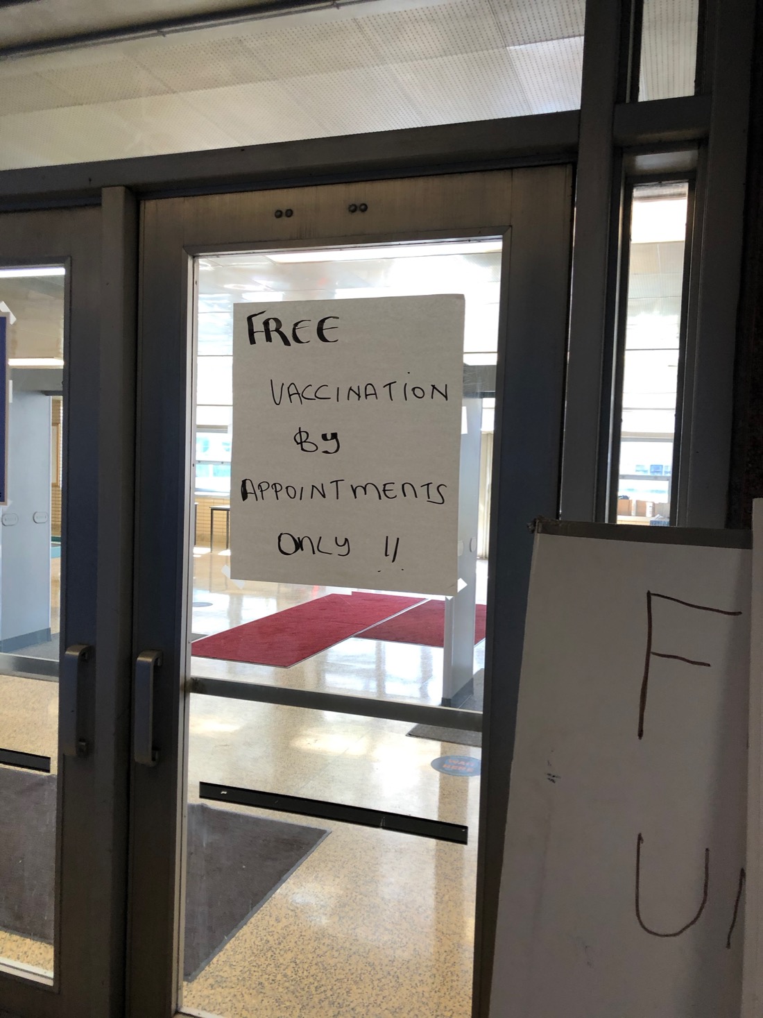
As you can see, there was nothing fancy about the experience—from the already weatherbeaten signage to the handwritten tickets to the institutional atmosphere of the old high school. But I felt safe and well-cared-for all the way through. Most of all, after this year of fragmentation and isolation, I felt like I was part of something. I was just another New Yorker getting their vaccine, one of the many hundreds (thousands?) of people of every “race, color, or creed” going through the system that day. If this is what my tax dollars go to, then I couldn’t be more happy to contribute.
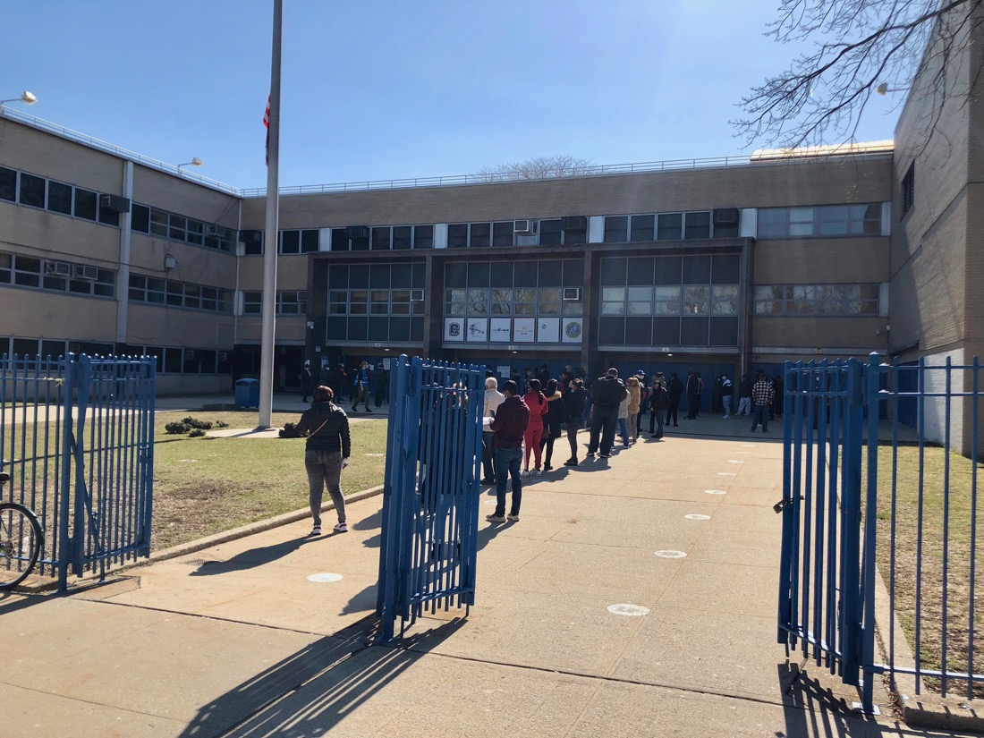
Both times when I showed up, there was hardly any line, and I was quickly ushered into what would have been the school’s lobby. Every 30 feet or so there was a volunteer in a red or yellow vest—almost all of them African-American women—to shepherd me on my way. After a few moments of waiting, I was told to show my documentation to a person at a desk. They checked my ID and scanned my appointment QR code (they did have digital tablets for that part), and I was given the go-ahead to get the shot.
From there it was a short walk to the school cafeteria, where they were administering the vaccine. There were maybe 30 tables set up in the large room, with a vaccination station on each end; by my count, there were about 60 people getting the shot at any one time. I sat down at my allotted spot, the nurse checked my credentials once again, and then it was time for the poke. The woman who gave me the shot the second time told me that it was the same exact dosage for both shots—0.5 ml. I’m not particularly squeamish about needles, so I watched her give me the shot in the shoulder. It was a long needle, but it was also very thin, and I really didn’t feel much at all.
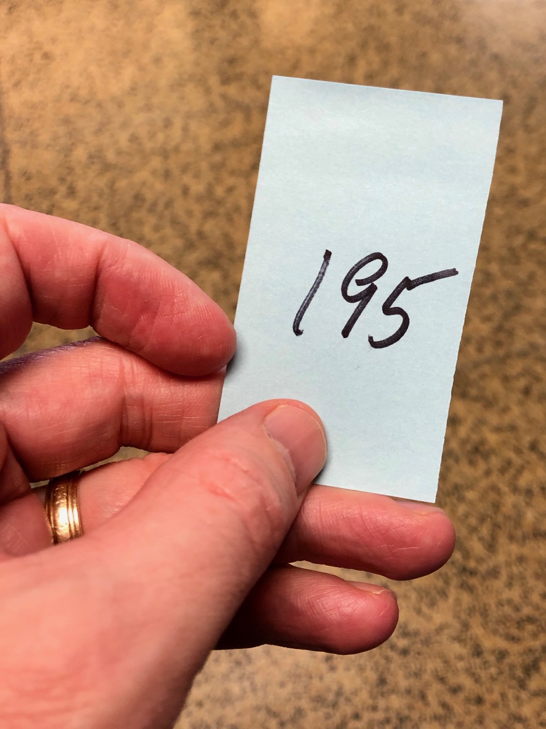
Then it was on to the school auditorium, where I was given another number and told to wait 30 minutes—to make sure I didn’t have an adverse reaction to the vaccine. The first time around, once my 30 minutes was up, I was called up to a table at the front of the stage to schedule my next appointment. This time around, after my second shot, I was able to leave after 15 minutes. The whole thing—from intake to exit—took less than 30 minutes!
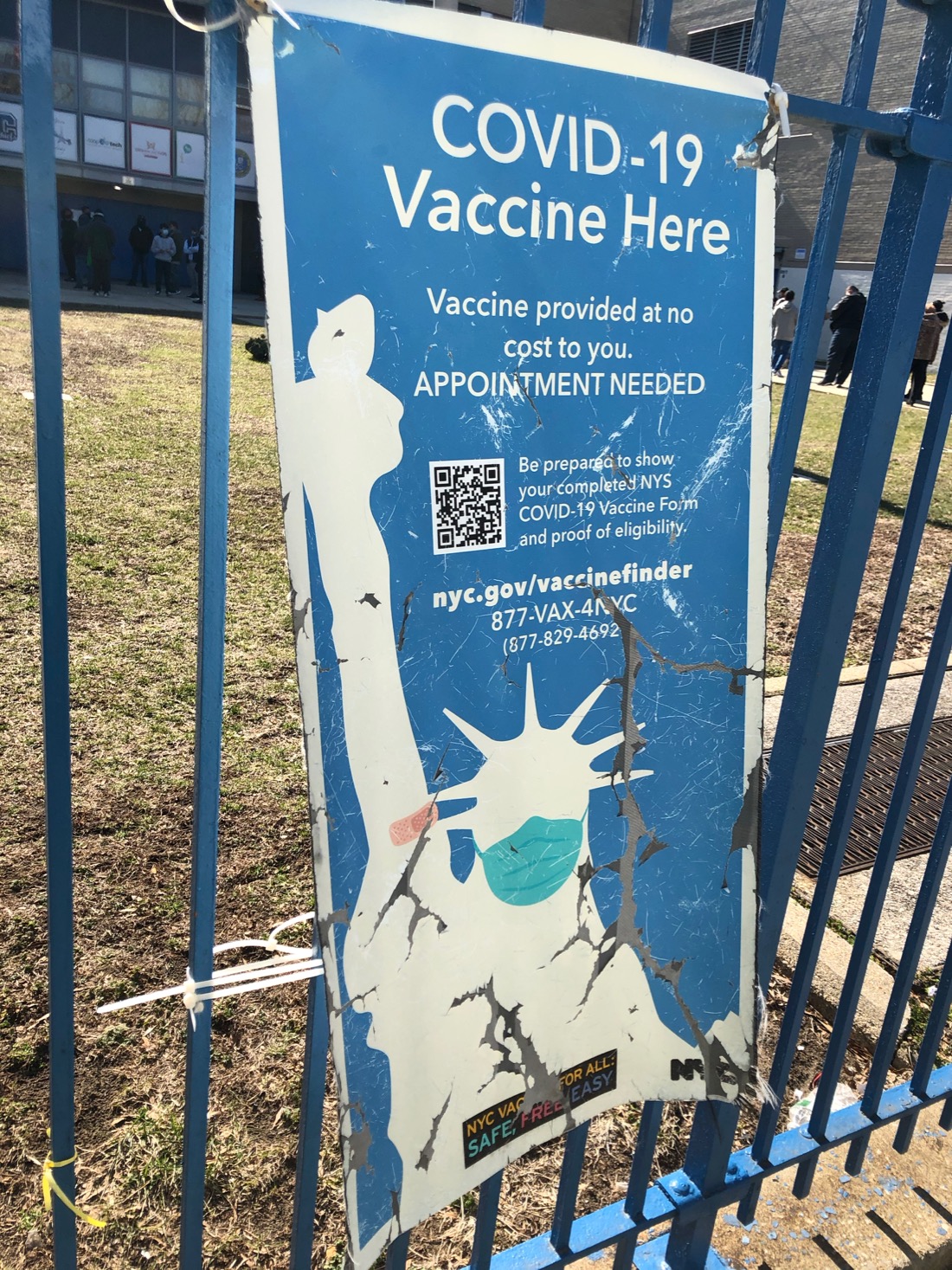
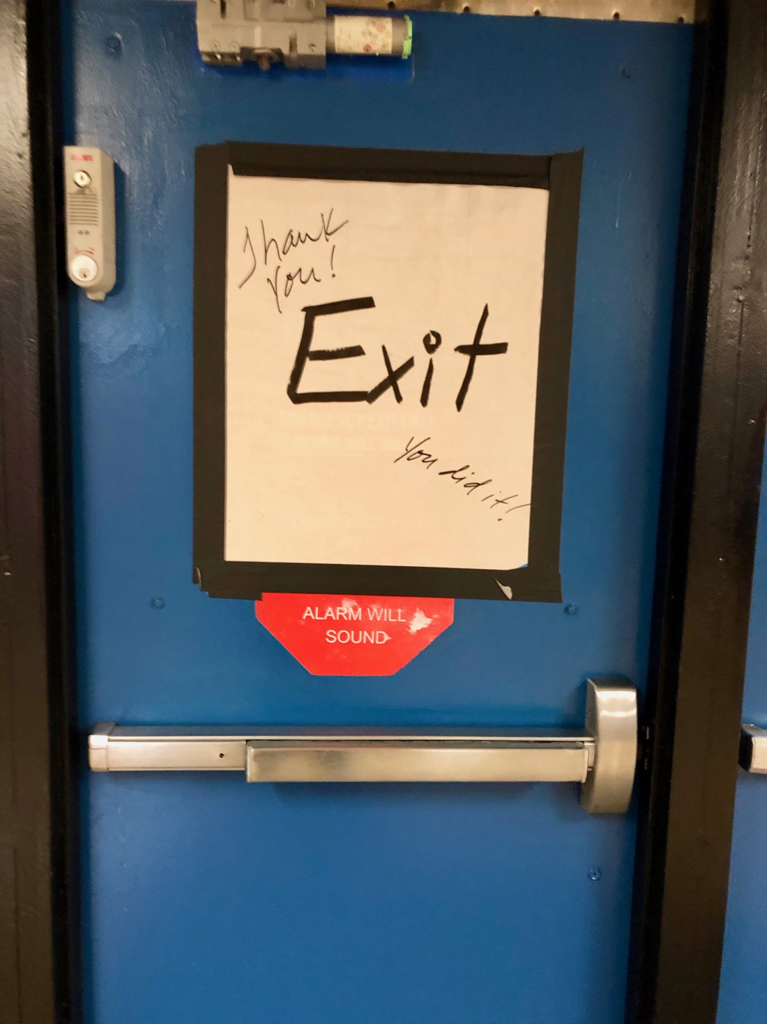
I loved seeing this handmade sign as I headed out the door back into school’s sunlit courtyard:
There was something so inspiring about the humble, makeshift nature of the whole experience. It made me think of those photos from the “old days” of the distribution of vaccines against polio and smallpox. I was struck throughout the whole process by how cheerful everyone was. I like to think it was because they were also inspired by this feeling that we’re all in this together, of our community working together to bring something close to normalcy back to our lives.
My mother lives alone, in another neighborhood in Brooklyn. Now that we’ve both been vaccinated, I can visit her and give her a hug—the first hug she’ll have had in over a year. Thinking of moments like that is what we’re all grateful for.
Apparently, the woman I captured on video the other night (from the George Floyd murder protest), throwing what I thought was a glass bottle at a stationary police van, actually threw a Molotov cocktail. (If you watch the video you can see that the bottle as it flies through the air is faintly glowing.) At the time, I had no idea that’s what happened, even though I was standing very close nearby! (Although you can see from the reaction of those even closer than me, that many people did see what the object was.)
As you can see in the video — which I shot at approximately 10:40 pm on the corner of Eastern Parkway and Washington Avenue — the bottle shatters harmlessly on the side of the van. Immediately afterward, the van then reverses on the street and four officers jump out and pursue the woman. They eventually corral her on the steps of the nearby Brooklyn Museum. Subsequent reports have listed her name as Samantha Shader, of Catskill, New York.
Shader was initially charged with four counts of attempted murder of a police officer, attempted arson, assault on an officer, criminal possession of a weapon, and reckless endangerment.
From my perspective, it appears the case against her has been exaggerated by the police. And much of the news reporting on the incident has been shoddy — because much of the information in the reports came from police rather than reporters or eyewitnesses. For instance, multiple outlets initially blamed Shader for a totally separate incident of an unoccupied police van being set on fire in Fort Green, a different neighborhood in Brooklyn. (I live in Prospect Heights.) The oh-so-reliable Washington Times, for instance, writes, “The officers were able to quickly exit the vehicle before it became engulfed in flames.”
From my video, you can clearly see the bottle did not break any of the van’s windows, and the van certainly never caught on fire. (My wife Sari also filmed the incident, from our apartment window, and you can also see from her video that the van is unharmed.)
Other reports on the story I found last night on the web made similar claims, and errors. For instance, The Mount Pleasant Daily Voice wrote that “the four officers inside the van were able to escape as the fire broke out.”
It looks like much the misinformation can be attributed to an NYPD spokesman, Det. Brian Magoolaghan, who told Hudson Valley 360 that “the bottle shattered a window but did not explode on impact, Magoolaghan said. The four officers, who were not injured, were able to get out of the van before the firebomb exploded and van burst into flames, Magoolaghan said.”
In another example of poor reporting, the New York Daily News wrote that “An upstate woman admitted using a Molotov cocktail to set ablaze an NYPD vehicle with four officers inside. . . . At about 1:12 a.m. Saturday, Shader approached a police vehicle near the corner of Eastern Parkway and Washington Ave. and lit up a bottle containing ‘an incendiary chemical.”
So the Daily News apparently got their facts from the police affidavit, which has the time wrong by almost two-and-a-half hours. More importantly, they state that the vehicle was “set ablaze,” which it definitely was not.
To its credit, the Daily News reports that “Two other protesters are suspected of setting fire to a second police vehicle at about 12:57 a.m. Saturday near the 88th Precinct in Clinton Hill.” (Clinton Hill is adjacent to Fort Green, so sometimes the two neighborhoods are confused for each other.)
The New York Post initially wrote that Shader had set the van set ablaze and the four cops had barely escaped with their lives — but they have now changed the story to get closer to the facts (though with no record of their correction).
The N.Y. Post and Gothamist both write that the NYPD announced they were charging Shader with four counts of attempted murder, but apparently now the federal government is taking over the case, charging her with the much less serious crime of “Causing Damage by Fire and Explosives to a Police Vehicle.” I’m not sure if both cases will still proceed, (The Gothamistpiece also gets the time wrong, saying it was at 1:12 AM — I’m assuming they got that from the police affidavit.)
The New York Times reported that “A Molotov cocktail was thrown at an occupied police van at around 1 a.m., Mr. Shea said. . . . While the firebomb Ms. Shader threw shattered a rear window of the van, the officers inside managed to jump out.” The time is wrong, and I still contend that the van’s window was not broken.
I’m not in any way trying to excuse what Shader did, but it appears — big surprise — that the case against her has been exaggerated by the police, and has been amplified by some weak reporting.