
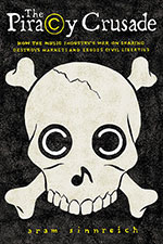
 I illustrated the cover of Aram’s Sinnrich‘s new book, Piracy Crusade: How the Music Industry’s War on Sharing Destroys Markets and Erodes Civil Liberties (University of Massachusetts Press), and I thought I’d take you through the process.
As the title indicates, Sinnreich’s argument is that so-called “piracy” is really the battle between those who believe information (e.g., music) should be shared and the media cartels who want to control that flow. In the spirit of openness, Aram even made a draft of the book available online under a Creative Commons license.
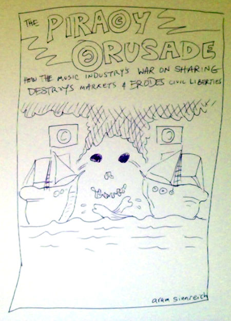
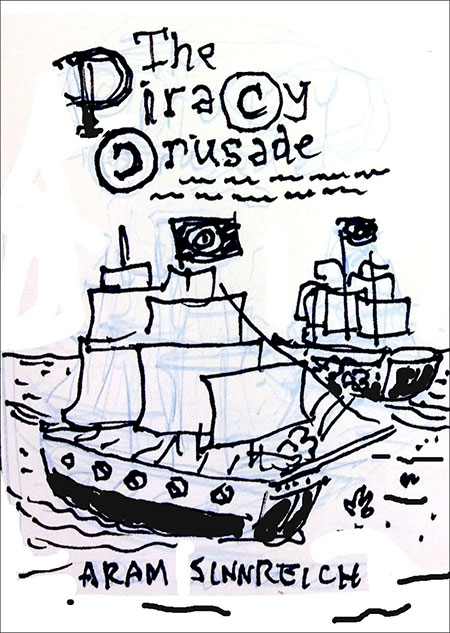
Before I got to work, Aram and I talked a little bit about the cover. (Unlike with my previous book cover, for Alissa Quart’s Republic of Outsiders, Aram was acting as his own “art director” on the project, so I dealt directly with him.) One thing he was keen to include was traditional pirate ship/pirate flag imagery, as well as the symbols for copyright and “copyleft” (essentially, the same concept as the Creative Commons movement). He even drew up a sketch, which featured two tall-masted ships firing on each other, with the cannon balls, smoke, and water splashes forming a “Jolly Roger” death’s head between the ships. His drawing looked like this:
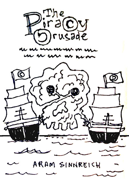
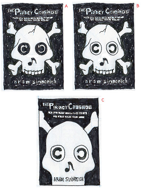
Using Aram’s sketch as a starting point, I drew up four sketches of my own. As I worked, I tried to incorporate as many of the same motifs as his sketch, but I found that trying to use all three image ideas was too much for one cover to bear. There is only so much visual information you can squeeze into one image, and I wanted the cover to be punchy and quickly graspable.
Just for the heck of it, I made a fourth sketch that went in a very different direction. A black cover with a death’s head in white, the skull’s eyes were made up of copyright & copyleft symbols (and the nose was music symbol). I got rid of the ships entirely. This cover was very stark and iconic.

Despite my reservations about the first sketch (the one closest to his original concept), Aram was still leaning toward it, though he agreed it was cluttered. But, in the spirit of openness and crowd wisdom he suggested posting the sketches on his blog and letting the book’s audience weigh in.
I have to admit that at first I wasn’t thrilled about the idea, mostly because when it’s come to these sort of creative decisions in the past I’ve often found the phrase “too many cooks” to be very true. But I couldn’t argue with the point that the whole project was about openness, so I decided to jump into the crowd-sourcing idea and see what resulted.
Well, lo and behold if the consensus on Aram’s blog wasn’t clearly in favor of my last sketch, the “dark horse” death’s head! It so happened that Aram had also shown the first round of sketches to his publisher’s editorial/design team, and they also had liked the last sketch the best. Clearly, just the right number of cooks!
(I have to hand it to Aram that he stayed true to the crowd-sourced results. Even though he personally liked his original concept, he showed no hesitation in signing off on the death’s head cover.)

The client was happy with the pencils. (At this point, the publisher was taking a more active role in giving me feedback.) Their only change had to do with the title: They didn’t love the transposed “C” in “Crusade,” and asked me to just render it normally. They also were slightly concerned that my hand-drawn lettering—particularly in the subtitle and the author credit—wouldn’t be crisp and readable enough. I was sure it would be fine, but we left the option open to typeset those elements if they ended up deciding to do that. While I was finishing the drawing, I also moved the skull’s eyes a little further apart. Here are the inks…

The lettering looked good to them, so at this point the drawing was done!
For the color treatment, I again gave them a few options: the basic black-and-white version (above), one with yellow accents, and a “distressed” look. (I had long ago created a spatter pattern in PhotoShop that I sometimes used to give images that distressed look. I used it for the paperback cover of A.D. and also for the A.D. giclee prints I sell on my website…)

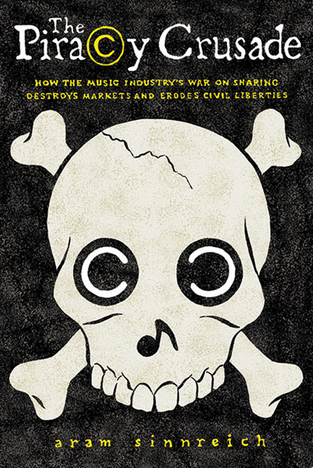
Happily, the consensus was the the “distressed” look gave the image “character and depth.” And, voila, the cover was done!
The book came out last month, and I guess it’s been doing well. Aram recently told me he’s planning on making some Piracy Crusade “swag”—T-shirts and the like. I can’t wait to own some!