I recently unearthed an old art project of mine from 30+ years in storage, and it’s a fascinating time capsule, both of the late 1980s and of myself from that period.
The object in question is a large 36″ x 48″ collage I painstakingly crafted out of images cut from magazines, postcards, and my own art and photographs. Made during my senior year of college at Oberlin — on the cusp of charting my own path as a so-called adult — I see now that the collage reflects my desires, and fears, about the future.
Why did I make this thing? I believe I got the idea from a birthday present I had received a few years before: a wall calendar that encouraged the owner to decorate the page above each month of the year. For some of the months, I drew something, and for some of them, I made little collages.
It must also be acknowledged that my mother, the artist Martha Rosler, had created a series of feminist collages when I was a child for which she became quite well known. (One of those series, Body Beautiful, or Beauty Knows No Pain, featured images of nude women paired with kitchen appliances!) I actually got to study my own mother’s work in college — I was an art history major with a focus on contemporary art — and while I was there she was invited to visit the school in an official capacity. So, I’m sure my mom’s work was hovering in the back of my mind as well.
Either way, I got in my head to make my own giant-size “Josh Collage.”
At first glance, the collage appears to be a straightforward catalog of my interests/obsessions from that period. My tastes back then were pretty mainstream — they still are — but what I was into, I was REALLY into. (And it’s funny: only in going through this collage in such detail do I truly appreciate how many of my interests and tastes — in music, in art, in politics — were informed by my mother. Thanks, mom — for bringing me into the world and shaping who I am in it.)
So WHY did I make this collage? I believe it was a form of “art therapy” for my insecure 21-year-old self, a way of proclaiming, “Hey, I exist!” And if so, it was a fun coping mechanism, like solving a puzzle, fitting all the images together in various pleasing (and occasionally clever) ways.
That said, it’s interesting to see what I chose to reveal about myself. Surprisingly there are virtually no images from popular movies or TV — no stills from Vietnam films (my obsession at that time), or Taxi Driver or The Godfather, or Woody Allen movies (probably for the best, that last one). No Star Wars. By the same token, there’s virtually nothing from the world of comics — other than my own artwork of the time. Clearly, I was trying to project an idea of myself, and even though I was still an avid reader of mainstream superhero comics at that point, I must have felt self-conscious about advertising it to whoever walked into my room. (This was all before I “discovered” the world of alternative comics — Harvey Pekar, Joe Sacco, et al.)
And, in poring over the collage again, I see that there was actually a larger concept behind it. The collage is roughly divided into sections — about me and my friends, about pop culture, about sports, about art, about city life, and about politics (with a fair amount of overlap). Looking at it now, though, from the vantage point of 30+ years, it seems to actually be a reflection of my anxieties and desires about the next stage of life in the “real world”: the big city, career, relationships… family?
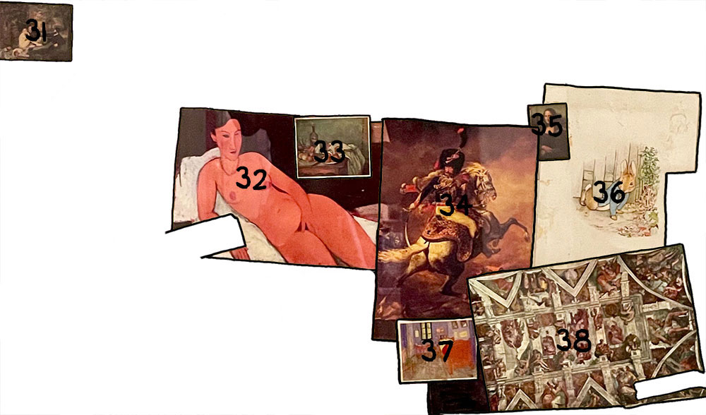
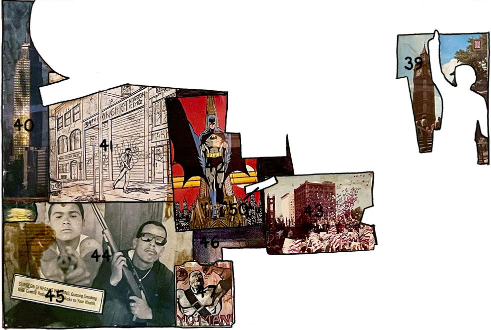
So, here’s the full collage and my thoughts on its various elements. Prepare yourself for a trip back to 1988 — and the contents of my unformed brain…
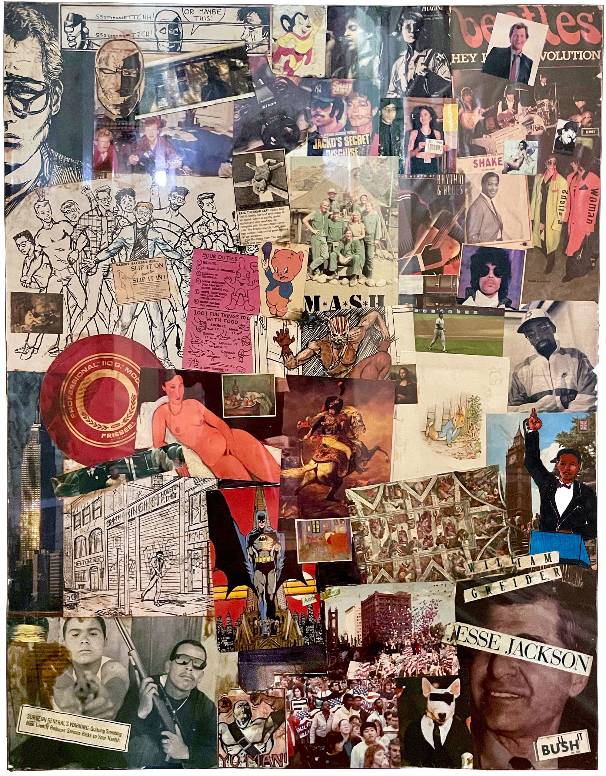
Just in case you don’t instantly recognize these icons of the late 1980s (and in the spirit of the cover of Superman vs. Muhammad Ali), I’ve created a legend that identifies the various images that make up the collage. Let’s go through it, section by section, shall we?
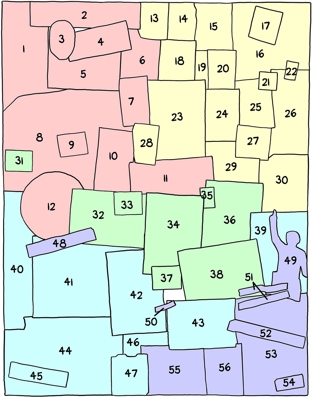
This first section focuses on 21-year-old me: self-portraits, my own art, my friends, and my sense of humor. In retrospect, it also reveals some preliminary anxiety I might have had about one day becoming a father…
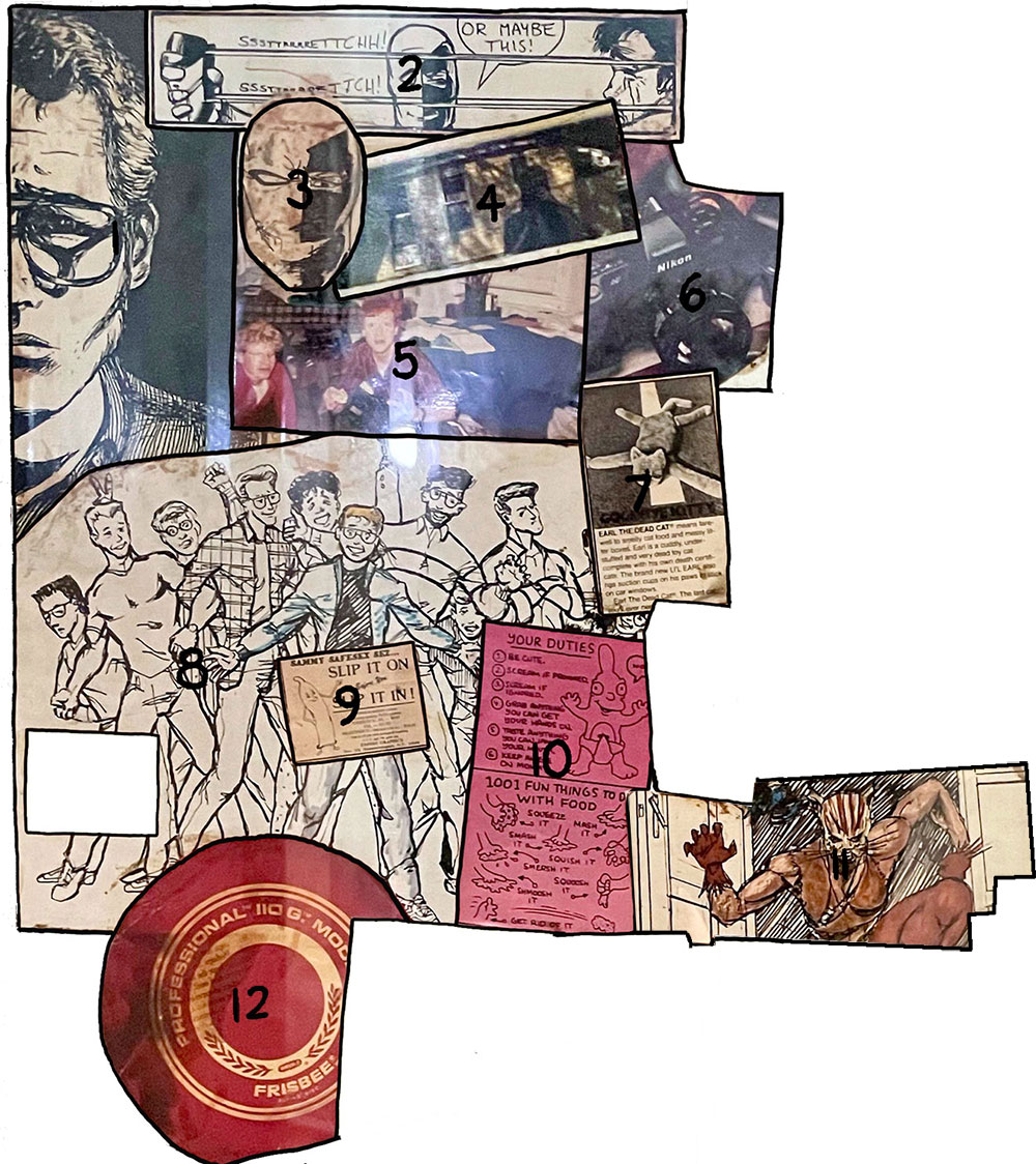
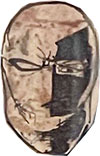
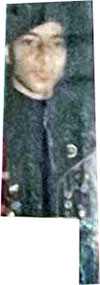
- Self-portrait in pen-and-ink — It’s only appropriate that this self-portrait collage should start with a literal self-portrait. Like most teenagers, I spent countless hours staring (unhappily) at my face in a mirror. I drew this “soulful” chiaroscuro self-portrait in 1985, at the start of my freshman year at Oberlin. Is there any significance to the fact that I cut off the left (dark) side of my face from the original portrait? You tell me!
2. Slash vs. Blade — a panel from “Battle,” a jam comic I did with Dean Haspiel also during my freshman year, in the period 1985–1986. (Back then, pre-Internet, we would draw a page of the strip, fold it up and mail it via the post office to the other guy so he could continue the story. I was in Ohio; Dino was back in NYC.) Dean and I have known each other since freshman year of high school; this may have been our first true collaboration, predating our two-man anthology Keyhole, the jam comic Lionel’s Lament, and of course our podcast Scene by Scene with Josh and Dean. Slash was Dean’s character (inspired by Star Wars‘ Boba Fett) and Blade was mine (inspired by the Teen Titans villain Deathstroke the Terminator). In this panel, my character Blade is torturing Dino’s character Slash by stretching his mask to its fullest extent so it will snap back on his face in an extremely painful manner. (Later on in “Battle,” the two characters wind up naked and then have sex with each other.)
3. Blade as drawn by Dean Haspiel — I always loved/envied this drawing of Blade, which I felt looked cooler than any image of my own character that I had ever drawn. (Did I imagine that Dean was a better version of myself? No, that can’t be…)
4. Self-portrait reflected in a car window — my mom (also a renowned photographer) had given me a Minolta X-7A 35 millimeter camera, and I loved it. And it presented new opportunities to make “interesting” and “dramatic” self-portraits. Deep!
5. Josh & Jake — a candid shot of me and my college BFF Jake Elsas up to our usual hijinks. I’m not sure where this photo was taken, but I don’t think it was at Oberlin. Possibly one of our family homes on a spring break visit? A few years later, after Jake spent a year in the Soviet Union, he and I were roommates in a couple of too-small NYC apartments. Then, my girlfriend (and future wife) Sari moved in and Jake moved to Portland, Oregon.
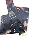
6. Nikon 35mm camera — As mentioned before, I was really in love with my Minolta camera (remember, this was before everyone had a high-quality camera in their pocket). I guess I couldn’t find an image of my exact camera, but this Nikon looked pretty similar.

7. Earl the Dead Cat — “Earl the Dead Cat(TM) means farewell to smelly cat food and messy litter boxes. Earl is a cuddly, under-stuffed and very dead toy cat complete with his own death certificate. The brand new L’IL EARL also has suction cups on his paws to stick on car windows. Earl the Dead Cat(TM). The last cat you’ll ever need.” Apparently, this toy was introduced in 1985, and was featured on The Tonight Show and Weekly World News. A typical example of the “ironic” humor from that period. True, I was never much of a cat fancier, but this seems to clearly reveal anxieties I may have had about taking care of a real living thing…

8. Residents of Dascomb second-floor men’s wing — my first two years at Oberlin, I had the weird fortune of living in the same dorm room (with a different roommate each year) on the second floor of Dascomb Hall. Freshman year I drew a series of pen-and-ink portraits of roommates on that hall; sophomore year I saved time by just drawing a whole group of guys at once. (It was a fun bunch — we all had a lot of good times together despite them being so much younger than me LOL.) This is that illustration, which was probably originally drawn in 1987.
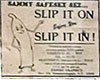
9. Sammy Safesex sez… “Slip It On Before You Slip It In!” Another example of what I found HILARIOUS back then. Anyway, note how Sammy Safesex is strategically placed over my self-portrait’s crotch from no. 8. Safe!

10. Life in Hell cartoon by Matt Groening — two panels from “Childhood is Hell: Chapter 2: How to be a Wily 1-Year-Old,” probably from 1988. I loved the Life in Hell strip, which ran weekly in alternative papers (and at that point was the closest thing I got to so-called “alternative comics”). Matt Groening, right around this time, was creating The Simpsons, an animated show that changed American humor forever. But I can’t help but find it significant that I chose and placed this strip, focused on childhood, in the vicinity of the above condom cartoon…
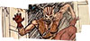
11. The Ocelot — When I was still in high school, I hooked up with an APA (amateur press association) called The Chain that was set up to help wannabes like myself get work in the comics industry. I met writer Gene Phillips through The Chain. He and I collaborated on a number of stories in the late 1980s — none of which ever saw print. This image, drawn in the late summer 1988, was of our superhero The Ocelot, whose powers derived from her allegiance to the Aztec god Itztlacoliuhqui. Following every sexist superhero comics trope of the time, I designed her as a scary/sexy cat-woman. Tsk. Hiss!

12. Frisbee — my dad is the one who first taught me to throw a frisbee, and I’ve loved tossing one around ever since. (There’s nothing more “Oberlin” than a frisbee.) While I was still at Oberlin, a pal from another school commissioned me to draw a T-shirt for his Ultimate team, Dasein.
This next section — the biggest part of the collage — focuses on what were my pop culture interests: music, TV, and sports. (I still find it odd that I left movies out of the collage. Maybe there was just too much for me to condense down to a few images?) Again, many of my musical interests back then reveal what was foremost on my mind (hint: it’s spelled S-E-X)…
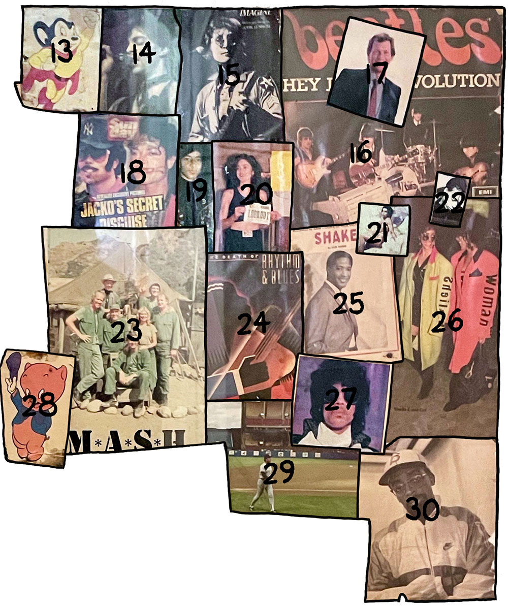
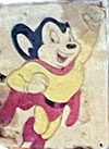
13. Mighty Mouse — As a scrawny youngster, I had really identified with this little cartoon mouse with big super-powers. “Here I come to save the day!”
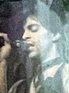
14. Prince — I was a HUGE Prince fan during this period (I still am), buying every single, every 12-inch, every bootleg, and of course every album he released. (To this day, my favorite Prince song is the album version of “Purple Rain.“) I also tracked down every article I could find about Prince in every magazine. Prince’s whole image and much of his music were centered around sexuality and its taboos. This photo looks like it’s from the Controversy period (circa 1981).
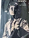
15. John Lennon — Even though Paul McCartney was my favorite Beatle, John came in a close second; and even almost a decade later, I was still mourning Lennon’s 1980 murder. This image is from his famous 1972 concert at Madison Square Garden in New York City.
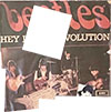
16. The Beatles — my first musical obsession, dating back to when my mom introduced me to their music when I was about ten years old. I still have my vinyl LPs of all their American albums and a few imports. According to Discogs, this image is from the Swedish edition of the “Hey Jude” single, released in 1968 with “Revolution” on the B side. (Since you didn’t ask, I would say my favorite Beatles songs are “A Day In the Life,” “I Am the Walrus,” “I Want You [She’s So Heavy],” and “Ticket to Ride.”)

17. David Letterman — from the get-go I loved Late Night with David Letterman and Dave’s send-up of the traditional stodgy talk-show format. Late Night‘s combination of absurdist humor, wacky segments, and awkward celebrity interviews — sprinkled with huge heaps of irony — really spoke to me and my ilk. Back then, it seemed like a big deal that a late-night host wore sneakers with his suit!
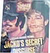
18. Michael Jackson — It wasn’t exactly cool to like Michael Jackson during this period (which is probably why I chose this image), but I really did love his music, beginning with Thriller and continuing on with Bad. (I retroactively came to love Off the Wall as well.) But one couldn’t help but be fascinated with how odd Michael was — little knowing how much more bizarre he would become (tragically). This was from a British tabloid image of him walking the streets in “disguise,” coming off a bit like a skinny Reggie Jackson — no relation — from the 1970s. It looks like Michael put in fake teeth too? Oh, Jacko!
19. Terence Trent D’Arby? — It’s small and blurry, but I’m 85% sure that this photo is of Terence Trent D’Arby, because the cap and leather jacket are extremely similar to what the singer wore in the video to “Sign Your Name Across My Heart.” I’ve also seen a live rendition of “Wishing Well” where he wore a coat even more like the one in this photo. See no. 16 for more on the singer now known as Sananda Maitreya.)
20. Madonna — Is it a shock that I was really into Madonna (oh, and her music too)? This photo was taken in New York City on September 11 (!), 1988, when Madonna ran the 5k event Sport Aid 88: The Race Against Time, which was held simultaneously in cities all over the world. Madonna is shown here holding up her running bib number 1,000,001 (fellow pop stars like Sting, Steve Winwood, and Eurythmics took part in Sport Aid 88 as well). Sponsored by CARE, the race was part of a slew of charity events all inspired by Bob Geldof and Live Aid.

21. Prince — yep, him again, looking quite fetching. This iconic androgynous photo is from the cover of Lovesexy (1988).

22. Terence Trent D’Arby — As soon as I heard the music from his 1987 debut album, Introducing the Hardline According to Terence Trent D’Arby (this image is from the cover), I was in love. And how could I not have been, given how evocative of Prince he was in both his music, his stage presence, and his general vibe? Though D’Arby’s follow-up albums had some good stuff, I wasn’t as into Neither Fish Nor Flesh (1989) or Symphony or Damn (1993), and I lost touch with him after that. I wasn’t even aware that he had changed his name to Sananda Maitreya until I looked him up again recently.
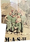
23. The cast of M*A*S*H — My favorite TV show for many, many years, a show that artfully combined humor and pathos (“dramedy”). I identified with the character of Hawkeye Pierce to an extreme degree, and I think my personality was greatly formed by that admiration. (I became equally obsessed with Alan Alda for similar reasons.) A shared love of M*A*S*H in high school and college lead me to a number of lasting friendships. Even though the show had gone off the air some years earlier, while at college I watched daily reruns on a tiny black-and-white TV in my dorm room. This postcard shows the latter group of cast members, including B.J. Hunnicutt, Colonel Potter, and Charles Winchester; but no Radar, Trapper John, Frank Burns, or Colonel Blake.
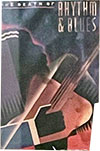
24. The Death of Rhythm & Blues — I never read this book by Nelson George, but I loved the cover art, which to me evoked cubism and art deco. I periodically read George’s column, “Native Son,” which ran in the Village Voice around this time, and I remember his work as being passionate and challenging. I’ve read that in this book, George partially blames Michael Jackson and Prince for bringing R&B to the white mainstream, which helped “kill” it as an art form. And now they’re both dead too — RIP.
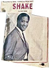
25. Sam Cooke (“Shake”) — After she got me into The Beatles, my mom introduced me to the music of Sam Cooke, and I still get a thrill when I hear his distinctive, heartfelt voice, especially on songs like “A Change is Gonna Come” and “Frankie and Johnny“. My mom has good taste in music! This album, Shake, was released in 1965, one year after Cooke’s untimely death (murder?).

26. Sheila E. and Cat — Two of Prince’s sexy protegés from the Lovesexy era. Sheila E. is an awesome percussionist who was associated with Prince for much of the second half of the 1980s — as well as heading her own band — and Cat Glover (“Woman”) is a dancer, singer, and choreographer who performed with Prince in the late ’80s.

27. Prince — Mr. Rogers Nelson looking cool as can be; this image is from the cover of the “When Doves Cry” single (1984). When I first heard the song, I hated it — I think it scared me. After I saw the Purple Rain film, and came to appreciate Prince for the genius he was, I came to accept “When Doves Cry”… and now I rank it as one of my favorite Prince songs.
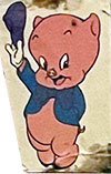
28. Porky Pig — he’s a funny little cartoon pig with a stutter. (He also looks like a baby, which is probably why I glued this pic down next to nos. 8, 9, and 10 of the previous section.) It’s crazy to think that many people today are unfamiliar with Porky, Bugs Bunny, Daffy Duck, and their Looney Tunes friends.
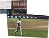
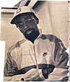
29. Jack Clark — My dad taught me to play baseball when I was about 11 or 12, and I soon became obsessed with the game. Right around that time, I moved to San Francisco, becoming a Giants fan, a team I have stayed loyal to ever since. Jack Clark was the team’s indisputable star, and I was obsessed with him — even after he left the Giants I followed his career with great interest. (I still have pretty much all his baseball cards from every stop along the way.) I took this photo when I went to see him play in person in mid-September 1988, when the Yankees visited Cleveland Municipal Stadium to play the then-Indians. (Clark only played one year for the Yanks.)
30. Spike Lee — I love Spike’s movies, but at this point I mostly knew him from the Nike commercials he — as Mars Blackmon — shot with Michael Jordan! (I don’t even think I had seen She’s Gotta Have It at this point). After seeing Do the Right Thing in the summer of 1989 — still one of my all-time favorite films — I wrote Spike a letter begging to work for him at 40 Acres and a Mule Productions. I got a postcard back — all it said was “Fight the Power! Fight the Power! Fight the Power!“
As I’ve mentioned, I was an art history major at Oberlin, and this section features reproductions of European fine art, mostly of paintings I had seen in person when I spent a month traveling around France, Italy, Germany, and the Netherlands on a Eurail Pass in the winter of 1987–1988. That trip followed a fall semester I had spent at University College, London. Oberlin’s study abroad program was extremely expensive, so to get to London, I temporarily transferred to Beaver College, which ran a much more affordable study abroad program in the U.K. (I never actually set foot in Beaver College, which was located in Glenside, Pennsylvania.) And, yes, before you make any dumb jokes, Beaver College changed its name in 2001 to Arcadia University (in large part because its name was being filtered out of Internet searches due to the “other” meaning of “beaver” LOL).
31. Le Déjeuner sur l’herbe by Édouard Manet (1862–1863) — I was an art history major at Oberlin, and really came to love French 19th Century painting; this originally infamous image of a luncheon on the grass is one of my favorite works from the period. (I’m sure the fact that it features a nude woman sitting with two fully dressed men has nothing to do with that.) It hangs in the Musée d’Orsay in Paris.
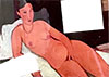
32. Nude with Coral Necklace by Amedeo Modigliani (1917) — My dad had a pair of Modigliani reproductions — of a clothed man and a nude woman (there’s that theme again) — hanging in our apartment for many years, and I studied them intently. This particular Modigliani painting hangs in Oberlin’s very own Allen Memorial Art Museum, which is where I got the postcard for my collage.
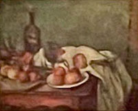
33. Still Life with Red Onions by Paul Cézanne (1896–1898) — Cézanne was an artist I had to be taught to appreciate; when I first saw his work I was put off by the angularity of his work. When I later studied him in art history class (thank you, Pat Mathews!), I came to love Cézanne: the vibratory tension, the geometry of forms, his beautiful understanding of color — and that brushstroke! This painting also hangs in the Musée d’Orsay.
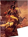
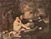
34. The Charging Chasseur by Théodore Géricault (1812) — Géricault is another favorite artist of mine. When I first visited England and France, as a high school teenager, my mother was dragging me through the Louvre Museum when I caught sight of Géricault’s epic history painting The Raft of the Medusa (1818–1819). According to my mom, I audibly gasped, and stood there for ten minutes just taking it all in. That may have been the moment that led to me eventually majoring in art history. The Charging Chasseur also hangs in the Louvre, which is where I got the postcard.
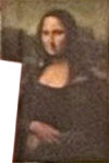
35. The Mona Lisa by Leonardo da Vinci (1503–1506) — as beautiful and mysterious as everyone says. Also hangs in the Louvre.
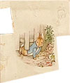
36. Peter Slips Under the Fence by Beatrix Potter (c. 1902) — my mom was a huge fan of Beatrix Potter and Peter Rabbit, and she read me the stories when I was kid, pointing out how beautiful Potter’s illustrations were. I grew to love them as well; I picked up this postcard when I was studying in England.
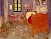
37. Bedroom in Arles (3rd version) by Vincent Van Gogh (1889) — What’s there to say about Van Gogh‘s work that hasn’t already been said by people way more articulate than me? This painting also hangs in the Musée d’Orsay.
38. Sistine Chapel ceiling by Michelangelo (1508–1512) — I got to visit the Vatican during my 1987-1988 Eurail adventure, an experience I will never forget. Being in the actual Sistine Chapel, staring up at the ceiling Michelangelo painted was as close to a religious experience as I’ve ever had. I bought this postcard in the Vatican gift shop.
This section focuses on city life — featuring monuments, crowds, deserted streets, and images of implied violence. Living through the 1980s in New York felt like an achievement, and though I wore that experience like a badge of honor, I was clearly a bit apprehensive about my imminent return to the Big Apple! But I think that after spending the better part of four years in the quiet corn fields of Ohio, I felt the need to reclaim my urban origins.
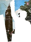
39. Big Ben in London — The “city section” is bookended by two towers; this famous clock being one of them. My semester in London was foundational for me. I made some good friends, I had a lot of adventures, and I learned a lot — about history, art, and myself. I also spent a lot of time involved in an ill-advised long-distance love triangle, which entailed various periods of panicked phone calls and letters back to the U.S. Oy!

40. Empire State Building — I’ve long had an appreciation for the Empire State Building, which to me always represented the essence of New York City. Looking back, it’s probably a good thing I didn’t have the same affinity for the Twin Towers. *Sigh*
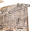
41. Penciled Panel from The Ocelot — this panel from The Ocelot #2 ostensibly takes place in Houston, Texas, but I didn’t have much photo reference for Houston, so I drew my version of a neglected NYC street instead. This page was penciled in August 1988; I finally finished the 8-page story in February of 1989 (probably working on the bulk of it during Oberlin’s Winter Term).
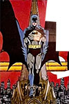
42. Batman by George Pérez — this is the only example of professional comics in this whole collage, and I couldn’t resist adding an image by one of my original artistic heroes, George Pérez. (Batman stands here atop a Gotham building; Gotham was a comics analog for New York City.) My early attempts at superhero comics were greatly influenced by Pérez and John Byrne. Pérez recently announced that he has inoperable cancer; his last wish is to share his final months with his family, friends, and fans. What a brave and generous spirit.

43. Cleveland, Ohio (Michael Dukakis rally) — In September of 1988, I went with a busload of Oberlin students to nearby Cleveland for a Dukakis presidential rally, which is where I took this photo. See nos. 52–55.

44. V13 Gang Members — Despite being a typical Oberlin peacenik, I was (not so) secretly obsessed with images of guns and portrayals of gun violence. The photo, by Merrick Morton, of a baby-faced Venice 13 gang member pointing his gun right at the camera, was irresistible. It accompanied Mike Sager‘s Rolling Stone article, “Death in Venice: The Effect of Crack on Gangs in Venice, California,” (September 22, 1988), which helped open my eyes to the “hardness” of life in American cities other than New York.
45. Surgeon General’s Warning: “Quitting smoking now greatly reduces serious risks to your health” — I was really anti-smoking! I didn’t even like my friends to smoke around me (which is probably why I didn’t have any friends who were poets or intellectuals). Smoking is certainly not confined to urbanites, but back then the image of cigarettes and tough city streets really went together.
46. Sidewalk? — Hard to tell, but this looks like one of my own photographs, maybe a bird’s eye view of city sidewalks, shot out of a window from the second or third floor.
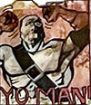
47. Blade from Slash vs. Blade — “Yo, man!” Blade is very upset with Slash because in the previous episode of “Battle,” Slash cut him in half. From what I recall, this scene took place in the city where Slash and Blade were having their battle. (It also probably just fit really well in that particular spot of the collage.)
The final section of the collage features politics and the world around me in 1988. A big focus is the 1988 election for U.S. President (already alluded to in no. 43), which pitted Democrat Michael Dukakis against George H. W. Bush. Spoiler: Bush won. By a lot. It was a depressing time.
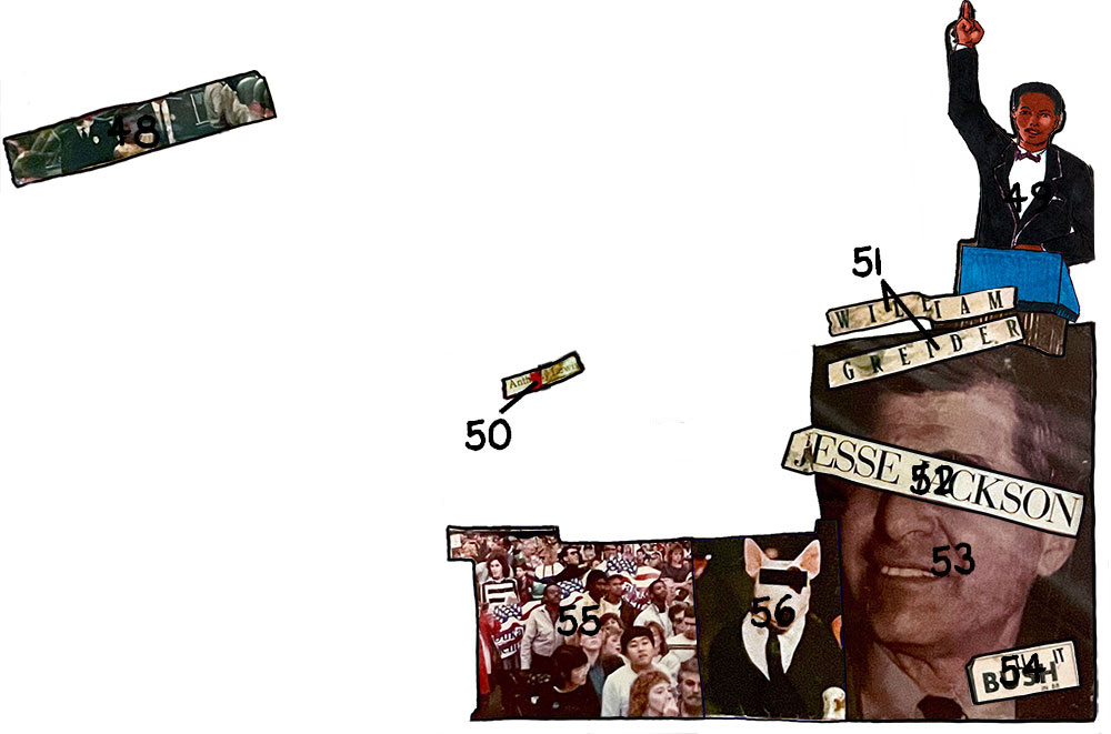
48. Unknown Civil Rights Pioneer — The best I can tell, this is a photo from the Civil Rights era, of a lone Black woman escorted by FBI agents and flanked by National Guard soldiers — possibly bravely desegregating a Southern school? Like many college students during this time, I felt very engaged with the anti-Apartheid movement during this period, so the connections between what was then going on in South Africa and the American South during the 1950s were very clear. My guess is that this photo was from a Rolling Stone article about the Civil Rights era. If anyone can identify the woman in the image, I would be most grateful.
49. Sean Tucker — Sean was on my hall in Dascomb during my freshman year, and this image is from the drawings I did of various sets of roommates. He had this inherent gravitas, and this great deep voice, and it always seemed to us that he was destined to become a politician, which is why I drew him speechifying at a podium! Sean was from Cleveland and I went to visit his family once. I also once flew with him and another Oberlin couple in a tiny 4-seater prop plane; they flew the plane to an island on Lake Erie, we ate dinner at a restaurant and then flew back to a local airfield outside of Oberlin. Sean and I went back to our respective cities after college, and we fell out of touch. I don’t know if he ended up pursuing public service.

50. Anthony Lewis — My mom got me a subscription to the New York Times while I was at college, and I actually read it — well, at least the sports pages and the op-ed page. Lewis was one of my favorite columnists — his At Home Abroad column always helped me see the alternative point of view during that period of conservative Reaganism.
51. William Greider — I was an avid reader of Rolling Stone magazine during this period, and I loved Greider‘s columns. He wrote powerfully about finance and income inequality in ways I could actually understand. (I had never taken an economics class.)
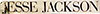
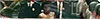
52. Jesse Jackson — Jackson’s name artfully placed over the eyes of the eventual Democratic presidential nominee Michael Dukakis (see 53). It’s hard to overstate now how exciting was Jackson’s run for the Democratic nomination in the spring of 1988. A civil rights leader who had worked with Martin Luther King Jr., Jesse Jackson was leader of the National Rainbow Coalition, and an inspiring public speaker. At that time, 20 years before Obama’s election, it was so thrilling to imagine the possibility of a Black president. By the time Obama won in 2008, it felt like most people had forgotten how far Jackson got in ’88 — winning 13 state primaries and caucuses, and accumulating over 1,000 delegates to the convention. I voted for him in the primaries and always thought he would’ve been a far better candidate than was Dukakis. After college, I applied for a job with the Rainbow Coalition, though I never heard back from them 🙁
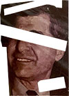
53. Michael Dukakis — I always think of that video of him riding around in a tank. Meant to make him look tough and “presidential,” it instead made him look like a silly little kid.
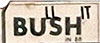
54. BU ll SH it in 88— get it? Summarized my thoughts on the guy who beat Dukakis — in large part due to Lee Atwater’s infamous “Willie Horton” strategy.
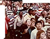
55. Oberlin students at the Dukakis rally, Cleveland, Ohio — I clambered up a lamppost or a stanchion to take this shot of a bunch of Obies in the crowd.
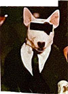
56. Spuds MacKenzie — the cute bull terrier from those Bud Light commercials. Spuds was attacked by politicians because he (actually she) supposedly made beer seem attractive to kids. Big industries like beer and tobacco would never stoop so low as to target underage consumers, right, Joe Camel?
Phew! So there you have it: thanks for taking that trip back in time with me.
The collage itself, once I finished it, was obviously very important to me, because I ended up framing it for wall display. I think I actually did hang it on the wall of my first New York City apartment, but by the time I moved in with Sari, barely a year and a half after graduation, it had been put away, never to be displayed again. Like I said, a time capsule.
And you know — I shouldn’t have been so anxious about the future… Life since college has been pretty good: I’ve discovered my calling as a nonfiction cartoonist, had the opportunity to travel widely (pre-pandemic), and have gotten to share my knowledge with later generations. And best of all, I’ve been able to spend 30+ years married to my best friend, and together we have a wonderful daughter.
Makes me wonder what a contemporary version of this collage would look like. Well, that’s a project for another day. (And then I can revisit that collage when I’m in my 80s and analyze it to death as well!)


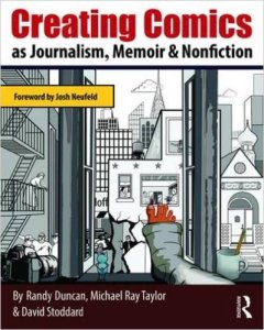 There’s a new book out, by three college professors, called
  Just out this week in