
I’ve written previously about State of Emergency, Sari’s adaptation of both my A.D.: New Orleans After the Deluge and Dave Eggers’ Zeitoun. Part of Scholastic’s On the Record series, the book is aimed at high-school “reluctant readers” (thus the appeal of the graphic novel format). I think Sari did a really great job of adapting and abridging the two books.
For me, it’s a thrill to be paired with Eggers. I really admire Zeitoun, and of course I’m grateful to Dave for his blurbing of A.D. And what makes this project even sweeter for the whole Josh & Sari family is that Scholastic asked me to draw the cover for State of Emergency. I was happy to oblige, and thought you might enjoy seeing how the illustration developed.
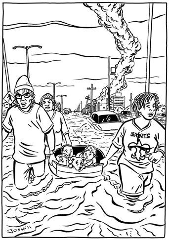
We quickly determined that they were looking for images of post-flooding New Orleans and "people helping people." So the first thing I did was come up with a few sketches:
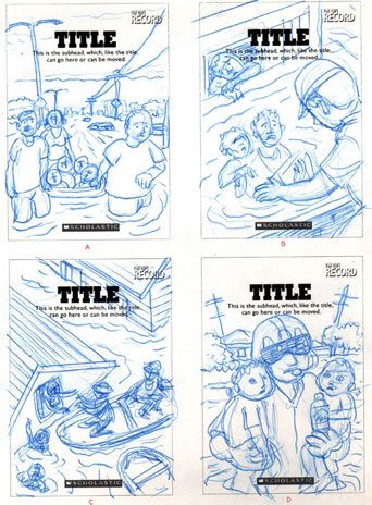
The got back to me fairly quickly with the decision that they liked the first image, of some adults pulling a tub filled with kids through the flooded streets.
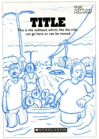
Their only specific note at that point was that I add a dog to the boat (!), and to make sure that at least one of the characters was African-American. (That was a no-brainer for me, for a couple of reasons. One was that the majority of the flooded areas in New Orleans were black neighborhoods, which is just a fact of the storm. The other reason was that I’ve had enough experience working in academic publishing to know there is always concern about issues of diversity and representation of “minorities.” These are things I think about a lot too.)
The next stage was the pencil stage, where I really fleshed out the scene and gave it weight and detail:
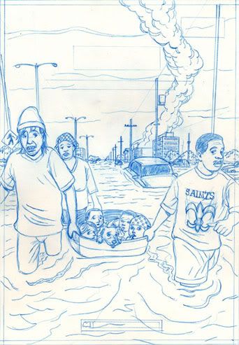
Though generally happy with the pencil sketch, the powers-that-be soon got back to me with a few suggestions and one major change: they wanted to guy on the right to be a woman! They also asked that the guy on the left should be more “manly,” that the woman in the background not seem so depressed, and that there be one fewer kid in the tub. I found these requests to be a bit idiosyncratic but not particularly onerous. Even giving the front guy a sex-change wasn’t that big a deal: a shave, a wig, and a little padding in all the right places, and, voila…
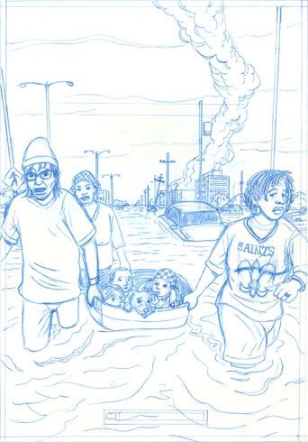
Their only comment about the pencils was that the guy on the left be a little less “intense” (which I happened to agree with), so I proceeded on to inks.…
It’s at this point that I pray the client won’t ask for any significant changes, as I always stress the time to ask for those are in the sketch and pencil phases. Fortunately, they were quite pleased with the drawing and gave me the go-ahead to color the piece for final delivery.
Their direction in terms of color was that it not be quite as limited in palette as A.D. with its three-color treatment; although they were fine with me being otherwise restrained in my color choices, which is my preferred mode. (I’m really not a fan of the heavily PhotoShopped “airbrush” look of most current comics. Way too garish for my tastes.)
My one big question for myself was how I wanted to treat the flood waters. Basically, in A.D., I treated the water as black, as a mysterious, malevolent force that “ate” up the city of New Orleans. But in the context of a four-color treatment, I thought that coloring the water black would make it look too much like oil, which could be seen a confusing (though not necessarily inaccurate) reference to the recent BP oil spill. So I decided to basically color everything pretty naturalistically. And this was the result:
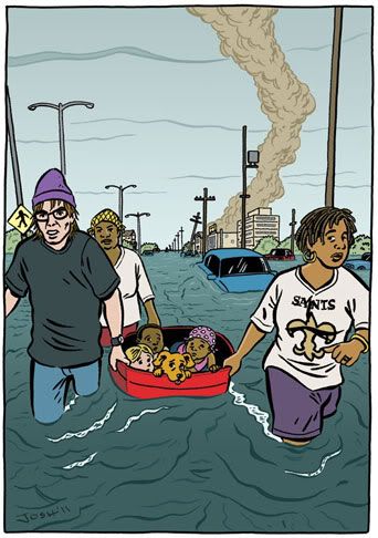
I was happy and the client was happy, so after making a couple of tiny tweaks, I delivered the final art:
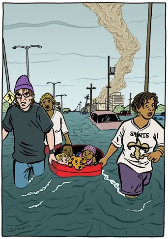
We weren’t quite done, however. Once the cover had been mocked up with the title logo and other elements, the designer felt that the left-hand-most lamp post was getting in the way. So he moved it down a bit:
To my eye, it just didn’t look right. It threw off the perspective and it made the lamp post more distracting rather then less. To me, it appeared that the lamp post was part of the guy’s hat, almost like a beanie. So I suggested they just take the lamp post out of the image altogether. And that’s what they did:
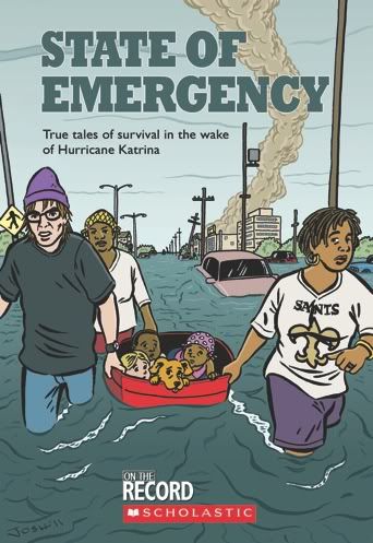
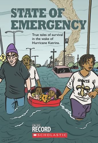
Problem solved. And that’s the final cover.
State of Emergency is due to be published some time later this year.
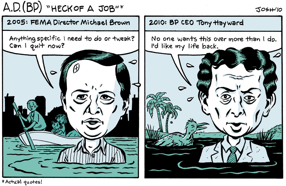
As a post-K federal levee failure survivor, I’m certainly relieved that you weren’t allowed into that meeting without a coat and tie. I think that was one of the main criteria for letting people into the Superdome too. 😛