
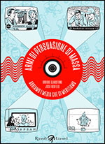
 Today marks the debut of the French translation of The Influencing Machine, my collaboration with Brooke Gladstone. The publisher is Ça et Là, run by one of my favorite people in comics, Serge Ewenczyk. This is the third translation of the book, which had already benefitted from two great cover designs in hardcover (Mark Melnick) and then paperback (Albert Tang):
 |
 |
And here are the previous translated editions, in Korean and Italian, also both very cool:
 |
 |
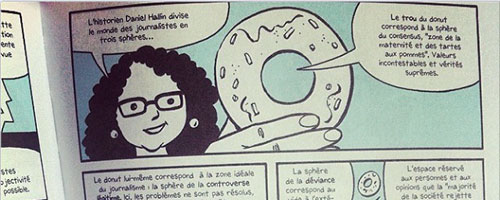
Serge asked me to draw the cover for the French edition, saying that neither of the American editions would work for French audiences. so here’s a blow-by-blow of the process involved. 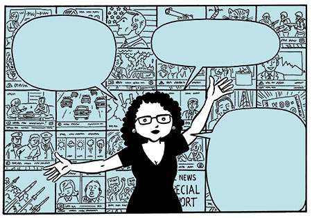 His first suggestion was to create something similar to a panel on page 37 of the book, with Brooke in front of a wall of screens/panels showing TV scenes but also illustrations connected to other media, like press and radio. (I have to also say here that the composition and some of the images on p. 37 itself pay homage to Alan Moore and Dave Gibbons‘ Watchmen—think back to the scenes in Ozymandias‘ Antarctic lair.) As always, my first step was to rough up a couple of sketches. Both went for the idea of “the media” as a sinister, controlling force—even though, utlimately, the book disputes that thesis. The first sketch was pretty straightforward—a spooked-looking Brooke in front of a row of screens…
 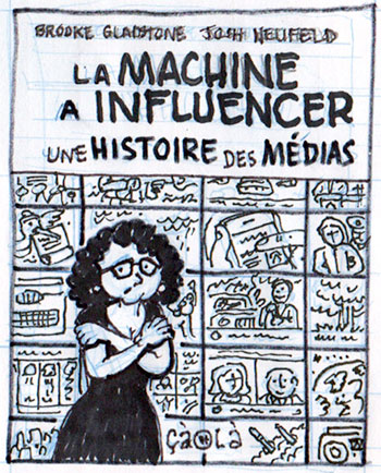 For the second sketch I really tried to convey the ominousness of the title, with Brooke being “replaced” by a witchlike figure with a giant eye for a head. (The giant eye was a cool motif created by designer Mark Melnick for the original hardcover edition.) My thought with this concept was that Brooke was enacting yet another of the many roles she already plays in the book: guide, jester, cavewoman, ancient Roman, etc.. I envisioned the cover as embodying one more preconceived notion which the book utlimately debunks.
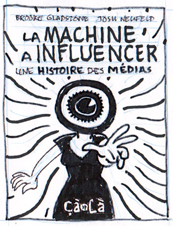
Serge really liked the second cover, feeling it was dynamic and striking. But he had some concerns: he felt that the “Eye-Head” might be “a bit over the top and misleading (too eerie).” He also was worried that the image implied “that Brooke was trying to influence the reader, and/or that she is impersonating the media, and that the media are trying to influence everybody,” which, as I said, is exactly the opposite of the book’s core message.
In turn, I thought that taking away the Eye-Head and just making the figure into Brooke would really imply that SHE was a malevolent, manipulative force. I felt that the Eye-Head at least made her “anonymous”—a representation of “THE MEDIA”. (And of course, Brooke IS a member of the media—she is co-host of a weekly radio show with millions of listeners.)
Serge countered that the figure was obviously Brooke. He also began to feel that the image might look too fantastic and turn down potentially interested readers. In response, I adapted the sketch to draw in the screen/panel background behind her, instead of the wavy hypnotism lines. I hoped this made the cover slightly less eerie…
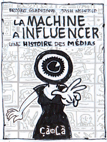
At this point, Serge and I were happy, but we wanted to clear the concept with Brooke. Unfortunately, it didn’t work for her. She felt the sketch was at odds with one of the book’s core principles. By having her head as a machine, “it undermined my argument that people have volition, that their brains aren’t being ‘taken over.'” She said, in fact, she “wouldn’t have had a problem with her body being a machine, because we’re physically connected to the internet all day long. (I was just concerned that a cover illustration with a gadget for a head would contradict the idea that our individual brains are in charge of that relationship.)”
Oh well! It is her book, after all, so I couldn’t take issue with her response. At that point, I suggested we just do a version of the same cover but with Brooke in a more neutral pose, maybe holding a radio microphone. I also proposed that I would render Brooke in full color, with the bank of monitors in the same blue tone as the inside of the book (so Brooke would pop).
Something like this:
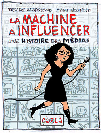
Serge was quite happy with this concept, only asking that Brooke be a bit smaller in comparison to the rest of the cover. Brooke gave the OK as well, so I got to work on the pencils, incorporating as many key images from the interior pages as I could, as well as representations of different media from on down the years. (I also drew Brooke on a separate layer, to give Serge’s designer room to manipulate her size and position…) 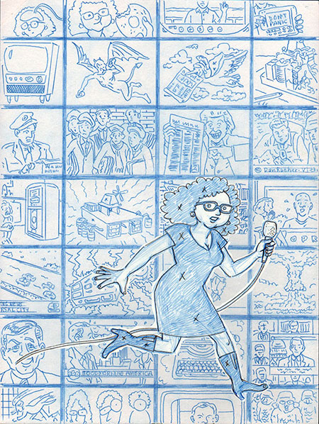
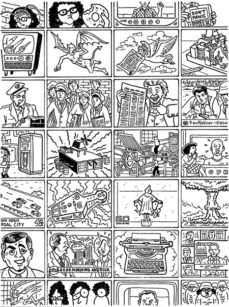
Serge liked the pencils, only asking for one small tweak: to switch the location of the “air loom” machine (row 4, panel 2) with the picture of the Acta Diurna bird (row 2, panel 3). He thought it was too much “weirdness” to have both the air loom and the “Body Electric” coffin machine (row 5, panel 3) so central and next to each other. This was no problem to change—I actually appreciate working with a client so attached to both the look AND content of the piece. This was how the cover looked inked. (I switched the air loom and the bird later on in PhotoShop.)
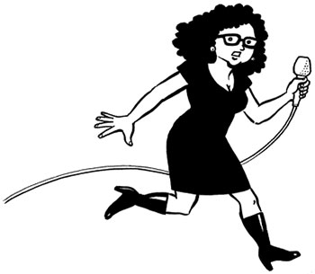
And here was the separate image of Brooke:
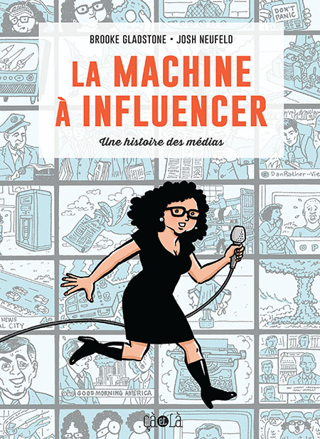
At this point everybody was happy, so I put everything together. And here’s how the final cover looks. Voila!
0 thoughts on “Evolution of a book cover: The Influencing Machine en français”