Twitter #FF: the JoshComix Collection

Plug, Work

Today’s Friday Follow suggestions are all folks who are currently using my art for their Twitter avatars:

mhkeller Michael Keller (@mhkeller)—interactive news reporter @ajam, fellow @towcenter, co-founder @csvsoundsystem, @TreasuryIO. comic book character → http://bit.ly/ajam-tos
justinmaiman Justin Maiman (@jmaiman)—Executive Producer, Business Insider Video, fellow KWF’13 alum
joshdneufeld Josh D. Neufeld (@joshdneufeld) (name sound familiar?)—Associate Professor of microbial ecology studying the diversity, function, phylogeny of environmental and host-associated microbial communities.
scottpeppet Scott Peppet (@speppet)—Law professor with passions for privacy, technology, and various other aspects of law. And a major character in Terms of Service!
aramsinnreich Aram Sinnreich (@aram)—Media Professor @RutgersCommInfo. Bassist @BNGsoul. Author of 2 books: Mashed Up (http://Mashed-Up.com) & The Piracy Crusade (http://PiracyCrusade.com). [The latter book features my cover illustration]
joshneufeld Me! (@joshneufeld)

The ACA’s Closets of Legacy

Plug, Travel

I’m in Master Artist Cabin #3 (aka Andersen Cottage) here at the Atlantic Center for the Arts, nestled amidst the palms and Spanish moss, accessible by wooden walkway. The cabin itself is a nice size, sort of a semi-duplex with the bedroom up the stairs. I very much think I can deal with these accommodations for the next three weeks!

IMG_5562 IMG_5566

My first introduction to a long-standing ACA tradition came when I opened my closet door to unpack. Scrawled all over the closet walls were signatures—lots of them—from previous Master Artists who’d stayed there. Cabin #3 is traditionally the writer’s cabin (which isn’t entirely inappropriate for me, as comics are, after all, an amalgam of writing and art), and the names on the closet walls are like a who’s who of literary stars: Rick Moody, Ishmael Reed, Richard McCannSamuel R. Delany, the late writer/monologist Spalding Gray, Douglas Coupland… even my old buddy Nick Flynn! Some artists’ names popped out at me too, including the late great sculptor Duane Hanson and MacArthur “Genius” Award-winner Carrie Mae Weems.

It’s pretty inspiring to be (metaphorically) sharing this space with such a roster of creative minds—to think they cooked their meals in the same kitchen, slept in the same bed, woke up to the Florida sunlight pouring through the same skylight…

Flynn & Moody Reed
Flynn & Moody Reed
Samuel R. Delaney Spalding Gray
Delany Spalding Gray (and his son Forrest)
Hanson and Weems Amy Bloom
Coupland, Dyer, Waldman Doty
Douglas Coupland, Geoff Dyer, and Anne Waldman poet Mark Doty
Mat Johnson Patricia Smith
Mat Johnson (of Inconegro fame) poet Patricia Smith
Richard McCann Quincy Troupe
Richard McCann poet Quincy Troupe

Joel Christian Gill's STRANGE FRUIT

Plug

Strange FruitIn 2007 Boston-area cartoonist Joel Christian Gill started drawing a story about a 19th-century man who escaped slavery by mailing himself to freedom in a box. The following year he made a minicomic and went to his first comics show to sell Strange Fruit #1 (followed by six additional issues). Today those stories and more are collected in Strange Fruit, vol I: Uncelebrated Narrative from Black History (Fulcrum Publishing)—with a foreword by Henry Louis Gates!

These offbeat stories of heretofore-obscure African-American pioneers are filled with heartbreak and triumph. Without whitewashing the realities of slavery and racism, Strange Fruit has a wry, welcoming tone—much aided by Gill’s dynamic, inventive storytelling. After reading about such real American heroes as chess master Theophilus Thompson, bicycling champion Marshall “Major” Taylor, and lawman Bass Reeves, I’m eager to learn more—and so should you!

So buy the book—and check out Gill discussing it recently on HuffPo: http://live.huffingtonpost.com/r/segment/537e66e3fe34440f9d00011c

Dean Haspiel's cosmic, circuitous, and kooky FEAR MY DEAR

Plug

Fear My DearMy old buddy/Hang Dai Editions partner/former Keyhole co-conspirator Dean Haspiel has just released Fear My Dear: A Billy Dogma Experience (Z2 Comics) and you must buy it! Completely remastered from the webcomic that ran online on ACT-I-VATE, it’s a gorgeous square-bound objet d’art. Dino asked me to write the book’s introduction, and I was honored to oblige: see how many phrases I copped directly from Billy, Jane, et al…

Friends, folks, and jackasses:

You are in for a treat: Dean Haspiel at the height of his powers. It’s all here: Dino’s spectacular storytelling, his gorgeous, stylish brushstrokes—and his iconic creation Billy Dogma in a way we’ve never seen him before: rebooted, stripped-down to his purest essence.

The original Billy was a philosopher for the 1990s, sounding off in his own unique way about the vagaries of fame, neighborliness, and the functional necessity of women’s hips. There’s a great moment in Fear My Dear when Billy pauses in the midst of furious action. He pauses, and he… thinks! Before he acts! It’s a first for the character, and it sparks a metamorphosis: the square-jawed philosopher transforms into a scruffy desert prophet. Billy Dogma 2.0 is all about the heart—and the hard lesson that “you don’t get to love when you love like you love.”

The primary object of Billy’s love, of course, is the spectacularly bespectacled Jane Legit. And In “Immortal,” the red-soaked opening story, Billy and Jane’s “war of woo” is played out—disastrously—on the mean streets of Trip City. (Billy and Jane are reality stars without the mediating authority of television.) And all the inhabitants of Trip City, from the beat cops to the regulars over at Lucy’s Bar, tell the tale. One of the great pleasures of all Billy Dogma stories is the language. Billy has always had the gift of gab—Jane too—and here we discover that apparently everyone in Trip City talks in the same lingo: part hard-boiled slang, part beat poetry. Thus we learn about “indulging a ruse,” “a lonely monster sans purpose,” and “steeping in seasons of cosmic love.” Sometimes your only option is to laugh and scratch your head at Dino’s unfathomable brilliance, but there’s no doubt it rings a cryptic coda.

From “Immortal” we segue into the golden-accented tones of the title story, as Billy embarks on a vision quest to (literally) get his head on straight. I won’t spoil the details of his heroic journey, but what emerges is Billy’s “secret origin:” Who is he? Where does he come from? What’s the deal with that Berserk Gun? Bite the bullet and take the bait—all shall be revealed.

Hopefully, your eyes are sensitive to feelings, because Fear My Dear is beautiful, funny, and guaranteed to make you go, “Awww”! I love Dino’s Billy Dogma tales precisely because they’re so completely different from my own work—fantastic, imagistic, and preoccupied by the BIG QUESTIONS. And after reading Fear My Dear, I bet you’ll love them too.

Fear My Dear is Dino’s most ambitious work to date. Harder than the hardest heart attack, it will spark the napalm in your apocalypse. So, sally forth, reader—it’s as easy as hopscotch!

A.K. Summers' PREGNANT BUTCH

Plug

PBcoverMedCartoonist A.K. Summers is someone I went to Oberlin with, though I didn’t know her there. (I didn’t know Sari there, either—which is amazing when you consider the entire college has like 2,000 people. Cliques.) Anyway, I’m glad to know A.K. now! Her first graphic novel is now out, and the title says it all: PREGNANT BUTCH. The project started out on the web, ran on ACT-I-VATE, and is now in print.

Her publisher, Soft Skull, asked me to write a few words about the book, and this is what I came up with:

A.K. Summers’ Pregnant Butch is a Tintin lookalike who embarks down the path to motherhood. If you made it through that sentence without your head spinning, then you’re ready for one of the weirdest, wonderful-est pregnancy memoirs out there. Employing a variety of art styles (think Hergé meets Jaime Hernandez, with a little Jack Kirby thrown in for fun), Summers has crafted a wry, wise tale that guarantees a chuckle on every page. Pregnant Butch is an unsentimental, no-holds-barred book filled with insight and genuine feeling. (And you know you want to see Tintin pregnant!)

Buy it now from your favorite retailer.

Jewish Comix Anthology Kickstarter fail?

Plug, Work

Sadly, things aren’t looking too good for the Jewish Comix Anthology. Its Kickstarter goal of $50,000 CAD seems to be falling far short—they need more than $35,000, with only five days to go. The anthology features such luminaries as Will Eisner, Michael Netzer, Joe Kubert, Art Spiegelman, and Robert Crumb (um, not Jewish ;->). And me too. I was looking forward to doing an adaptation of the very funny folk tale “Digging a Pit,” about the Wise Men of Chelm. There are tons of other great contributors too—Trina Robbins, Rachel Pollack, Joe Infurnari, Harvey Pekar… the list goes on. Let’s hope Alternative History Comics (the publisher) can figure out a way to fund the book even if the Kickstarter doesn’t hit its goals. In the meantime, please think about backing the project. Shalom.

It's a Pro Bono Comix World

Plug

How’s this for a week of comics-related-but-not-actually-making-comics tasks? Just last week, I…

  • wrote the introduction to a friend’s upcoming graphic novel
  • penned a blurb for an upcoming comics memoir
  • wrote a recommendation letter for someone applying to a comics certificate program
  • served as a thesis advisor for an MFA student

I was super-excited to do all these things. It’s a testament to how far I’ve come in my own career that others might think my opinions are useful. Also, when I was starting out in comics, there were so many people who threw me bones, from tipping me off to freelance gigs, letting me work in their studio, giving me professional and technical advice, writing me letters—not to mention publishing my less-than-stellar stuff.

But, much as I love “paying it forward,” last week was a little intense!


Evolution of a book cover: Republic of Outsiders

Illustration, Plug, Publicity

I illustrated the cover of Alissa Quart’s new book, Republic of Outsiders: The Power of Amateurs, Dreamers and Rebels (The New Press), and I thought I’d take you through the whole process.

The book is about how a diverse group of outsiders who seek to redefine a wide variety of fields—from film and mental health to diplomacy and music, from how we see gender to what we eat—are succeeding in various ways in changing the status quo. So from the get-go the initial concept was to show a large crowd of people on the cover, something to convey the idea of “here comes everybody.” The book’s particular subjects—including  an Occupy Wall Street “alternative banker,” a transgender activist, an autistic artist, and indie musician Amanda Palmer—would be prominently featured at the front of the crowd.  I wanted the art to “bleed,” to extend past the edge of the cover, to help convey the “infinite” size of the crowd of amateurs, dreamers, and outcasts (at that point the book was subtitled “The Power of Rebels, Amateurs, and Outcasts”).

My initial sketch looked like this:

RoO-sketch-lorez

The client was pretty happy with the sketch, with their only major comment regarding the Amanda Palmer figure. Because of some recent negative press, they asked me to downplay her somehow—suggesting I “anonymize her, so she could be a more generic glam genderbending figure.” I pointed out that with my cartoony style I doubted many people who would recognize the character as Amanda Palmer, but I was happy to do as they asked.

We also agreed that I would hand-letter the title and other cover lettering. Given that, the client felt the subtitle needed a little more air. At that point, I came up with the idea of the crowd holding signs making up the words of the subtitle. I thought it further sold the concept of this group being paet of a movement effecting change on society.

This was my first attempt at the pencils (the blue outline shows the bleed and the crop marks of the actual book dimensions):

RoO-pencils-lorez

Although generally happy with the pencils, the client asked for some changes. There was some concern that the central figure (based on a real-life autistic artist was “too prominent and particular.” One way they suggested to do that was to eliminate the plastic iguana she was holding and make her expression less vacant; the second adjustment took care of another unresolved issue, which was how to display the author’s name. They came up with the idea of setting in a foreground sign which also would partly cover the autistic character. In addition, feeling that the “Amanda Palmer” avatar was too aggressive, they asked me to tone down her expression a bit as well.

At this point, I was a bit concerned about the changes being requested because frankly I thought they weakened the impact of the image. My understanding of the project was that the people on the cover were outsiders dancing to the beat of their own drums—and succeeding by doing that. And my feeling was the client’s suggestions were making the cover blander and less memorable. But… in the end, they were the client (who is always right ;->). I expressed my reservations and made the changes they asked for. (I also found out later that there were some legal concerns regarding the autistic artist character, who is only referred to by her first name, Katie, in the book…)

Finally, they asked me to replace the chunky “Outsider” title lettering with a simpler “font.”

This is what the second round of pencils looked like:

RoO-pencils2a-450px

By this point, the client and I were pretty much on the same page, and they gave me the go-ahead to proceed to inks. Wait! There was one more last-minute change: the subtitle of the book was changed from “The Power of Rebels, Amateurs, and Outcasts” to “The Power of Amateurs, Dreamers and Rebels”. So, here are the inks:

RoO-inks2-lorez

After a little more back-and-forth (thankfully, nothing too onerous), they gave me permission to color the piece, which I did in PhotoShop. As is my wont, I went with a reduced color palette, focusing mostly on greens and yellows, with a optimistic blue sky and red lettering to really pop. Here’s how it looked:

RoO-colors-lorez

The first color treatment made it all the way up the line to publisher, but she felt the palette was “too retro.” The client’s direction was to “maybe lighten the skin tones and add a bit more cyan to the clothes, so they’re not so contrasty with the sky.” Given how “unrealistic” the original color treatment was, I  was prepared for some pushback, and thought their comments made sense. So I warmed up the skin tones and made a few other adjustments (including making the “Katie ” painting a bit more distinctive from the rest of the scene). I thought the changes relieved the “monotony” of the original color treatment while staying true to my original concept:

RoO-colors2-lorez

Success! Everyone liked the new color treatment. So I was done, right?

Wrong! When it came to mocking up the book, the artwork on the right-hand side didn’t extend far enough to cover the bleed on to the dust cover flap. Left as-is it would show the art “fading away”—which I thought undermined the “infinite” feeling of the crowd. They also wanted the line “author of Branded and Hothouse Kids” added underneath the author’s name. So… I went back to the drawing board (literally) and extended the artwork to the right (as well as adding the “author of” line in PhotoShop, using a font of my lettering). And, voila:

RoO-revise-lorez

We were finally done! This is how the “mechanical” (front, back, flaps, and crop marks) looked on publication:

Republic-of-Outsiders_1st-mech-lorez

The book came out last month, and it’s been cool seeing my work on the cover—a first for a book I did not myself draw.

After all the back and forth, I obviously felt very connected to the process, and to all the individual decisions that led to the distinctive final product. So I was a bit chagrined when this image was brought to my attention: the cover of Eric Alterman’s 2008 book, Why We’re Liberals: A Political Handbook for Post-Bush America (Viking), illustrated by the very brilliant Tom Tomorrow

Alterman-WhyWe'reLiberals-cover-lorez

Oops! I don’t remember ever seeing that book cover before, I swear!

Influencing Machine Korean edition cover

Influencing Machine, Plug, Work

Just for poops & chuckles, I thought you’d like to see the cover of the Korean language edition of The Influencing Machine, published by Doddle Saeghim. They took the art from the last page (with Brooke’s head blown up a bit) and colored it—in a much louder style than I use in the book itself. They also added a bunch of shadows. 

IF-DoddleSaeghim-cover-sm

P.S. Anyone out there have a Korean URL for the book? I can’t seem to find it…

My comics and sketches in Steve Heller's COMICS SKETCHBOOKS

Comics, Plug, Work

Comics Sketchbooks
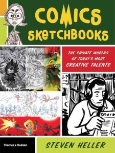
Last fall, just when I was learning the ropes of the Knight-Wallace Fellowship, I received a contributor copy of Steve Heller’s Comics Sketchbooks: The Private Worlds of Today’s Most Creative Talents (Thames & Hudson).

When Heller first approached me about being in the book, I immediately felt my stomach clench. Like most cartoonists I’m pretty insecure about my art; most times, it’s bad enough to see my finished work in print—the idea of exposing my half-assed doodles and thumbnails felt really risky. But how could I turn down an invitation from design legend (and former New York Times chief art director) Steve Heller?

My first problem was that I don’t really have a sketchbook per se (e.g. as a thing I sketch in). I’ve kept my sketchbooks since high school—and thanks to my packrat mother, have artwork dating back to when I was four years old. (No matter how brave I am, I wasn’t about to show any of that!) But I really had to dig deep into old work to find anything suitable. For one thing, the purpose of my sketchbooks has radically changed as I’ve gotten older and as my career has progressed. In going through all the old books, I was amazed  how they reflect my evolution as an artist and as a cartoonist.

In high school, I kept a sketchbook to draw character ideas for various superheroes I created, or to do full-color “pin-ups” of some of my favorite Marvel or DC heroes. My friends and I at Music & Art High School would also trade our sketchbooks and draw in each other’s books, so they were ways of having samples of each other’s work for posterity. For awhile after I graduated from college, I kept a sketchbook at my day job at The Nation magazine, just to keep my skills fresh. That was the first time I really used a sketchbook for doodling and sketching, and as a record of the world around me: my girlfriend, co-workers, guest speakers, people on the subway, and the like. (I was also losing interest in superhero comics around that time, and was casting about for another way to express my artistic impulses.)

Then, in the early 1990s, when Sari and I embarked on a round-the-world backpacking trip, I took along the Eric Fischl/Jerry Saltz book Sketchbook with Voices (Van Der Marck Editions, 1986; now re-issued). The book is essentially filled with blank pages, but at the top of each page are instructions from  contemporary artists of that period; ideas which served as jumping-off points for various drawings. Oftentimes I would ignore the directives and just draw or paint whatever I felt like during my travels, but the ideas in the book are sharp and fresh, and often helped me when I needed a little prodding. That was also an important period where I did very little comics work, instead just sketching from life and painting watercolor landscapes and the like. The book helped me unlearn a lot of bad habits I had picked up during my youthful years as a wannabe superhero cartoonist. I kept Sketchbook with Voices all throughout my travels through Southeast Asia and Central Europe, and it’s filled with all sorts of memories—and even a few illustrations I’m not too embarrassed to look back at.

Nowadays, however, my “sketches” tend to be highly directed, either character studies or thumbnail layouts for scripts I’m working on—not so much sketches as preliminary drawing for finished comics.

The trip down memory lane was less painful than I feared, and I found a selection of things to submit for the book. I answered a few of Heller’s questions for the profile section, sent everything off, and then basically forgot about it. As I mentioned, the book arrived at my door just as I was immersing myself in my fellowship. Believe it or not, it wasn’t until the fellowship was over (last month) that I was finally able to check out the book.

One thing I really appreciated was Heller’s acknowledgment (in his introduction) of the inherent vulnerability evoked by the project, whose subtitle, “The Private Worlds,” etc. really rings true for me. (And I was relieved to see that a lot of the contributors admit that they too don’t spend a lot of time sketching for sketching’s sake.)

That said, the book features quite an impressive list of contributors, including masters like Crumb, Burns, Seth, and Mazzucchelli. It’s always instructive to see the sketchbooks of guys like that—like peeking into their brains and feeling a bit of the spark of their creative process. Another one of my long-time favorites, cartoonist Mark Alan Stamaty, gets really metaphysical about his sketchbooks, talking about how they’re attempts to explore what mystifies him in life, to get to deeper meanings, to discover new paths. And he quotes Matisse, who, when asked to explain one of his paintings, said, “If I could explain it, I wouldn’t have painted it.”

I loved looking at Peter Kuper‘s sketchbook work, much of it from his recent sojourn to Oaxaca, Mexico. Peter Kuper’s Comics Trips: A Journal of Travels Through Africa and Southeast Asia (NBM, 1992) was the only comic book I took with me on my round-the-world backpacking trip. Comics Trips is part comic, part sketchbook, and part photo album. It’s punctuated by beautiful watercolor sketches, ticket stubs and collages, and humorous photo essays like “Toilets of the World.” Comics Trips was a huge influence on my own travel work, and the main inspiration behind A Few Perfect Hours. So it was exciting to me to see more recent sketchbook work from Kuper—the images are energetic, filled with personality, and vibrating with color.

I loved reading British cartoonist Posy Simmonds comments, and looking at her sketches from one of my favorite recent graphic novels Gemma BovaryCarol Tyler‘s work was a revelation. With cartoonist/friend Lauren Weinstein it was cool to see the various styles at work in her sketchbooks, from intricate inked landscapes to watercolor figure drawing. That’s another great function of a sketchbook: to play around with styles you don’t normally use in your professional work.

I really identified with what David Heatley says about struggling to retain the energy of his thumbnail sketches. There’s definitely a spontaneity, looseness, and economy to my sketches that I struggle to evoke in my more polished work. For this reason, my buddy & fellow cartoonist Dean Haspiel is always encouraging me to publish my sketches/layouts as completed comics—more on that later.

Upon returning to the States after our backpacking adventure, Sari and I ended up in Chicago, where I soon got hooked into the cartooning scene. I happened to get to know Chris Ware a little bit during that time, and he once gave me a very useful bit of sketchbook advice. His own sketchbooks were filled with hilarious one-pagers and strips which he did for fun—and as far I know, never published. Anyway, Chris recommended that I use my sketchbook to write and draw open-ended comics stories, to just go ahead with Panel One and see where it led me. I normally work in a very controlled way—full script, layouts, pencils, inks—so I followed his advice a little bit, and found it very useful in un-blocking my creative channels. Spontaneous sketchbook comics were a very good way of breaking habits and rethinking the comics-making process.

sketchbook-questions-lorez
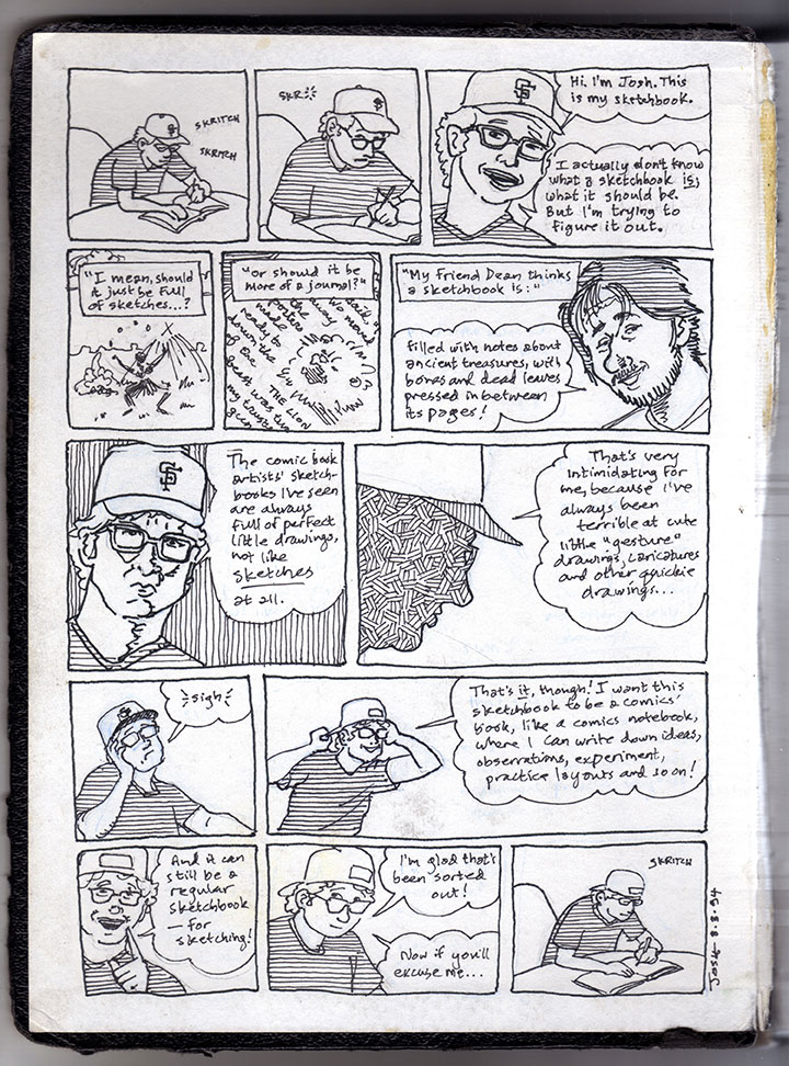
Still, old habits die hard—the only sketchbook comics I’ve ever published are the humorous travel tip “How to Squat;” and the one-page sketchbook comic that appears in Comics Sketchbooks. Created almost 20 years ago, in the piece I muse upon the very purpose of a sketchbook. So meta! Even though it’s quite an old piece, it still reflects my questions about the whole sketchbook practice, and I still find it an amusing little story.

The other pieces of mine used in the book were some character sketches and floor plan layouts from A.D., two pages of layouts from American Splendor, a pen & ink & watercolor Tintin cover pastiche called The Adventures of Josh & Sari, and a drawing I did of actors and assorted characters from the late lamented HBO show Bored to Death (which I drew when I was on-set).

# # #

P.S. Ironically, this past year I sketched more than I had in years. All during my fellowship I used my Moleskine notebook to sketch speakers who came in for seminars and presentations. I collected over 50 of those sketches in a booklet I printed up and gave to each of my fellow Fellows at the end of the year.

P.P.S. Regarding Steve Heller. He shows up as the art director from hell in Bob Fingerman’s Minimum Wage (originally published in the 1990s by Fantagraphics). I’ll never forget the scene where Fingerman’s sweaty stand-in, Rob Hoffman, an up-and-coming illustrator, visits Heller’s offices at the Times to show his portfolio. The Heller character whips through it like a flip book, never actually looking at the images, and sends Rob on his way. I read that scene right before I myself went in to show Heller my illustration portfolio. Talk about bad timing! However, he was kind enough to actually look at my work and gave me a few specific pointers before he rejected me. Well, I guess he didn’t technically reject me—he did give me the coveted contact list of all the art directors at the Times (the heads of the various sections), and eventually I did get a piece published in the paper’s Travel section. (It’s still up on my illustration website!) That was the last contact I had with Heller—I think he left the Times not oo long afterward—until he contacted me out of the blue to be part of this book. Clearly, in his mind at least I had grown as an artist in the intervening decade. Thanks, Steve!
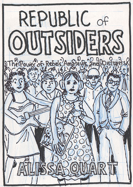
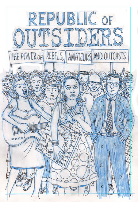
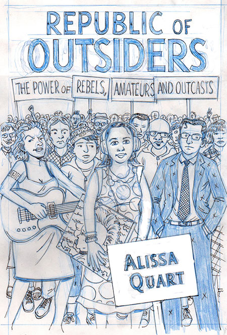
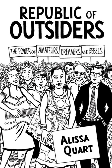